Login to Ask a Question or Reply
Forum Replies Created by Priyanka M S
-
Creating the chart within ngOnInit() should work fine. Also, if your div-id is
chartContainer, the same ID has to be passed as container-id to CanvasJS asconst chart = new CanvasJS.Chart("chartContainer", {.
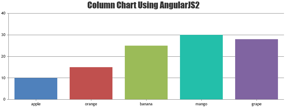
Please take a look at this sample project on using CanvasJS charts with AngularJS-2.
__
Priyanka M S
Team CanvasJSJune 25, 2018 at 1:29 pm in reply to: three questions: shadow, hover datapoints, toolTip remain #21235In lines 28,29,30 we are setting shadowColor, shadowBlur and shadowOffsetX. If you are rendering only one chart type, you can comment lines 49,50,51. If you are combining different chart types like line, column, area etc. and if those lines are commented, the shadow gets applied to all the chart types. So it’s advised to reset it.
__
Priyanka M S
Team CanvasJSYou can simply render chart inside setInterval or setTimeout function, which renders the chart for every set duration. Please check this thread for more information.
__
Priyanka M S
TeamCanvasJSJune 22, 2018 at 7:35 pm in reply to: three questions: shadow, hover datapoints, toolTip remain #212201) Please take a look at this jsfiddle to set shadow in line chart.
Maybe it can be done by mouseover and mouseout functions but it seems to be a better solution. if not i’ll be glad if you put some code to change color(something like e.dataSeries.dataPoint.color=”red”; ?!!!)
Thanks for your suggestion. We’ll reconsider it for our future releases.
3) toolTip can be hidden on click of dataPoint by disabling it on click and enabling on mouseover. Please take a look at this jsfiddle.
__
Priyanka M S
Team CanvasJSJune 22, 2018 at 5:05 pm in reply to: Graph showing elements that have a range of value by Y and by X #21218June 22, 2018 at 4:02 pm in reply to: Graph showing elements that have a range of value by Y and by X #21210Thanks for your interest in CanvasJS. I have forwarded your query to our Sales Team and the concerned person will be contacting you shortly over email, they will assist you in upgrading.
Are you looking for Range Column Chart?
If not, could you please provide a pictorial representation of your requirement so that we can understand it better and help you out?__
Priyanka M S
Team CanvasJSIn order to load a local file on browser, you need to have a local server running in your system to avoid cross origin requests which most of the browsers doesn’t support. You can read data directly from a local text file (sample.txt), please take a look at this sample project.
__
Priyanka M S
Team CanvasJSJune 20, 2018 at 12:14 pm in reply to: Please how can i edit a simple text in this PHP Spline Area Charts & Graph? #21174The values you seen on axisX are the x values that you provided to dataPoints. You can change the date as per your requirement, by providing proper unix/PHP timestamps to the x-value. Please take a look at date-time axis in docs page for more info.
__
Priyanka M S
Team CanvasJSInstead of updating the dataPoints at certain interval, update dataPoints frequently for every count of loop and later update the chart at the required interval. This would solve your requirement. Please take a look at this jsfiddle.
__
Priyanka M S
Team CanvasJSThanks for the feedback. We will reconsider this for our future releases.
__
Priyanka M S
Team CanvasJSJune 20, 2018 at 12:08 pm in reply to: Taking input as imported html table to the line graph. #21171To avoid overlapping of labels, interval is automatically calculated. When interval is set to 1, labels get rendered for every value within the axis range. In your case, labels get rendered for every value starting from 1 to 5000000 since the interval is set to 1, resulting in label overlapping and delay in rendering. However, interval for axes has to be set according to the range of input that’s been provided to the chart. Please refer to interval in our documentation.
If max value more than 1000 times of interval, then interval should be switched to auto.
Thanks for the suggestion. CanvasJS doesn’t ignore user provide inputs, except for the rare scenarios. However, if the interval is not set, it gets auto-calculated.
__
Priyanka M S
Team CanvasJS