Login to Ask a Question or Reply
Forum Replies Created by Manoj Mohan
-
You can achieve your requirement using viewportMaximum and viewportMinimum as shown in this JSFiddle.
—-
Manoj Mohan
Team CanvasJSDecember 6, 2019 at 11:18 am in reply to: Moving the slider out of the page incorrectly indicated timestamps on the axisX. #27637You can create multi series chart as shown in this JSFiddle.
—-
Manoj Mohan
Team CanvasJSDecember 4, 2019 at 8:20 pm in reply to: Stack not visible for small value in stacked column chart #27621As the difference in the two mentioned dataPoint y-value is large, height of the smaller y-value dataPoint will be negligible and not visible. We will reconsider this behaviour to be improved in future releases. However, you can workaround this behaviour by adding some larger value dataPoint instead of smaller value as shown in this JSFiddle.
—-
Manoj Mohan
Team CanvasJSDate Time on axisY is not supported as of now. However, you can achieve your above requirement as shown in this JSFiddle.
—-
Manoj Mohan
Team CanvasJSIndex-labels overlap each other as there would be no space available when the datapoint values are small. It can be avoided to an extent by setting indexLabelFontSize to a smaller value.
—-
Manoj Mohan
Team CanvasJSYou can disable interaction with chart like updating toolTip, zooming/panning, mouse-events, etc with the help of interactivityEnabled property. Setting interactivityEnabled to false in smaller screen should work fine in your case. Please take a look at this JSFiddle.
—-
Manoj Mohan
Team CanvasJSNovember 25, 2019 at 6:19 pm in reply to: How to generate chart reports using php and mysqli with an array in a column #27502Please take a look at this gallery page for an example on adding dataPoints from mysql database in PHP.
If you are still facing issues in integrating kindly share sample project along with sample database over Google-Drive and Onedrive so that we can look into code and understand the scenario better and help you resolve.
—-
Manoj Mohan
Team CanvasJSTo display the image properly on zooming and panning, you can call a function to re-position the image on rangeChanged event.
—-
Manoj Mohan
Team CanvasJSSetting exportEnabled property to true lets you to print or save the chart as an image. You can also print the chart programmatically with the help of the print method. Please refer to the documentation for more customisation options available.
—-
Manoj Mohan
Team CanvasJSSetting minimum and maximum of axisX with an appropriate javascript date object or timestamp as per your data range and dataPoints should work fine in your case.
In case you are still facing the issue, can you kindly create JSFiddle along with sample data and share it so that we can look into the code, understand it better and help you out?
—-
Manoj Mohan
Team CanvasJSEarlier WebKit allowed 448MB of canvas buffer memory whereas now they have dropped it to 224MB. Because of this, there was some memory issue with CanvasJS Charts in the latest iOS. However, we had optimized memory consumption in CanvasJS v2.3 – please check out this release blog for more info.
For more optimization on dynamic charts, update chart options and re-render and don’t instantiate/create new chart on every update.
Also, we will further optimize this behavior in future releases.
—-
Manoj Mohan
Team CanvasJSCan you kindly share an example and brief us more about your requirements so that we can understand your scenario better and help you out?
—-
Manoj Mohan
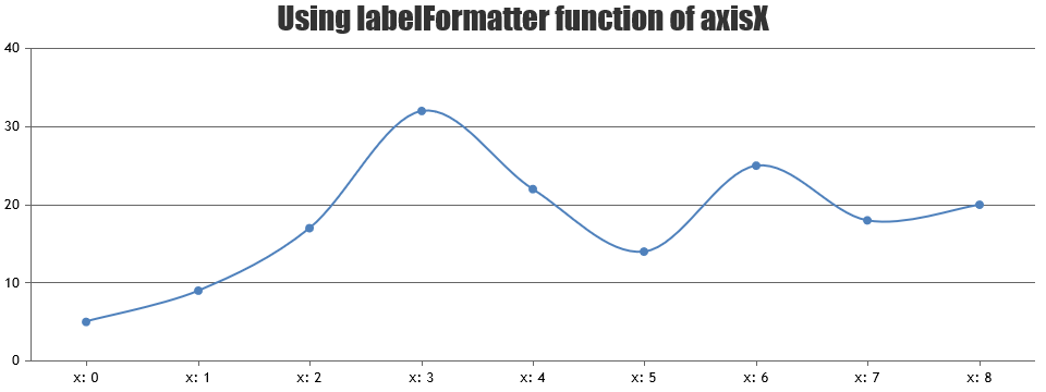
Team CanvasJSYou can achieve the above requirement by formatting the labels of axisX2 using labelFormatter.

—-
Manoj Mohan
Team CanvasJS