Login to Ask a Question or Reply
Forum Replies Created by Manoj Mohan
-
October 5, 2021 at 7:33 pm in reply to: iOS | chart not display with warning maximum limit (224 MB). #35931
Sorry for the inconvenience caused. As iOS has dropped the canvas memory buffer to 224MB, we have tried to optimize memory consumption of our library. Also, we will optimize it further in our future releases.
—-
Manoj Mohan
Team CanvasJSWe have just released v1.4.3 with this bug fix. Please refer to the release blog for more information. Do download the latest version from our download page and let us know your feedback.
—
Manoj Mohan
Team CanvasJSCanvasJS library is based on JavaScript and hence it inherits all its behaviour and limitations. However, we will reconsider the behaviour of handling large numbers for improvement in our future releases.
—-
Manoj Mohan
Team CanvasJSThe number you are passing to y-value seems to be greater than JavaScript Number.MAX_SAFE_INTEGER, because of which axis labels are not rendered properly.
—-
Manoj Mohan
Team CanvasJSPreviously shared code seems to work fine with positive values. The logic can be improved to make it work with negative values as shown in the below code-snippet
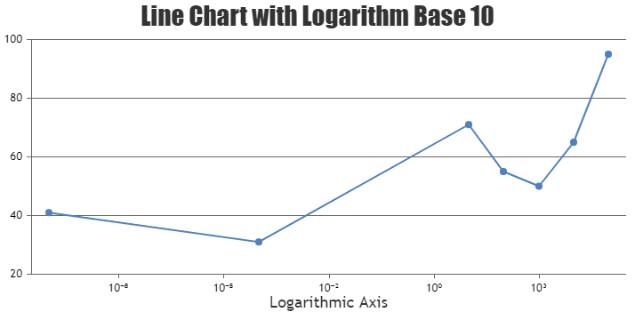
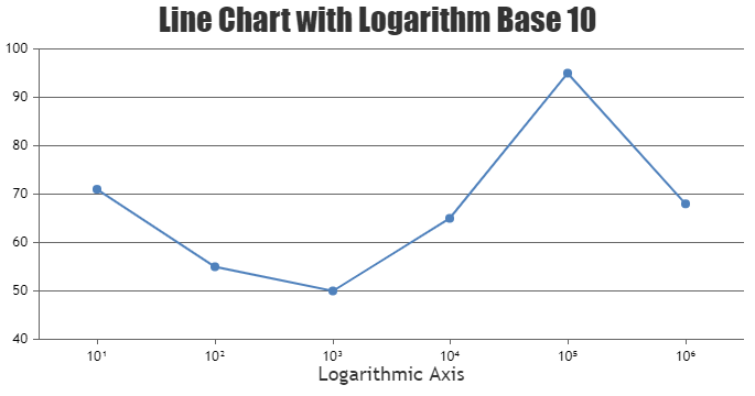
function getSubscriptString(value) {
    var subscriptValue = Math.ceil(Math.log(value)/Math.log(10));

    //Handling double digit numbers
    if(subscriptValue > 9 || subscriptValue < -9) {
      return (subscriptValue < -9 ? "\u207B" : "") + (Math.abs(subscriptValue)+"").split('').reduce(
        function(prevVal,val) {
          return prevVal + unicodeStringForSubscript[val];
        }, "")
    }

    return (subscriptValue < 0 ? "\u207B": "") + unicodeStringForSubscript[Math.abs(subscriptValue)];
  }
..
axisX:{
      title: "Logarithmic Axis",
      logarithmic: true,
      logarithmBase: 10,
      labelFormatter: function(e) {
        return 10 + getSubscriptString(e.value);
      }
    }
..
Also, check out this JSFiddle for complete working sample.
—-
Manoj Mohan
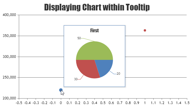
Team CanvasJSYou can pass the pie1, pie2,… values to respective dataPoints of the scatter chart and on displaying the tooltip, you can get the values for pie chart using
e.entries[0].dataPointsobject. Please take a look at the code snippet below for the same.. . toolTip: { updated: function(e) { typeof pieChart.destroy === "function" && pieChart.destroy(); pieChart = new CanvasJS.Chart('pie-chart', chartOptions); pieChart.options.title.text = e.entries[0].dataPoint.name; pieChart.options.data[0].dataPoints = []; pieChart.options.data[0].dataPoints.push({y: e.entries[0].dataPoint.pie1}); pieChart.options.data[0].dataPoints.push({y: e.entries[0].dataPoint.pie2}); pieChart.options.data[0].dataPoints.push({y: e.entries[0].dataPoint.pie3}); pieChart.render(); }, contentFormatter: function() { return "<div id='pie-chart' style='width:200px; height:200px;'></div>"; }, hidden: function() { typeof pieChart.destroy === "function" && pieChart.destroy(); } } . . dataPoints: [ { y: 219960, name: "First", pie1: 20, pie2: 30, pie3: 50}, { y: 363040, name: "Second", pie1: 60, pie2: 20, pie3: 40} ] . .Please take a look at this JSFiddle for complete working code.
—-
Manoj Mohan
Team CanvasJSYou can use unicode characters in labelFormatter to display power (subscript) values in the axis labels. Please check out the code snippet for the same.
var unicodeStringForSubscript = ["\u2070", "\u00B9", "\u00B2", "\u00B3", "\u2074", "\u2075", "\u2076", "\u2077", "\u2078", "\u2079"]
.
.
 axisX:{
      title: "Logarithmic Axis",
      logarithmic: true,
      logarithmBase: 10,
      labelFormatter: function(e) {
        return 10 + unicodeStringForSubscript[Math.ceil(Math.log(e.value)/Math.log(10))] ;
      }
.
.
Also, take a look at this JSFiddle for a complete working code.
—-
Manoj Mohan
Team CanvasJSSeptember 13, 2021 at 6:12 pm in reply to: get charts.axisY2[0].bounds without first rendering. #35699I need to be able to get a charts.axisY2[0].bounds property calculated BEFORE I render it. How can I do that?
Sorry, it’s not possible to access bounds of the axis before rendering the chart. However after rendering it once, you get access to all the properties. Please refer to the Methods & Properties documentation for more info.
how can I use offscreenCanvas with my chart too?
offscreenCanvas is not supported in CanvasJS as of now.
—
Manoj Mohan
Team CanvasJSSeptember 13, 2021 at 6:12 pm in reply to: Typescript converts CanvaJS.Chart to undefined when building #35698Sorry, there is no official TypeScript type definition for CanvasJS as of now. However, this feature is there in our roadmap but no definite timeline yet as we are working on some other important features at this point in time.
You really shouldn’t include node_modules in zips like that.
Thanks for the suggestion. We have provided node_modules for the ease of the user to run the sample.
—-
Manoj Mohan
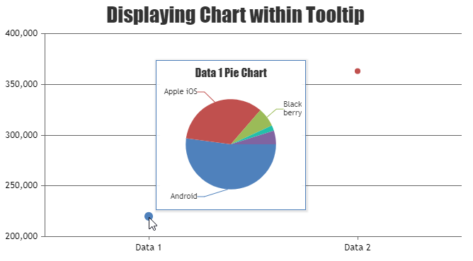
Team CanvasJSTo display a chart inside tooltip, you can create a DOM required for the chart within tooltip using contentFormatter and render the chart on updated event of toolTip. Please take a look at this below code snippet for the same.
toolTip: {
      updated: function(e) {
        typeof pieChart.destroy === "function" && pieChart.destroy();
        pieChart = new CanvasJS.Chart('pie-chart', chartOptions[e.entries[0].dataPoint.label]);
        pieChart.render();
      },
      contentFormatter: function() {
        return "<div id='pie-chart' style='width:200px; height:200px;'></div>";
      },
}
Also, check out this JSFiddle for complete sample code for rendering the chart within tooltip.
—-
Manoj Mohan
Team CanvasJSYes, you can use datetime in x-axis. In order to use datetime in x-axis, you need to first convert PHP date to timestamp using strtotime and then convert PHP timestamp to JavaScript timestamp by multiplying it with 1000.
$phpDate = date("Y-m-d h:i:sa");
$phpTimestamp = strtotime($phpDate);
$javaScriptTimestamp = $phpTimestamp * 1000;
You can refer to this thread for more information on using datetime on x-axis in PHP. Also, you can check out this gallery page for an example on using JavaScript timestamp in x-axis in PHP.
—-
Manoj Mohan
Team CanvasJSOne of our sales representative will get in touch with you over email. For any license related query, please contact sales@canvasjs.com.
—-
Manoj Mohan
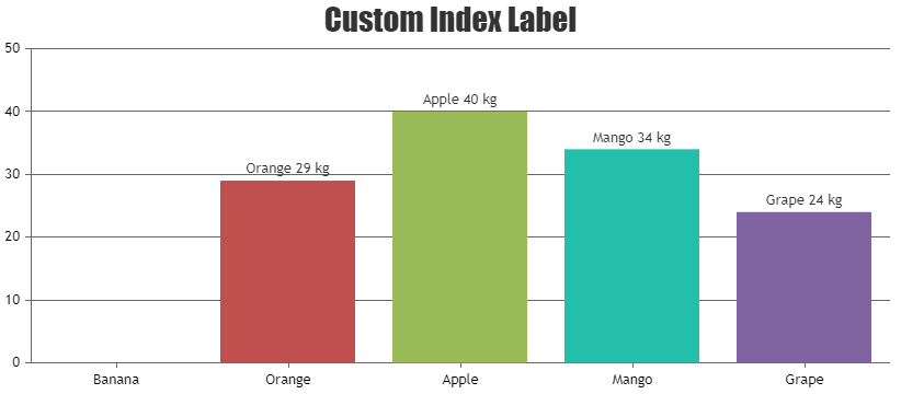
Team CanvasJSAugust 6, 2021 at 9:51 pm in reply to: How to hide indexLebel value if zero globally for all charts in v3.2.2 #35067The use case you mentioned of indexLabel not being shown when y value is 0 was a bug and it has been fixed in the releases prior to 3.0. In order to hide indexlabel when y value is 0, you need to use indexLabelFormatter property.
So, can anyone please suggest global fix for it, to hide 0 0 0 0 from all charts of my website?
Sorry, as of now you cannot revert this behaviour globally. However, you can create a global function which takes chart object as parameter and set the indexLabelFormatter in the chart options and render it as shown in this code snippet.
addIndexLabelFormatterToChart(chart);

function hideIndexLabelOnZero(e) {
return e.dataPoint.y !== 0 ? e.dataPoint.label + " " + e.dataPoint.y + " " + "kg": "" ;
}

function addIndexLabelFormatterToChart(chart) {
chart.data[0].set("indexLabelFormatter", hideIndexLabelOnZero);

}
Also, check out this JSFiddle for complete working code.
—-
Manoj Mohan
Team CanvasJSNeha,
We don’t support setting fontColor, fontSize and fontWeight for each individual legend items as of now.
—-
Manoj Mohan
Team CanvasJS