Login to Ask a Question or Reply
Forum Replies Created by Indranil
-
@nsn,
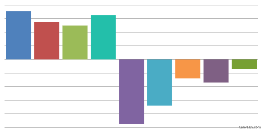
Setting valueFormatString defines the format for labels appearing on Axis Y, which doesn’t include the negative symbol (-) incase of negative number. Instead, using labelFormatter to return an empty string should work fine in this case. Please check the below code snippet –
axisY:{
  title: "",
  tickLength: 0,
  lineThickness:0,
  margin:0,
  labelFormatter: function(e) {
     return "";
  }
},
Also, kindly take a look at this updated JSFiddle.

___________
Indranil Deo
Team CanvasJSCan you please brief us further about your requirement along with a pictorial representation so that we can understand your scenario better and help you out.
___________
Indranil Deo,
Team CanvasJSPlease download the sample project from this link to create Drilldown chart in ASP.NET MVC. An instructions.txt file has been included for your convenience with instructions to set up the project and get the charts running.
In case you are still facing any issue, please create a sample project with a sample database and share it over Google-Drive or Onedrive so that we can look into the code, understand the scenario better and help you out?
__________
Indranil Deo
Team CanvasJSYou can add an option to the specific dataPoint with the required description/comment and use the toolTipContent to customize the information showed on the toolTip. Please take a look at this JSFiddle.
__________
Indranil Deo
Team CanvasJSSorry, line chart can’t be rendered vertically as of now.
__________
Indranil Deo
Team CanvasJSFred,
When you are rendering multiple charts it involves multiple DOM elements, which may take more time as compared to rendering a multi-series chart with a single DOM element.
Please try out these performance tests for the above scenarios –
__________
Indranil Deo
Team CanvasJSI will discuss this with the development team to consider this feature for the future versions.
__________
Indranil Deo
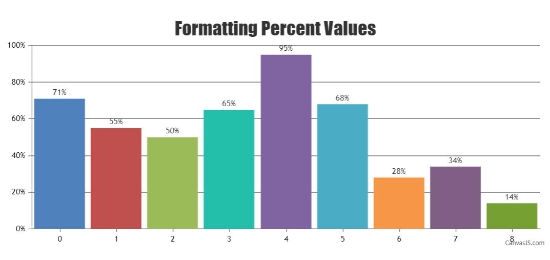
Team CanvasJSYou can format the y-axis label by adding “%” to the valueFormatString of axisY. Please refer to the below code snippet.
axisY:{
    valueFormatString:"0'%'"
},
Also, kindly take a look at this JSFiddle for an example.

__________
Indranil Deo
Team CanvasJSAugust 5, 2019 at 5:39 pm in reply to: datetime picker to dispaly a chart containing values from oracle database #26177Do you have a sample project with datetime picker attached to it
Please take a look at this JSFiddle.
kindly check for this if possible why only double parameters can plot the graph from database and not string / date type data.
CanvasJS supports numeric and date-time as x-values and when it comes to date-time, it should be JavaScript date object or timestamp. If you like to use string, you can use labels. To pass Java date to JavaScript, you would need to convert Java date to timestamp in milliseconds and pass it to JavaScript. Please refer this stackoverflow thread for more information.
__________
Indranil Deo
Team CanvasJSCan you please brief us further about your requirement along with a JSFiddle so that we can understand your scenario better and help you out.
__________
Indranil Deo
Team CanvasJSAugust 1, 2019 at 11:18 pm in reply to: datetime picker to dispaly a chart containing values from oracle database #26143how to fetch data from oracle database in canvasjs and present in a multiseries line chart. database is oracle and server side lang is java client side is javascript.
CanvasJS just renders the chart with the set of data being passed to it and doesn’t fetch data. Please refer this tutorial for more information on Querying Oracle Database and fetching data. Please take a look at this Sample Project. The sample shows the integration of CanvasJS charts in Java Server Pages with dataPoints to the chart being read from oracle database.
also i have a datetime picker so on refreshing the datetime picker accordingly the chart should get populated.
Updating dataPoints and re-rendering the chart on updating datetime picker should work fine in this case.
__________
Indranil Deo
Team CanvasJS