Login to Ask a Question or Reply
Forum Replies Created by Vishwas R
-
Jim Ginn,
Axis range depends on multiple factors like y-values of dataseries attached, other chart-options like includeZero, interval, minimum, maximum, etc. In your case, multiple dataseries are attached to secondary y-axis that includes range of values from 0.18 to 281. Hence, auto calculated axis minimum includes a negative interval. Setting
minimum: 0should remove negative values in this case.—
Vishwas R
Team CanvasJSChris Trigg,
Glad that you figured it out :)
Thanks for bringing this to our notice, we have updated our documentation accordingly.
When
updateChartparameter is passed as true, it updates the chart automatically after removing dataseries. And it doesn’t when it’s passed as false. Please refer to this documentation page for more info along with live example.—
Vishwas R
Team CanvasJSRendering bar chart with positive & negative values seems to be working fine. Can you kindly create JSFiddle reproducing the issue you are facing & share it with us, so that we can look into the code / chart-option being used by you, understand the scenario better and help you out?
From what we have observed, sometimes things get delayed mostly when we are not able to reproduce the issue or not able to understand the exact scenario, or the solution that we provide may not work properly at your end due to variation in the chart-options being used by you and us. Having a JSFiddle with sample data helps us in figuring out the issue and suggesting an appropriate solution accordingly.
—
Vishwas R
Team CanvasJSDecember 19, 2022 at 6:33 pm in reply to: Cannot read properties of undefined (reading ‘getTime’) #41690Can you kindly create JSFiddle reproducing the issue you are facing & share it with us so that we can look into it, understand the scenario better and help you out? We are unable to reproduce the issue as values of
xAxis, secXAxisare not known.—
Vishwas R
Team CanvasJSCarl Bright,
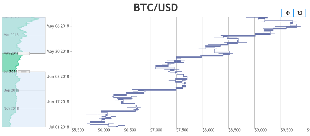
You can move toolbar to top-right / top-left by changing CSS positioning properties. Please find the code-snippet below.
.canvasjs-stock-container .canvasjs-chart-toolbar {
  top: 0px !important;
  left: 10px !important;
  right: auto !important;
  transform: rotate(270deg) translate(-50%, -50%) !important;
}
Please take a look at this JSFiddle for working code.
—
Vishwas R
Team CanvasJSSetting axisY viewportMinimum & viewportMaximum same as axisX in rangeChanged event-handler should work in your case. Please find the code-snippet below.
rangeChanged: function(e){
  e.chart.axisY[0].set("viewportMinimum", e.axisX[0].viewportMinimum, false);
  e.chart.axisY[0].set("viewportMaximum", e.axisX[0].viewportMaximum);
}
Please take a look at this JSFiddle for a working example.
—
Vishwas R
Team CanvasJSSome of the text content might look blurry because of the font-families & it’s size. I suggest you to try using Web Safe Fonts & font size that looks better as per the size of the image.
—
Vishwas R
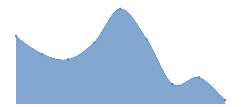
Team CanvasJSYou can hide grids, ticks & axis lines by setting gridThickness, tickLength and lineThickness properties to 0. Please find the code-snippet below.
axisX:{
   gridThickness: 0,
   tickLength: 0,
   lineThickness: 0
},
axisY:{
   gridThickness: 0,
   tickLength: 0,
   lineThickness: 0
},
If you like to show axis labels inside the bar, you can do so by using labelPlacement property. Please take a look at this gallery page for an example on the same. However, if your requirement is to completely hide the axis labels & use indexlabels, you can use labelFormatter to do so. Below is the code snippet for the same.
axisX: {
    labelFormatter: function(e) {
        return "";
    }
}
Please take a look at this JSFiddle for an example on sparkline chart. Also, take a look at this Github repo for a plugin that ease your task.
—
Vishwas R
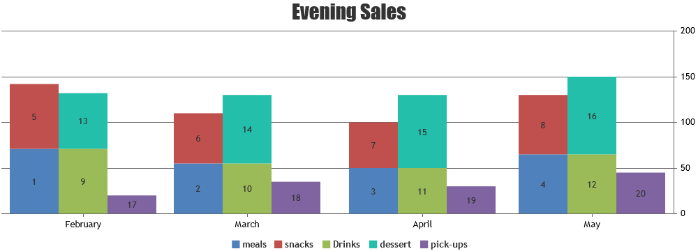
Team CanvasJSNovember 21, 2022 at 10:56 am in reply to: Grouped bar chart(stacked Column), gap between the bars, index Label, legends #40000[UPDATE]
@mm,We have just released CanvasJS Charts v3.7.2 with this fix. Please refer to the release blog for more information. Do download the latest version from our download page and let us know your feedback.
—
Vishwas R
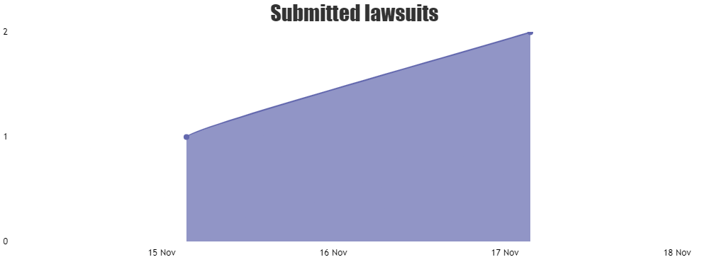
Team CanvasJSAs you are passing x-values as time-stamp, it’s not considered as date-time but number. Setting interval to 1 will make chart render axis label at an interval of 1, i.e. for every 1 milliseconds and not at every 1 day. Setting
xValueType: "dateTime"will convert axis into date-time axis & should work fine in this case. Also, I would suggest you to use valueFormatString to define the format of the axis label instead of using labelFormatter, unless your requirement is to completely format the axis label. Please take a look at this updated JSFiddle for the working code.
—
Vishwas R
Team CanvasJSNovember 11, 2022 at 9:47 am in reply to: cannot use databiding to create a chart when xVal is date #39534X-Value can either be numeric or JavaScript date-time. In your case, it seems to be Java date-object. Passing it as timestamp as shown in this Gallery Example should work fine in this scenario.
If you are still facing issue, kindly create a sample project reproducing the issue & share it with us over Google-Drive or Onedrive so that we can run the sample locally to understand the scenario better and help you out.
From what we have observed, sometimes things get delayed mostly when we are not able to reproduce the issue or not able to understand the exact scenario, or the solution that we provide may not work properly due to the variation in chart options being used by you and us.
Having a sample project helps us in figuring out the issue and suggesting an appropriate solution accordingly.
—
Vishwas R
Team CanvasJSCan you kindly upload the sample project reproducing the issue you are facing to Google-Drive or Onedrive & share the link with us so that we can run it locally to understand the scenario better and help you out?
From what we have observed, sometimes things get delayed mostly when we are not able to reproduce the issue or not able to understand the exact scenario, or the solution that we provide may not work properly due to the variation in chart options being used by you and us.
Having a sample project helps us in figuring out the issue and suggesting an appropriate solution accordingly.
—
Vishwas R
Team CanvasJSCraig Pickerill,
It looks like the sample / image provided by you is restricted and requires permission. Can you kindly make it public so that we can access it & understand the scenario to help you out?

—
Vishwas R
Team CanvasJSWith the help of get method, you can get to know the maximum of primary y-axis. Once you get the maximum of primary y-axis, you can use set method to set the maximum of secondary y-axis. Below is the code-snippet to do so.
chart.axisY2[0].set("maximum", chart.axisY[0].get("maximum"));—
Vishwas R
Team CanvasJSNovember 11, 2022 at 9:27 am in reply to: Grouped bar chart(stacked Column), gap between the bars, index Label, legends #39530