Login to Ask a Question or Reply
Forum Replies Created by Vishwas R
-
You can change the background-color of the chart by setting backgroundColor property.
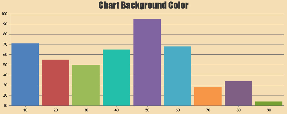
If you like to set gradient or image as the background, you can set backgroundColor property to transparent & set css background property to the chart-container. Please take a look at this JSFiddle for an example.
—
Vishwas R
Team CanvasJSChart is not getting rendered as the line before chart instantiation is throwing error. You seem to be doing it wrong.
element.innerHTMLgives you the content of the element whereaselement.innerHTML = "Some Content";is used to change the content of the element. Please refer to this MDN page for more information on innerHTML property. Please take a look at this updated JSFiddle for complete code.—
Vishwas R
Team CanvasJSYou can disable panning in individual charts of StockChart by setting panEnabled property to false, soon after rendering StockChart & within the rangeChanged event-handler. This is not an official API & hence might get changed in future. Please find the code-snippet below.
stockChart.charts[0].panEnabled = false;Please take a look at this JSFiddle for a working example.
—
Vishwas R
Team CanvasJS[Update]
@arjungoel10gmail-com,You can disable panning in individual charts of StockChart by setting panEnabled property to false, soon after rendering StockChart & within the rangeChanged event-handler. This is not an official API & hence might get changed in future. Please find the code-snippet below.
stockChart.charts[0].panEnabled = false;Please take a look at this JSFiddle for a working example.
—
Vishwas R
Team CanvasJSChart seems to be rendering with 3 dataseries but datapoints passed to the chart seems to be empty. Also, we observed that you are using older version of CanvasJS. Kindly download the latest version of CanvasJS Charts from our download page.
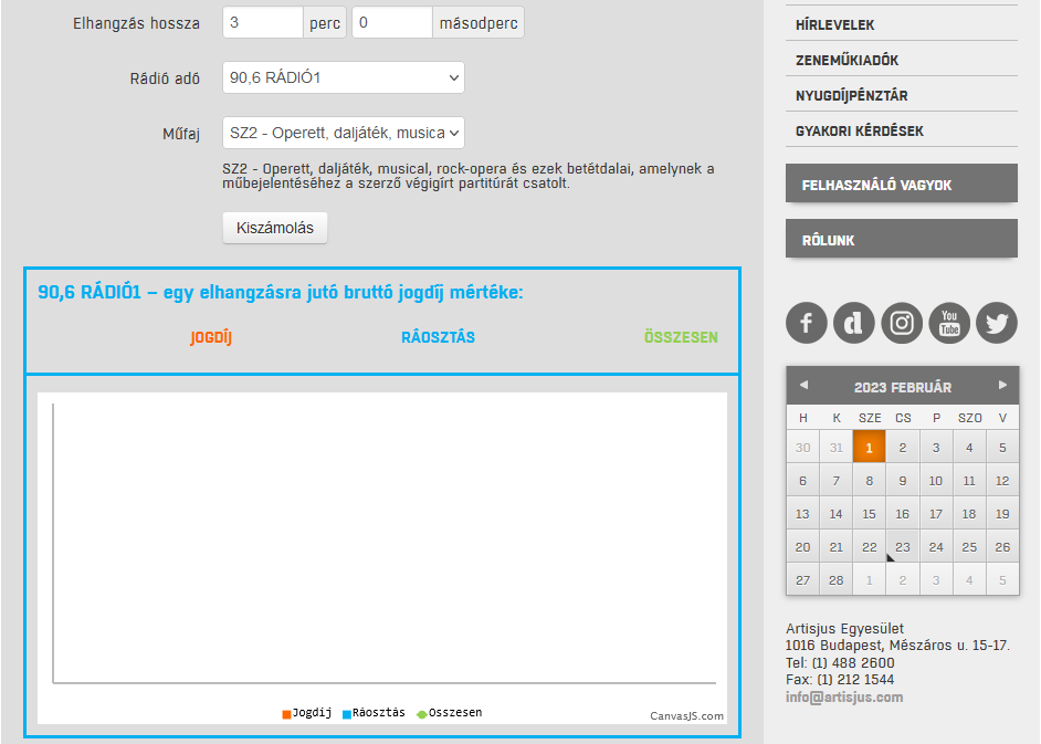
If the issue still persists, kindly create a JSFiddle with sample data reproducing the issue you are facing and share it with us so that we can look into the code, understand the scenario better and help you resolve it.
—
Vishwas R
Team CanvasJSJanuary 31, 2023 at 6:46 pm in reply to: How to display label both inside and outside of pie chart? #42087It’s not possible to display indexlabels both inside & outside in pie chart, as of now.
—
Vishwas R
Team CanvasJSPlease take a look at this Gallery Page for an example on rendering chart inside jQuery modal.
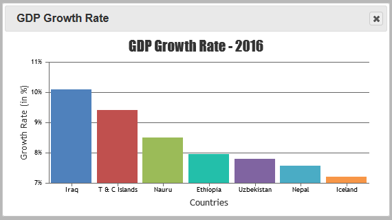
If you are still facing issue, kindly create JSFiddle reproducing the issue you are facing and share it with us so that we can look into the code, understand the scenario better and help you out.
—
Vishwas R
Team CanvasJSYou can zoom either horizontally, vertically or both by setting zoomType property. You can try setting
zoomType: "y"to zoom vertically. Please refer to our documentation for more customization options available.—
Vishwas R
Team CanvasJSBased on the link that you have shared, zoomEnabled property is set at stockchart level instead of chart level. Setting it at chart level (in RSI chart) should work fine in your case. Please find the code-snippet below.
var rsiDPS = calculateRSI(data);
stockChart.addTo("charts", {height: 100, zoomEnabled: true, axisY: [{minimum: 0, maximum: 100, stripLines:[{value:30}, {value: 70}]}],data: [{type: "line", name: "Relative Strength Index (RSI)", showInLegend: true, yValueFormatString: "00", dataPoints: rsiDPS}], legend: {horizontalAlign: "left"}});
—
Vishwas R
Team CanvasJSGlad that you figured it out :)
Yes, as you have mentioned setting toolTipContent to null will hide information related to that particular dataseries from the tooltip.
—
Vishwas R
Team CanvasJSYou can enable zooming in chart by setting zoomEnabled property to true. Please take a look at ‘Behavior of Zoom / Pan’ section in this documentation page for more information along with example.
—
Vishwas R
Team CanvasJSPushing datapoint values to different arrays & passing them in multi-series chart options should work fine in this case. Please find the code snippet below.
<?php
$dataPoints1 = array();
$dataPoints2 = array();

$con=mysqli_connect("localhost","root","","test"); //mysqli_connect("host","username","password","db"); - Refer https://www.w3schools.com/php/func_mysqli_connect.asp for more info

if (mysqli_connect_errno()) {
	echo "Failed to connect to MySQL: " . mysqli_connect_error();
}
$sql="SELECT xval,yval1, yval2 FROM datapoints";

if ($result=mysqli_query($con,$sql)){
	foreach($result as $row){
		array_push($dataPoints1, array("x"=> $row["xval"], "y"=> $row["yval1"]));
		array_push($dataPoints2, array("x"=> $row["xval"], "y"=> $row["yval2"]));}
}

mysqli_close($con);
?>

<!DOCTYPE HTML>
<html>
<head>
<script>
window.onload = function () {
	var chart = new CanvasJS.Chart("chartContainer", {
		animationEnabled: true,
		exportEnabled: true,
		theme: "light1", // "light1", "light2", "dark1", "dark2"
        exportEnabled: true,
		title:{
			text: "PHP Column Chart from Database - MySQLi"
		},
		data: [{
			type: "column", //change type to bar, line, area, pie, etc
			dataPoints: <?php echo json_encode($dataPoints1, JSON_NUMERIC_CHECK); ?>
		}, {
			type: "column", //change type to bar, line, area, pie, etc
			dataPoints: <?php echo json_encode($dataPoints2, JSON_NUMERIC_CHECK); ?>
		}]
	});
	chart.render();
}
</script>
</head>
<body>
	<div id="chartContainer" style="height: 360px; width: 50%; margin: auto;"></div>
	<script src="https://cdn.canvasjs.com/canvasjs.min.js"></script>
</body>
</html>
—
Vishwas R
Team CanvasJSY-value supports numbers as of now. However, if you like to show it as ‘100 INR’ in the tooltip, you can try setting yValueFormatString to “#,### INR”. To do the same thing in axis-labels, you can set valueFormatString property.
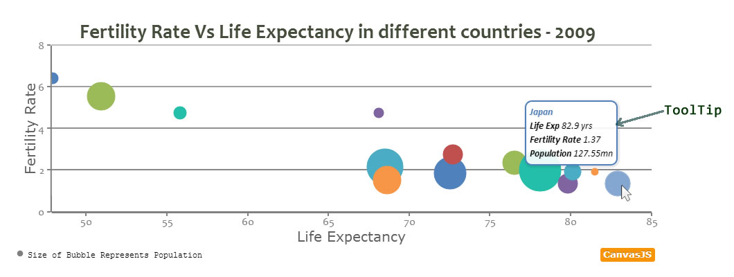
If you are looking for something else, kindly share your requirements so that we can understand it better and guide you accordingly.
—
Vishwas R
Team CanvasJS
