Login to Ask a Question or Reply
Forum Replies Created by Vishwas R
-
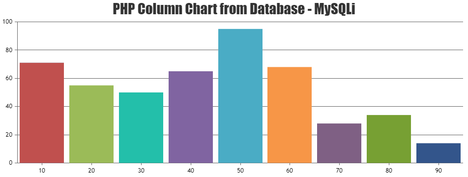
You can retrieve the data points from the database and pass it on chart options as shown in below code snippet.
<?php
$dataPoints = array();

$con=mysqli_connect("localhost","root","","test"); //mysqli_connect("host","username","password","db"); - Refer https://www.w3schools.com/php/func_mysqli_connect.asp for more info

if (mysqli_connect_errno()) {
	echo "Failed to connect to MySQL: " . mysqli_connect_error();
}
$sql="SELECT xval,yval FROM datapoints";

if ($result=mysqli_query($con,$sql)){
	foreach($result as $row){
		array_push($dataPoints, array("x"=> $row["xval"], "y"=> $row["yval"]));
	}
}

mysqli_close($con);
?>

<!DOCTYPE HTML>
<html>
<head>
<script>
window.onload = function () {
	var chart = new CanvasJS.Chart("chartContainer", {
		animationEnabled: true,
		exportEnabled: true,
		theme: "light1", // "light1", "light2", "dark1", "dark2"
        exportEnabled: true,
		title:{
			text: "PHP Column Chart from Database - MySQLi"
		},
		data: [{
			type: "column", //change type to bar, line, area, pie, etc
			dataPoints: <?php echo json_encode($dataPoints, JSON_NUMERIC_CHECK); ?>
		}]
	});
	chart.render();
}
</script>
</head>
<body>
	<div id="chartContainer" style="height: 360px; width: 50%; margin: auto;"></div>
	<script src="https://cdn.canvasjs.com/canvasjs.min.js"></script>
</body>
</html>
Please take a look at this Sample Project for complete working sample.
—
Vishwas R
Team CanvasJSSetting
indexLabel: "{y}"seems to be working fine i.e. it shows only y-value in indexLabel and not suffix. Please take a look at this JSFiddle.Can you kindly create JSFiddle reproducing the issue you are facing so that we can look into your code, understand your scenario better and help you out?
—
Vishwas R
Team CanvasJSSeptember 24, 2018 at 12:05 pm in reply to: Reset not working when chart is rendered already zoomed-in #22719Yes, its better to call e.chart.render() only on triggering reset instead of calling it everytime the range is changed :)
—
Vishwas R
Team CanvasJSSeptember 21, 2018 at 7:02 pm in reply to: Reset not working when chart is rendered already zoomed-in #22704viewportMinimum and viewportMaximum are used to programmatically zoom to a region. In this scenario, if you try to reset the range by clicking reset button it will fallback to the range that you have set (viewportMinimum and viewportMaximum). Removing viewportMinimum and viewportMaximum should work fine in this case. Or if you are trying to zoom to a certain region on initial render and like to reset on clicking reset button, you can use rangeChanged event as shown in this updated JSFiddle.
—
Vishwas R
Team CanvasJSI observe that the X-Value being passed in the view is a string, whereas X-Value can either be number or date-time. However you can use label to show names, which accepts string. Can you try changing
map.put("x", xVal);tomap.put("label", xVal);in Report.jsp (line no: 29) and check if it works?If this doesn’t solve your issue, I request you to export your project as war/archive along with database so that we can run the project locally, understand your issue better and help you out.
—
Vishwas R
Team CanvasJSxValueFormatString defines the format of x-value to be displayed in toolTip and indexLabel. Setting xValueFormatString to ‘YYYY-DD-MM hh:mm:ss’ should show date in the format you are looking for. Checkout our documentation for more customization options available.
—
Vishwas R
Team CanvasJSX-Value can either be numeric or a dateTime value. But in the pen that you have shared x-value seems to be string as
curTime()returns a string. You can use labels instead of x-value in this case. Please take a look at this updated pen.—
Vishwas R
Team CanvasJSSeptember 18, 2018 at 10:36 am in reply to: https://canvasjs.com/jquery-charts/candlestick-chart-json-data-ajax/ #22648You can store JSON data the way you want. But before passing dataPoints to the chart, you need to parse it to the format accepted by CanvasJS. Please take a look at this JSFiddle where Open, High, Low, Close data are stored separately.
—
Vishwas R
Team CanvasJSCanvasJS just renders the chart with the data that you have passed in chart-option. You can use AJAX getJSON to get the JSON data and with the help of key, you can get its corresponding value. Please refer this tutorial for the same.
Example: If you are storing json
{"Success":true,"Error":null,"Data":[{}]}as test.json, you can access Data using jsonData.Data where jsonData is the response that you get from AJAX request.$.getJSON("test.js", function(jsonData) { var data = jsonData.Data; });—
Vishwas R
Team CanvasJSSeptember 18, 2018 at 10:36 am in reply to: images not working while integrating 2 charts on same page #22645You are adding images on top of 1st chart-container even while adding it to 2nd chart because of which you can’t see images positioned on top of 2nd chart. Changing
.appendTo($("#chartContainer>.canvasjs-chart-container"))to.appendTo($("#chartContainer2>.canvasjs-chart-container"))within ‘addimages2’ method should work fine in your case.—
Vishwas R
Team CanvasJS@jay,
You can download Fully-Featured Version of CanvasJS from Download Page for evaluation purposes for up to 30 days. To use charts without ‘Trial Version’ and ‘CanvasJS’ Credit Link you will need to have a Commercial Version of CanvasJS. Please checkout our Pricing Page for Non-Commercial & Discounted Licenses. Please contact sales@canvasjs.com for sales related queries.
—
Vishwas R
Team CanvasJSYou can set valueFormatString to “HH:mm” to display hours in 24hours format along with minutes. You can customize the format of labels being displayed in axisX using valueFormatString, please refer documentation for more available options.
—
Vishwas R
Team CanvasJSGlad that you made it work using viewportMinimum and viewportMaximum :)
—
Vishwas R
Team CanvasJSIt seems to be working with date-time axis aswell.

Can you kindly create JSFiddle or in Codepen – reproducing the issue you are facing, so that we can look into your code, understand the scenario better and help you out?
—
Vishwas R
Team CanvasJS