Login to Ask a Question or Reply
Forum Replies Created by Vishwas R
-
Scott,
[update]
We have just released v3.11.0 Beta 1 with axisY labelPadding. Please refer the release blog for more information. Do download the latest version from our download page and let us know your feedback.
Sorry, there is no property to add padding between axis title and labels as of now. However you can achieve this by adding stripLine with transparent label as shown in this JSFiddle.
—
Vishwas R
Team CanvasJSJuly 11, 2019 at 10:44 am in reply to: Different Labels share x value when using multiple plots #25834When x-values are not provided, it takes default values starting from 0. Due to the default x-values Germany and India are grouped under Germany whose x-values are same (0-Zero). Assigning x-values along with labels should work fine in this case. Please take a look at this updated JSFiddle.
—
Vishwas R
Team CanvasJSSetting label along with x and y-values should work fine in this case.
Kindly take a look at the code snippet below,
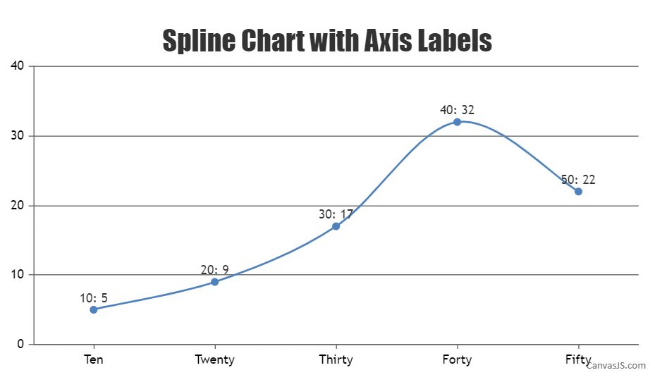
data: [{
    type: "spline",
    indexLabel: "{x}: {y}",
    dataPoints: [
        { x: 10, y: 5, label: "Ten" },
	{ x: 20, y: 9, label: "Twenty"  },
	{ x: 30, y: 17, label: "Thirty" },
	{ x: 40, y: 32, label: "Forty" },
	{ x: 50, y: 22, label: "Fifty" }
    ]
  }]
Please take a look at this JSFiddle for an example on spline charts with axis labels.
—
Vishwas R
Team CanvasJSJuly 11, 2019 at 10:29 am in reply to: Header (legend data) is inconsistantly creating problems #25832Chantelle Clayton,
We are unable to reproduce the issue at our end, please take a look at this JSFiddle where legendText and axis labels seems to be working fine with % values aswell. Can you kindly create JSFiddle reproducing the issue and share it with us along with sample data so that we can look into the code, understand the scenario better and help you resolve?
—
Vishwas R
Team CanvasJSThe Google Drive link that you have shared seems to be private, can you kindly change the permission so that we can download the sample project, run it locally at our end to understand the scenario better and help you out?

—
Vishwas R
Team CanvasJSYou can get the interval of axis with the help of get method and update the same with the help of set method. Please take a look at this JSFiddle for an example on the same.
—
Vishwas R
Team CanvasJSTo dynamically update chart, you need to update chart-options and re-render the chart. Please refer this documentation page for more information on the same. Also take a look at this updated JSFiddle.
—
Vishwas R
Team CanvasJSIn pie chart, each slice is a dataPoint. Updating entire dataPoints will update all the slices of pie chart. Please take a look at this updated JSFiddle.
—
Vishwas R
Team CanvasJSIt seems like you are setting interval to 2 in axisY (horizontal axis incase of bar chart). Auto-calculated interval (not setting any interval) or increasing the interval should work fine in your case.
1.) Change the size of the values of only the X-axis so they are slightly smaller in size physically
You can customize the font-size of label by setting labelFontSize.
2.) Skip every other value so that they look more evenly spaced
Labels will be shown at every interval of the axis. Setting larger interval will increases the space between labels.
If you are still facing the issue, kindly share JSFiddle reproducing the issue you are facing so that we can look into the code, understand the scenario better and help you out.
—
Vishwas R
Team CanvasJSOri,
xValueType is a property of dataSeries. Setting xvalueType to “dateTime” within dataSeries should work fine in this case. Please refer documentation for more info.
—
Vishwas R
Team CanvasJSWe are unable to reproduce the issue at our end. Can you kindly share working JSFiddle reproducing the issue or sample project / PHP file along with sample csv file over Google-Drive or Onedrive so that we can run it locally at our end, understand the scenario better and help you out?
—
Vishwas R
Team CanvasJSDo you mean synchronizing zoom / pan across? If so, you can achieve this using rangeChanged event. Please refer this documentation page for step to step tutorial on the same.
—
Vishwas R
Team CanvasJSSetting indexLabelMaxWidth should work fine in this case.
If this doesn’t fulfill your requirements, kindly share JSFiddle with us so that we can look in to the code, understand the scenario better and help you out.
—
Vishwas R
Team CanvasJSOri,
The issue seems to be the x-value that’s being passed to the chart-options. Passing x-value read from text-file as timestamp and setting xValueType to “dateTime” should work fine in this case. Please find the code snippet below:
while((data = br.readLine())!= null) {
	String[] splittedString = data.split(" ");
	Double doubleValue = Double.parseDouble(splittedString[4]);
	doubleValue = doubleValue / 1024 ;
	int valueint = (int) Math.round(doubleValue);
	Date date = format.parse(splittedString[1]);
	map = new HashMap<Object,Object>(); map.put("x",date.getTime()); map.put("y",valueint ); list.add(map);
	i++;
}
PS: Don’t miss out setting xValueType to “dateTime” – as timestamp is passed as x-value.
—
Vishwas R
Team CanvasJS