Login to Ask a Question or Reply
Forum Replies Created by Vishwas R
-
February 27, 2020 at 8:33 pm in reply to: How to change axisX title by user in single click ? #28502
You can update chart properties with the help of set method. Please take a look at this documentation page for more information on set method along with a live example.
—
Vishwas R
Team CanvasJSOne of our representatives from sales team will get in touch with you soon. Please contact sales[at]canvasjs[dot]com for more sales related information.
—
Vishwas R
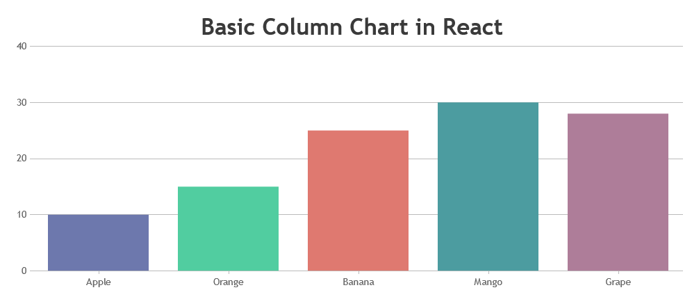
Team CanvasJSReact samples downloaded from Download Page seems to be working fine without any issue. Below are the steps for integrating CanvasJS in your react app.
1. Save canvasjs.react.js and canvasjs.min.js within source-folder of your React application
2. Import React Component to your appimport CanvasJSReact from './canvasjs.react';.Please refer to this documentation page for step-to-step tutorial on integration.
If you are still facing issue, kindly create a sample project reproducing the issue you are facing and share it with us over Google-Drive or Onedrive so that we can run it locally at our end to understand the scenario better and help you resolve.
—
Vishwas R
Team CanvasJSIs there another way to have text (instead of values) for the X-Axis?
You can use label to show text in axisX, please refer documentation for more info along with live example.
Label inside the DataPoints is the best way to do this?
Axis labels are shown at every interval whereas you can use indexLabel to show text / info regarding a dataPoint.
would paying for priority support possibly get this “label align” feature added?
Please contact sales[at]canvasjs[dot]com for more sales related information.
—
Vishwas R
Team CanvasJSAligning axis label is not available as of now. We will re-consider this behavior in future releases.
—
Vishwas R
Team CanvasJSFebruary 10, 2020 at 5:29 pm in reply to: [totally newbie] understanding line plot with dynamic data #28352Please refer this article for more information on array shift method in JavaScript.
If you are still facing any issue with CanvasJS, kindly share JSFiddle with your use-case so that we can look into the source code, understand the scenario better and help you out.
From what we have observed, sometimes things get delayed mostly when we are not able to reproduce the issue or not able to understand the exact requirements or the solution that we provide may not work properly due to the variation in chart-options being used by you and us.
Having a JSFiddle helps us in figuring out the issue and many a time we can just edit your code on JSFiddle to fix the issue right away.
—
Vishwas R
Team CanvasJSJakub,
Private email based support is available only in Priority-Support License. One of our sales team-member will get in touch with you over mail soon.
—
Vishwas R
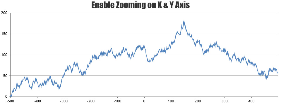
Team CanvasJSzoomType property allows you to control the axis for which zooming and panning are enabled. Setting zoomType to ‘xy’ will let you zoom / pan across both x and y axes. Please refer documentation for more info.
—
Vishwas R
Team CanvasJSJakub,
The JSFiddle shared seems to be working fine. If you could share JSFiddle or a sample project reproducing the issue you are facing, we could understand it better to help you out!
—
Vishwas R
Team CanvasJSJakub,
Syncing crosshair across multiple charts is not available as an inbuild feature, as of now. However, by simulating mouse-events across charts you can achieve it as shown in this JSFiddle.
If you are still facing issue, kindly create JSFiddle reproducing the issue you are facing and share it with us so that we can look into the code / options being used, understand the scenario better and help you resolve.
—
Vishwas R
Team CanvasJSJakub,
Please take a look at this documentation page for step-to-step tutorial and an example on rendering multiple charts in a page.
—
Vishwas R
Team CanvasJSPrathyush,
Please refer Microsoft Documentation for tutorials and code related to MS SQL database connectivity.
This forum is dedicated to queries related to CanvasJS, you can post your queries in Stack Overflow for programming specific queries.
—
Vishwas R
Team CanvasJSCanvasJS is a JavaScript library and follows JavaScript Date-Formats and is not a bug. However, you can use ISO format to pass month from 1 to 12 (Example: “2015-03-25” is considered as March 25, 2015). You can adopt the one of the format to fit your requirements.
—
Vishwas R
Team CanvasJSPrathyush,
Please take a look at this article for step-to-step tutorial on connecting to MySQL database and reading data from it, along with sample code and screenshots.
—
Vishwas R
Team CanvasJS