Login to Ask a Question or Reply
Forum Replies Created by Vishwas R
-
React samples are working fine. Please follow the below steps to add CanvasJS StockChart to your app.
1. Save canvasjs.stock.react.js and canvasjs.stock.min.js within source-folder of your React application ( src or src/assets or src/lib )
2. Import the StockChart component to your app.
import CanvasJSReact from './canvasjs.stock.react';
Please refer to this documentation page for step-to-step tutorial on integrating CanvasJS in react app. Also checkout this Stackblitz demo for working code.If you are still facing issue, kindly share the sample project with us over Google-Drive or Onedrive so that we can look into the code, understand the scenario better and help you out.
—
Vishwas R
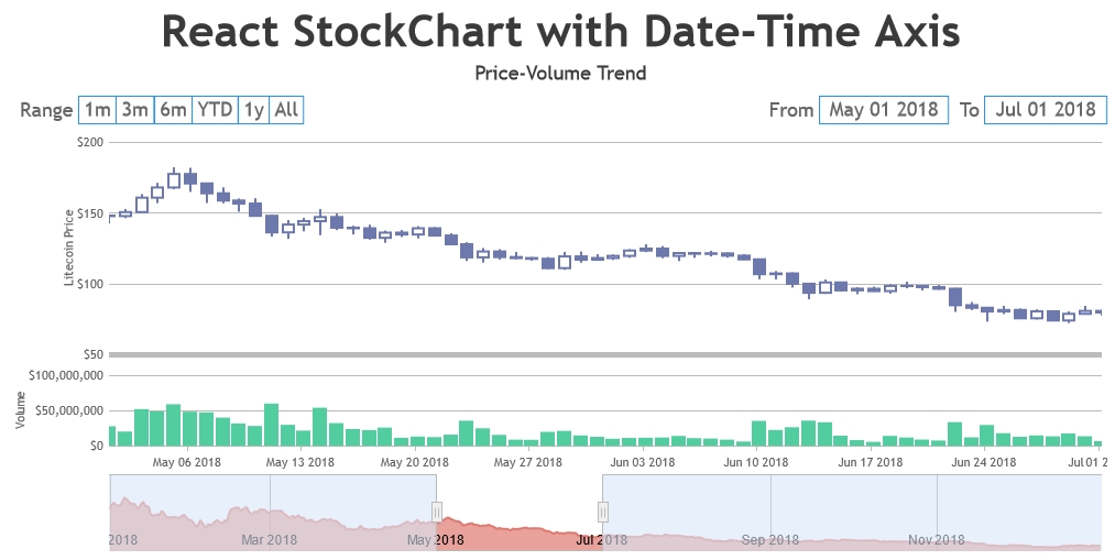
Team CanvasJSStockCharts comes with synchronizing tooltip & crosshair as an inbuild feature. You can use our react-component to add StockCharts to your react app. Please refer to React Gallery Section for examples on React StockCharts. Also refer to this demo page for an example on adding multiple charts with date-time axis in React StockChart.
—
Vishwas R
Team CanvasJSOne of our representatives from sales-team will get in touch with you soon regarding this. For more license related queries, please contact sales[at]canvasjs[dot]com
—
Vishwas R
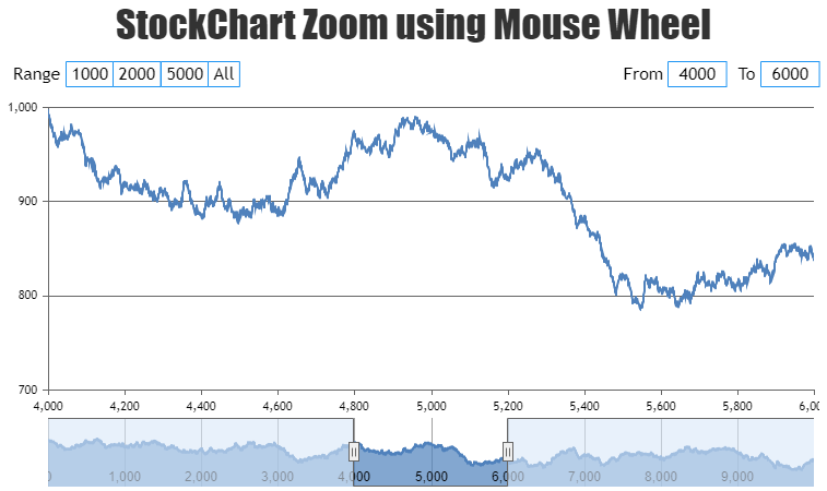
Team CanvasJSYou can zoom individual chart by rotating mouse-wheel by binding wheel event to the container of individual charts of StockChart. Please find the code snippet for the same below.
function addWheelZoom(stockChart) {
  stockChart.charts[0].container.addEventListener("wheel", function(e){
    e.preventDefault();

    var slider = stockChart.navigator.slider;
    var sliderMinimum = slider.get("minimum"),
        sliderMaximum = slider.get("maximum");

    var interval = (slider.get("maximum") - slider.get("minimum"))/50; // change interval based on the range of slider
    var newMin, newMax;

    if (e.deltaY < 0) {
      newMin = sliderMinimum + interval;
      newMax = sliderMaximum - interval;
    }
    else if (e.deltaY > 0) {
      newMin = sliderMinimum - interval;
      newMax = sliderMaximum + interval;
    }

    if(newMax < stockChart.navigator.axisX[0].get("maximum") || newMin > stockChart.navigator.axisX[0].get("minimum")) {
      stockChart.navigator.slider.set("minimum", newMin, false);
      stockChart.navigator.slider.set("maximum", newMax);
    }
  });
}
Please take a look at this JSFiddle for a working example on zooming StockChart using mouse-wheel.
Considering this thread as duplicate of zoomin/zoomout on wheel movement. Hence Closing the same.
—
Vishwas R
Team CanvasJSYou can zoom individual chart by rotating mouse-wheel by binding wheel event to the container of individual charts of StockChart. Please find the code snippet for the same below.
function addWheelZoom(stockChart) {
  stockChart.charts[0].container.addEventListener("wheel", function(e){
    e.preventDefault();

    var slider = stockChart.navigator.slider;
    var sliderMinimum = slider.get("minimum"),
        sliderMaximum = slider.get("maximum");

    var interval = (slider.get("maximum") - slider.get("minimum"))/50; // change interval based on the range of slider
    var newMin, newMax;

    if (e.deltaY < 0) {
      newMin = sliderMinimum + interval;
      newMax = sliderMaximum - interval;
    }
    else if (e.deltaY > 0) {
      newMin = sliderMinimum - interval;
      newMax = sliderMaximum + interval;
    }

    if(newMax < stockChart.navigator.axisX[0].get("maximum") || newMin > stockChart.navigator.axisX[0].get("minimum")) {
      stockChart.navigator.slider.set("minimum", newMin, false);
      stockChart.navigator.slider.set("maximum", newMax);
    }
  });
}
Please take a look at this JSFiddle for a working example on zooming StockChart using mouse-wheel.
—
Vishwas R
Team CanvasJSDatapoints supports both numeric and date-time for x-values. You can either pass date-time values as date object or timestamp. If you are passing x-values as timestamp, you will have to set xValueType to ‘dateTime’ –
xValueType: "dateTime". Please take a look at this documentation page for tutorial on using date-time values in chart along with examples that you can try out or download from the editor.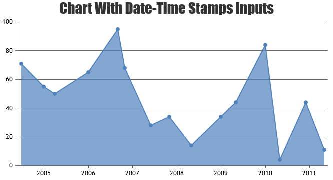
—
Vishwas RThe issue seems to be happening as you are returning the value as such in labelFormatter without formatting it. You can format the number to fix the number of decimal values by using formatNumber method.
CanvasJS.formatNumber(e.value, "#,##0.##")
Please take a look at this updated JSFiddle for working sample.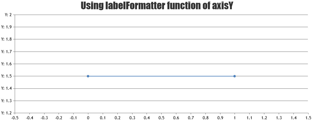
Also, please refer to valueFormatString which lets you format the value that appears in axis / parameter that you pass in formatNumber method.
—
Vishwas R
Team CanvasJSWe observed that the react wrapper that you are using is not official wrapper but a 3rd-party one. Using official wrapper seems to be working fine. You can download CanvasJS charting library along with wrapper from our download page and refer to our documentation for step-to-step tutorial on integration. Please download the working sample (official react wrapper) from here.
—
Vishwas R
Team CanvasJSAdding dummy series to secondary x-axis also works in your case. Glad that you were able to fulfill your requirements :)
—
Vishwas R
Team CanvasJSYou can update the stripline value dynamically using set method when you zoom or pan upon rangeChanged event as shown in this updated JSFiddle.
—
Vishwas R
Team CanvasJSThanks for your valuable feedback.
You can either pass the ID of the element where chart has to be rendered or the DOM element itself. This point is already addressed in Getting Started section of documentation. Please refer to the screenshot below.

—
Vishwas R
Team CanvasJSThe lines drawn at every interval of the axis are gridlines, including the line which you are referring. Gridlines are drawn as dashed lines as you are setting gridDashType to “dash”. It’s not possible to just change dash-type of just one gridline as of now. However you can add a stripline at the maximum of the axis to achieve your requirement. Please take a look at this updated JSFiddle for an example on the same.
—
Vishwas R
Team CanvasJS[UPDATE]
We have just released v3.2.9 Beta-1 with this feature. Please refer to the release blog for more information. Do download the latest version from download page & let us know your feedback.
—
Vishwas R
Team CanvasJS[UPDATE]
We have just released v3.2.9 Beta-1 with this feature. Please refer to the release blog for more information. Do download the latest version from download page & let us know your feedback.
—
Vishwas R
Team CanvasJSFebruary 3, 2021 at 7:01 pm in reply to: sir i want switch chart to stockChart but error accrues #32690Charts & StockCharts seems to be working fine. Please take a look at our gallery for variety of interactive & live examples that you can download & run locally at your end.
If you are still facing issue kindly create JSFiddle reproducing the issue you are facing and share it with us so that we can look into code / chart-options being used, understand the scenario better and help you out.
—
Vishwas R
Team CanvasJS