Login to Ask a Question or Reply
Forum Replies Created by Manoj Mohan
-
To avoid clipping of axis labels in navigator, you can set labelAngle to -1 in the navigator x-axis. Please find the below code-snippet for the same.
navigator: {
axisX: {
labelAngle: -1
}
}—-
Manoj Mohan
Team CanvasJSMay 31, 2022 at 7:45 pm in reply to: Animation not working after render. I want after 5 seconds animation show from 0 #37939Sorry, it’s not possible to animate the chart every 5 seconds as the chart animates only on the first render, as of now.
—-
Manoj Mohan
Team CanvasJSMay 23, 2022 at 7:50 pm in reply to: Creating Multiple Charts based on dictionary length using javascript #37787Can you kindly create sample project reproducing the issue you are facing and share it us over Google-Drive or One Drive so that we can understand your scenario better and help you out?
—-
Manoj Mohan
Team CanvasJSrangeChanging event is fired when the range of the chart is about to be changed i.e. just before rendering of the chart with updated viewport values. While rangeChanged event is fired after the chart is rendered with updated viewport values. With help of dynamicUpdate in StockChart, you can control when to fire rangeChanged and rangeChanging events. If dynamicUpdate is set to true, then range of chart will be updated at every movement of handle and hence rangeChanging and rangeChanged will be fired on updated viewport values. When dynamicUpdate is set to false, the range of the chart will be not updated at every movement of handle but rather will be updated when you release the handle. So rangeChanged and rangeChanging will be fired only on release of handle.
—-
Manoj Mohan
Team CanvasJSSorry for the inconvenience caused. One of our team representative will get back to you over email.
—-
Manoj Mohan
Team CanvasJSYou can update the dataPoints using set method like
stockChart.charts[0].data[0].set("dataPoints", subsetDataPoints)or update the stockchart options likestockChart.options.charts[0].data[0].dataPoints = subsetDataPoints. Please take a look at this updated JSFiddle for sample code.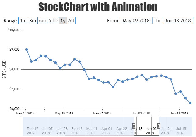
—-
Manoj Mohan
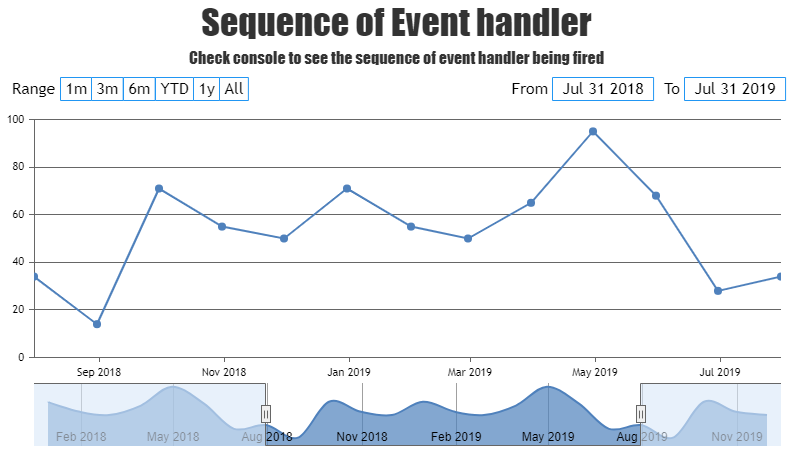
Team CanvasJSrangeChanging and rangeChanged are two different type of event handler which are fired before and after range is changed respectively. rangeChanging can be used to change chart options without any need to call render method to update the options in rangeChanging event handler. But in case of rangeChanged event, you need to call the render method again in order to reflect the change in chart options in the rangeChanged event handler. Please take a look at this JSFiddle for an example demonstrating the sequence in which rangeChanging and rangeChanged event handler is fired.
Furthermore, the “rangeChanged” event.type would seem to be over firing. I would have expected the “rangeChanging” event to fire during “onmousemove” as the user is dragging the slider and then the “rangeChanged” event.type would fire “onmouseup” as the user releases the slider. This would allow us to avoid unnecessary updates as the user is selecting their date range or update immediately depending on which event.type is fired.
You can set dynamicUpdate property of navigator to false to fire rangeChanged or rangeChanging event on mouseup in order to stop unneccessary updates while changing the range on mousemove. Please take a look at this updated JSFiddle for an example on the same.
—–
Manoj Mohan
Team CanvasJSMay 3, 2022 at 4:56 pm in reply to: Small line charts don’t always render lines between points #37622Glad that you figured it out. You can use connectNullData to connect adjacent non-null data with a straight line.
—-
Manoj Mohan
Team CanvasJSApril 29, 2022 at 6:37 pm in reply to: Small line charts don’t always render lines between points #37600Please take a look at this documentation page for step by step instruction for rendering multiple chart in a single page.
If you are still facing the issue, kindly create a sample project reproducing the issue you are facing and share it with us over Google-Drive or OneDrive so that we can look into the code, run it locally at our end to understand the scenario better and help you out.
—-
Manoj Mohan
Team CanvasJSYou can create a custom DOM for tooltip and show it on click of the dataPoint as shown in the code snippet below.
function showToolTipOnClick(e) {
    isDataPointClicked = true;
    if(dataPointShown !== e.dataPoint) {
      clicked = true;
      dataPointShown = e.dataPoint;
    } else {
      clicked = !clicked;
    }

    if(customToolTipDOM === null) {
      customToolTipDOM = document.createElement("div");
      e.chart.container.appendChild(customToolTipDOM);
      customToolTipDOM.style.display = "none";
      customToolTipDOM.style.position = "absolute";
      customToolTipDOM.style.background = "#fff";
      customToolTipDOM.style.border = "1px solid #dedede";
      customToolTipDOM.style.borderRadius = "4px";
      customToolTipDOM.style.padding = "8px";
      customToolTipDOM.style.top = "0px";
      customToolTipDOM.style.left = "0px";
    }

    if(clicked) {
      left = Math.round(e.chart.axisX[0].convertValueToPixel(e.dataPoint.x)) + 30;
      customToolTipDOM.style.left =   "0px";
      customToolTipDOM.style.top =  Math.round(e.chart.axisY[0].convertValueToPixel(e.dataPoint.y)) + "px";
      customToolTipDOM.innerHTML = e.dataPoint.toolTipData;
      customToolTipDOM.style.display = "block";


      if(left + customToolTipDOM.offsetWidth + 30 > e.chart.container.offsetWidth) {
        left = left - customToolTipDOM.offsetWidth - 30;
      }
      customToolTipDOM.style.left =  left + "px";

    } else {
      customToolTipDOM.style.display = "none";
    }

  }
  chart.container.addEventListener("click", function() {
    if(!isDataPointClicked && customToolTipDOM) {
      customToolTipDOM.style.display = "none";
      clicked = false;
    }
    isDataPointClicked = false;
  });
Also, check out this updated JSFiddle for showing toolTip on click of the dataPoint.
—-
Manoj Mohan
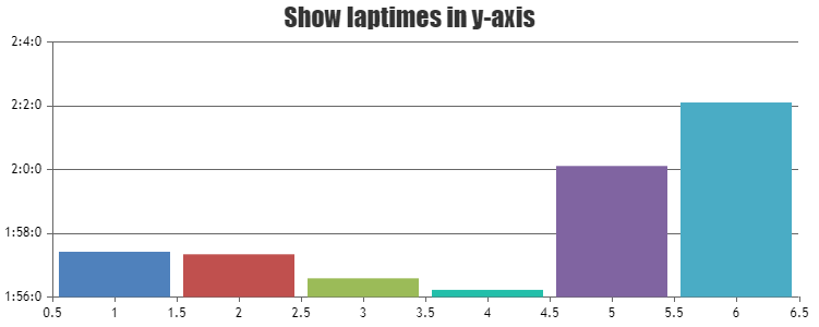
Team CanvasJSYou can convert your laptime format string to milliseconds and pass it as y-values in the dataSeries. For axis labels, you format the milliseconds passed to your desired format (minutes:seconds:milliseconds) using labelFormatter & contentFormatter for tooltip. Please find the code-snippet below.
var dps = [
    { x: 1, y: "1:57:420" },
    { x: 2, y: "1:57:340" },
    { x: 3, y: "1:56:587" },
    { x: 4, y: "1:56:225" },
    { x: 5, y: "2:0:110" },
    { x: 6, y: "2:2:102" }
  ]

  dps.forEach(dp => {
    var splitString = dp.y.split(":");
    dp.y = parseInt(splitString[0]) * 60 * 1000 + parseInt(splitString[1]) * 1000 + parseInt(splitString[2]);
  })

  function formatMilliSeconds(val) {
    var minutes = parseInt(val / (60 * 1000));
    var seconds = parseInt(val % (60 * 1000) / 1000);
    var ms = parseInt(val % (60 * 1000) % 1000);
    return minutes + ":" + seconds + ":" + ms;
  }

  var chart = new CanvasJS.Chart("chartContainer", {
    .
    .
    .
    axisY: {
      labelFormatter: function(e) {
        return formatMilliSeconds(e.value)
      }
    },
    toolTip: {
    	contentFormatter: function(e) {
      	toolTipContent = "";
      	e.entries.forEach( (entry) => {
        	toolTipContent += "x -> " + entry.dataPoint.x + "<br/>y -> " + formatMilliSeconds(entry.dataPoint.y) + "<br/>"
        })
      	return toolTipContent;
      }
    },
    .
    .
    .
  });
Also, check out this JSFiddle for complete working code.
—-
Manoj Mohan
Team CanvasJSWe are looking into your query and get back to you at the earliest.
—-
Manoj Mohan
Team CanvasJSApril 12, 2022 at 11:22 pm in reply to: How to use laptimes in minutes, seconds, milliseconds #37391Are you trying to show laptime in y-axis?
And also, can you kindly create sample project with your requirement and share it us over Google-Drive or One Drive so that we can understand your requirement better and help you out?
—-
Manoj Mohan
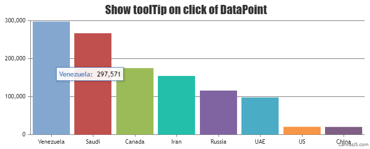
Team CanvasJSYou can use tooltip’s showAtX method along with click event handler of dataSeries to show tooltip on clicking datapoint. Please check out the code snippet below.
var clicked = false;
  var chart = new CanvasJS.Chart("chartContainer",
                                 {
    title:{
      text: "Show toolTip on click of DataPoint"
    },

    toolTip: {
      updated: function(e) {
      	// hide tooltip if datapoint is not clicked
        if(!clicked)
          e.chart.toolTip.hide();
      }
    },
    data: [

      {
        click: showToolTipOnClick,
        mouseout: hideToolTip,
        dataPoints: [
          { x: 1, y: 297571, label: "Venezuela"},
          { x: 2, y: 267017,  label: "Saudi"},
          { x: 3, y: 175200,  label: "Canada"},
          { x: 4, y: 154580,  label: "Iran"},
          { x: 5, y: 116000,  label: "Russia"},
          { x: 6, y: 97800, label: "UAE"},
          { x: 7, y: 20682,  label: "US"},
          { x: 8, y: 20350,  label: "China"}
        ]
      }
    ]
  });

  chart.render();

  function showToolTipOnClick(e) {
    clicked = !clicked;
    clicked ? e.chart.toolTip.showAtX(e.dataPoint.x) : e.chart.toolTip.hide();
  }

  function hideToolTip(e) {
    clicked = false;
    e.chart.toolTip.hide()
  }
Also, please take a look at this JSFiddle for complete working code.
—-
Manoj Mohan
Team CanvasJS