Login to Ask a Question or Reply
Forum Replies Created by Manoj Mohan
-
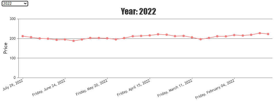
There are couple of issue in the sample that you have shared. Please find them address below.
1. CanvasJS & jQuery scripts are not present in the project
2. Variable names are not proper across multiple files (getData.php, getSearch.php & index.php).
Below is the code-snippet with the updated variable names./* getSearch.php */ echo json_encode($data_points, JSON_NUMERIC_CHECK); -> echo json_encode($yr_arr, JSON_NUMERIC_CHECK); /* getData.php */ $handle->bindParam(":year",$_POST["year"], PDO::PARAM_INT); -> $handle->bindParam(":year",$_GET["curnt_year"], PDO::PARAM_INT); /* index.php */ $.getJSON("getSearch.php", data, function(result){ -> $.getJSON("getSearch.php", function(response){ . . $.getJSON("getData.php", data, function(result){ -> $.getJSON("getData.php", data, function(response){Please download the updates sample project form here.
—-
Manoj Mohan
Team CanvasJSCan you kindly create sample project with sample data reproducing the issue you are facing & share it with us over Google-Drive or Onedrive so that we can run it locally at our end to understand the scenario better and help you out?
—-
Manoj Mohan
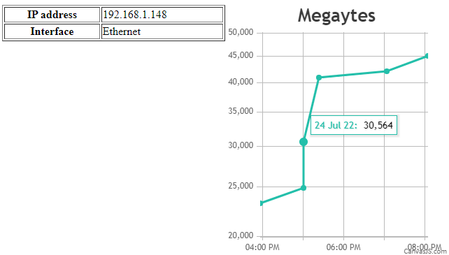
Team CanvasJSThe above issue is happening due to combination of float and absolute positioning of dom elements. You can check this StackOverflow thread for more information about the issue. In order to overcome this issue in your scenario, you can specify float as left or right for chart container and use clearfix hack for the parent element to handle the difference in height of floated elements. You can check this page for more information about the clearfix hack for handling float elements. Please take a look at this updated JSFiddle for an example on the same.
—-
Manoj Mohan
Team CanvasJSJE,
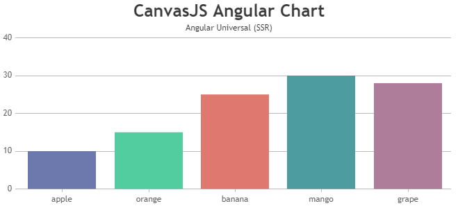
Angular Universal (Server Side Rendering) renders the application twice, once in server environment without any browser API and tries to load CanvasJS. Since CanvasJS requires browser environment and API’s to run, so we need to prevent running it in server environment. You can do so by modifying our chart component to import CanvasJS only when document object is present. Also, while adding canvasjs-chart to html, you can add ngIf attribute directive to add chart in client side only
/*canvasjs.angular.component.ts*/
.
.
if(typeof document === 'object' && !!document)
    var CanvasJS = require('./canvasjs.min');
.
.
/*app.component.ts*/
export class AppComponent {
  isDOMPresent:Boolean = typeof document === "object" && !!document;
  .
  .
}
/*app.component.html*/
<div>
  <canvasjs-chart  *ngIf="isDOMPresent" [options]="chartOptions" [styles]="{width: '100%', height:'360px'}"></canvasjs-chart>
</div>
Please take a look at this sample project for an example on CanvasJS Angular Chart with Angular Universal(SSR).
—-
Manoj Mohan
Team CanvasJSCan you kindly create sample project reproducing the issue you are facing and share it with us over Google-Drive or One Drive so that we can understand your scenario better and help you out?
—-
Manoj Mohan
Team CanvasJSJuly 4, 2022 at 10:01 pm in reply to: How to change Navigation range accordingly to range selection #38368– In order to see again ALL the chart data i need to click TWICE the “ALL” button in range selector, and this happen also in your JDIfiddle example above. Try selecting, the first time the page is loadedm range 3 months and then the ALL button. You’ll see that the first time will change just the navigation bar, and with a second click also the chart data will change accordingly.
To show all the chart data, you can set the slider’s minimum and maximum to null in rangeChanged event handler. Please take a look at this JSFiddle for an example on the same.
—-
Manoj Mohan
Team CanvasJSJuly 1, 2022 at 7:27 pm in reply to: How to change Navigation range accordingly to range selection #38355– before the modification you suggested, when the chart was rendered the first time i set the rangeSelector property “selectedRangeButtonIndex: 2” so the button with index 2 was selected. But now, setting this button using that property, the event “rangeChanged” is not triggered. Should i force this event via code so when the chart is loaded with button index 2 selected the navigation bar is set accordingly or there’s another way to do this?
rangeChanged event is triggered only when the range of the StockChart is changed manually using mouse/pointer (zooming/panning/sliding) and it doesn’t trigger when range of StockChart are set programmatically. However, you can manually call rangeChanged event handler after rendering the chart with required parameter as shown in this code snippet.
rangeChanged({minimum: stockChart.navigator.slider.minimum, maximum: stockChart.navigator.slider.maximum, source: "buttons" })– when selecting a different button, inside the rangeChanged(e) function i set these 2 properties:
// my intention was to set the new button as the selected one
stockChart.rangeSelector.selectedRangeButtonIndex = e.index;// and change the color of the new button
stockChart.rangeSelector.buttonStyle.set(“backgroundColorOnSelect”, “#ff9800”);In order to set selectedRangeButtonIndex, either you can use set method or update the stockchart options. Please take a below code snippet for the same.
stockChart.rangeSelector.set("selectedRangeButtonIndex", e.index);or
stockChart.options.rangeSelector.selectedRangeButtonIndex = e.index;– In order to see again ALL the chart data i need to click TWICE the “ALL” button in range selector, and this happen also in your JDIfiddle example above. Try selecting, the first time the page is loadedm range 3 months and then the ALL button. You’ll see that the first time will change just the navigation bar, and with a second click also the chart data will change accordingly.
We are looking into your query and will get back to you at the earliest.
—-
Manoj Mohan
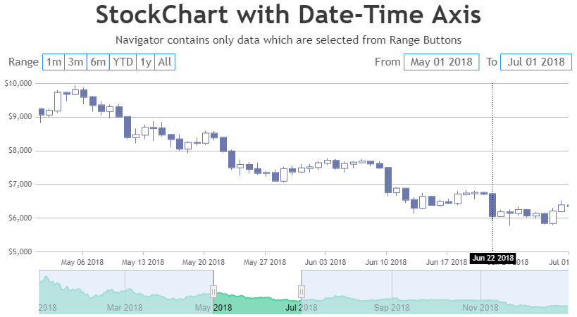
Team CanvasJSJune 28, 2022 at 7:48 pm in reply to: How to change Navigation range accordingly to range selection #38297You can update the dataPoints of navigator to show only dataPoints which are in selected range on click of range buttons using rangeChanged event. Please take a look at below code snippet for updating the datapoint based on the selected range in rangeChanged event.
function rangeChanged(e) {
    var minimum = parseInt(e.minimum);
    var maximum = parseInt(e.maximum);

    if (e.source == "buttons") {
        stockChart.options.charts[0].data[0].dataPoints = dps1 = [];
        stockChart.options.navigator.data[0].dataPoints = dps2 = [];

        for (var date in completeDPS) {
            if (
                ((date >= minimum && date <= maximum) || e.index == 5) &&
                completeDPS.hasOwnProperty(date)
            ) {
                dps1.push(completeDPS[date]);
                dps2.push({
                    x: completeDPS[date].x,
                    y: completeDPS[date].y[3],
                });
            }
        }
        stockChart.render();
    }
}
Please take a look at this JSFIddle for an example on the same.
Also, Ranges of range buttons are dependent on the datapoints present in navigator. Hence, updating the datapoints of navigator may result in disabling some of the range buttons whose ranges are outside the range of datapoints present in navigator.
—
Manoj Mohan
Team CanvasJSJune 21, 2022 at 7:16 pm in reply to: Error when i run with condition and without condition run fine #38154You can use useRef hook for getting the chart object reference as shown in the code snippet below.
<CanvasJSChart
        options={options}
        onRef={(ref) => {
          chartRef.current = ref;
        }}
/>
Also, check out this StackBlitz project for an example on the same.
If you are still facing the issue, kindly create a sample project reproducing the issue and share it with us over Google-Drive or Onedrive so that we can understand your scenario better and help you out.
—-
Manoj Mohan
Team CanvasJS@ib,
Chart seems to be working fine in ASP.NET MVC application. Please take a look at this tutorial page for integrating CanvasJS Charts with ASP.NET MVC application.
If you are still facing the issue, kindly create a sample project reproducing the issue and share it with us over Google-Drive or Onedrive so that we can understand your scenario better and help you out.
—-
Manoj Mohan
Team CanvasJSThe issue might be due to breaking changes in webpack. You need to import CanvasJSReact to your app using
import CanvasJSReact from './canvasjs.react.js'orvar CanvasJSReact = require('./canvasjs.react.js').default;. Please take a look at this StackBlitz project for an example on doughnut chart in react.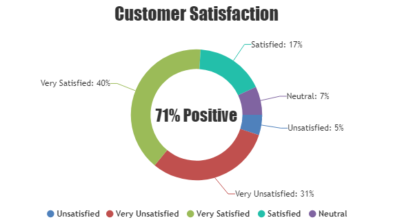
—-
Manoj Mohan
Team CanvasJSJune 7, 2022 at 1:23 pm in reply to: Animation not working after render. I want after 5 seconds animation show from 0 #37992CanvasJS commercial version doesn’t carry any watermark or credit link. You can purchase commercial version from the license page.
For further queries regarding commercial version, you can write to us at sales@canvasjs.com.
—-
Manoj Mohan
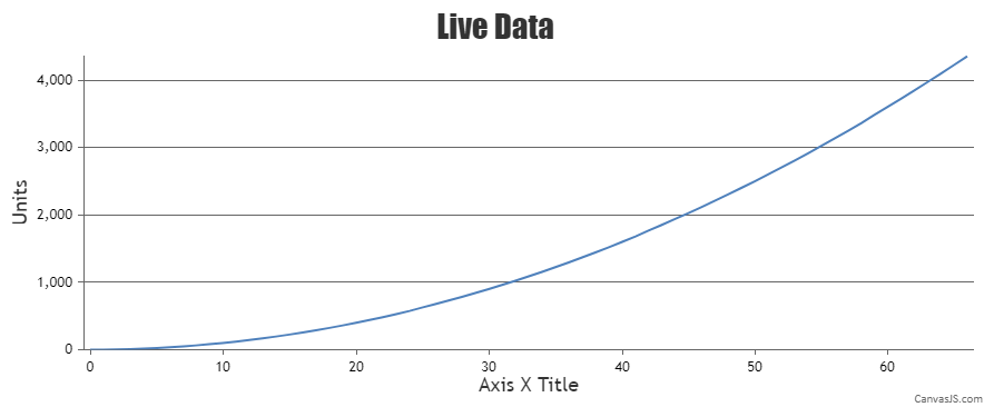
Team CanvasJSJune 3, 2022 at 7:04 pm in reply to: Animation not working after render. I want after 5 seconds animation show from 0 #37970You can create similar graph that you are referring in the link shared above by creating a dynamic chart and by setting labelAutoFit to false as well as setting y-axis maximum. Please take a look at this StackBlitz project for an example on the same in React.
—-
Manoj Mohan
Team CanvasJSTo avoid clipping of axis labels in navigator, you can set labelAngle to -1 in the navigator x-axis. Please find the below code-snippet for the same.
navigator: {
axisX: {
labelAngle: -1
}
}—-
Manoj Mohan
Team CanvasJSMay 31, 2022 at 7:45 pm in reply to: Animation not working after render. I want after 5 seconds animation show from 0 #37939Sorry, it’s not possible to animate the chart every 5 seconds as the chart animates only on the first render, as of now.
—-
Manoj Mohan
Team CanvasJS