Login to Ask a Question or Reply
Forum Replies Created by Ashish
-
Hi Theerawat,
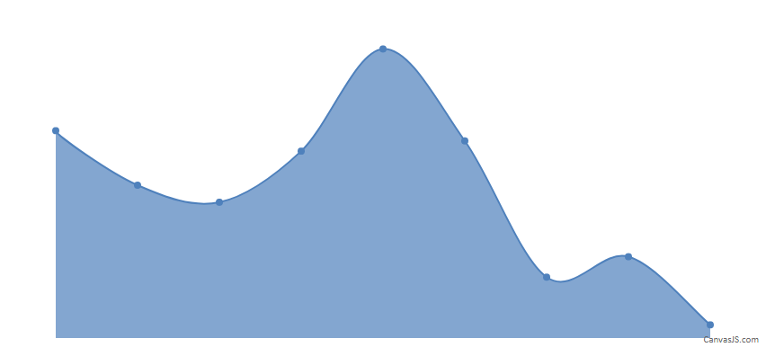
Take a look at CanvasJS charts with AngularJS-2.
-
This reply was modified 9 years, 8 months ago by
Ashish.
Hi Aggaton,
Please provide a jsfiddle or pictorial representation of your requirement so that we can understand your problem better and help you accordingly.
Hi Cristi,
1) This is mostly about both index labels and axis labels. Is there a switch anywhere?
By default the indexLabel is not shown, In case you would like to show the indexLabel, you can use indexLabel property to show some content (Eg: x-value or y-value)
To hide the axis labels you can use properties like labelFontSize or labelformatter. I would recommend you to use labelFormatter for your requirement.2) Same question for all pie labels, what if we don’t want any of them?
In Pie chart, only if you provide label property in the dataPoint, the indexLabels will be shown. By default the indexLabels are not shown.
3) As a more broader issue, is there a simple switch somewhere to hide both axes, with all their labels and grid lines?
You can use the properties like gridThickness(to hide the grid lines), tickLength(to hide the axis ticks), lineThickness(to hide the axis line) and labelFormatter(to hide the labels) for both X and Y axis
in order to hide the axes completely. Please take a look at the code snippet below,axisX:{ gridThickness: 0, tickLength: 0, lineThickness: 0, labelFormatter: function(){ return " "; } }, axisY:{ gridThickness: 0, tickLength: 0, lineThickness: 0, labelFormatter: function(){ return " "; } },Please take a look at this JSFiddle for an example with complete code on charts with hidden axes.
You can add HTML tags to toolTip.content. Please refer to this jsfiddle where we have added div to toolTip.content with specific width and CSS customizations.
—
Ashish Khatri
Team CanvasJSHi,
We have copied and modified your fiddle. Here is the updated fiddle. In the updated fiddle, after pressing the calculate button, you get the famname array for the values of Y-axis and vrijed array for the value of x-axis. Using vrijed and famname arrays, you can store and pass these values to the dataPoints property of the CanvasJS object, in the format required by CanvasJS.
Hi,
If i understood your requirement properly, you can use the labelFormatter for axisY as shown in the given fiddle.
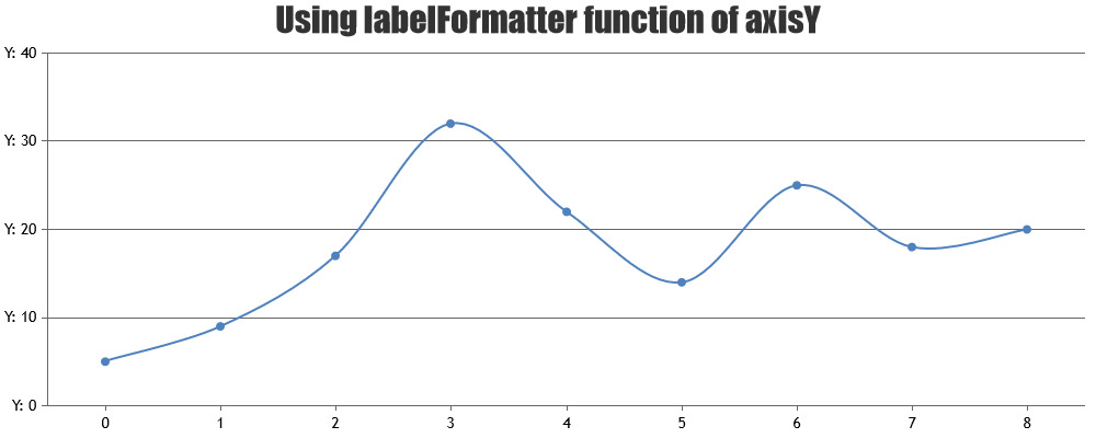
In case this is not what you are looking for, could you please try to elaborate a little more and create a jsfiddle so that we can get better understanding of your requirement. -
This reply was modified 9 years, 8 months ago by