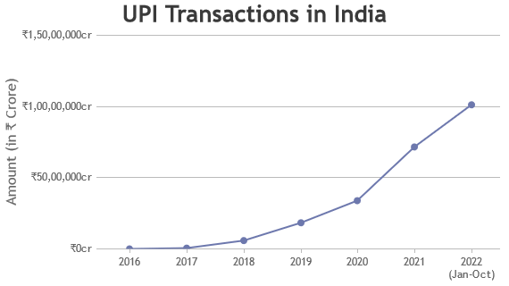
• Demos
    • JavaScript Charts
    • JavaScript StockCharts
  • Download/NPM
    • Download CanvasJS
    • Install via NPM
  • Integrations
    Front End Technology Samples
    • React Charts
    • Angular Charts
    • Vue.js Charts New!
    • jQuery Charts
    • Dashboards
    Server Side Technology Samples
    • PHP Charts
    • Python Charts New!
    • ASP.NET MVC Charts
    • Spring MVC Charts
    • JSP Charts
  • License
  • Blog
  • Docs
    • Chart Documentation
    • StockChart Documentation
  • Support Forum
    • Chart Support
    • StockChart Support
  • My Account
My Account
  • KEY FEATURES
    • Basic Chart
    • Chart with Animation
    • Chart with Zooming/Panning
    • Multi Series Chart
    • Chart with Multiple Axes
    • Chart with Logarithmic Axis
    • Chart with JSON Data
    • Dynamic Chart
    • Drilldown Chart
    • Responsive Chart
    • Synchronized Charts
  • LINE CHARTS
    • Line Chart
    • Dashed Line Chart
    • Multi Series Line Chart
    • Spline Chart
    • Multi Series Spline Chart
    • Step Line Chart
    • Multi Series Step Line Chart
  • BAR CHARTS
    • Bar Chart with Category Axis
    • Multi Series Bar Chart
    • Stacked Bar Chart
    • Stacked Bar 100% Chart
  • COLUMN CHARTS
    • Column Chart with Category Axis
    • Column Chart in Dark Theme
    • Multi Series Column Chart
    • Stacked Column Chart
    • Stacked Column 100% Chart
    • Stacked Column 100% Chart with IndexLabel
  • PIE & DOUGHNUT CHARTS
    • Pie Chart
    • Doughnut Chart
    • Doughnut Chart in Dark Theme
  • AREA CHARTS
    • Area Chart with Category Axis
    • Multi Series Area Chart
    • Spline Area Chart
    • Multi Series Spline Area Chart
    • Step Area Chart
    • Stacked Area Chart
    • Stacked Area 100% Chart
  • RANGE CHARTS
    • Range Column Chart
    • Multi Series Range Column Chart
    • Range Bar Chart
    • Multi Series Range Bar Chart
    • Range Area Chart
    • Multi Series Range Area Chart
    • Range Spline Area Chart
    • Multi Series Range Spline Area Chart
  • BUBBLE & SCATTER CHARTS
    • Bubble Chart with 3-Dimensional Data
    • Bubble Chart in Dark Theme
    • Scatter Chart
  • FUNNEL & PYRAMID CHARTS
    • Funnel Chart with Index Labels
    • Funnel Chart with Custom Neck Length
    • Pyramid Chart
  • FINANCIAL CHARTS
    • Candlestick Chart
    • Multi Series Candlestick Chart
    • OHLC Chart
    • OHLC Chart from JSON Data
    • Box & Whisker Chart
    • Waterfall Chart
  • COMBINATION CHARTS
    • Pareto Chart
    • Error Line Chart
    • Combination of Range Area & Line Chart
    • Combination of Candlestick & Line chart
  • DYNAMIC CHARTS
    • Dynamic Line Chart
    • Dynamic Column Chart
    • Dynamic Multi Series Chart
  • STOCKCHARTS
    • StockChart with Numeric Axis
    • StockChart with Date-Time Axis
    • StockChart with Navigator & Range Selector
  • JAVASCRIPT, JQUERY, REACT, ANGULAR
    • JavaScript Charts
    • jQuery Charts
    • React Charts
    • Angular Charts
  • SERVER SIDE TECHNOLOGIES
    • ASP.NET MVC Charts
    • JSP Charts
    • PHP Charts
    • Python Charts
    • Spring MVC Charts

Vue.js Line Charts

Download Vue.js Chart Samples
  • Vue.js Chart Samples
  • JavaScript Chart Samples
  • React Chart Samples
  • Angular Chart Samples
  • jQuery Chart Samples
  • PHP Chart Samples
  • Python Django Chart Samples
  • ASP.NET Chart Samples
  • JSP Chart Samples
  • Spring MVC Chart Samples
  • Dashboard Samples
  • JavaScript StockChart Samples

Vuejs line chart / plot connects series of points by a line segment. Line Graph is frequently used to show trends & analyze how the data has changed over time. Vuejs chart component supports multiple variants of line charts like Line Chart, Spline Chart & Step-Line Chart. You can easily switch between them just by changing the type property.

Multiple dataseries can also be plotted in a chart to compare the trend between them & they are called multi-series line charts. In case of multi-series line chart, line color, thickness & dash-type can be set in order to distinguish between them. Also, you can enable legends to display the dataseries name.
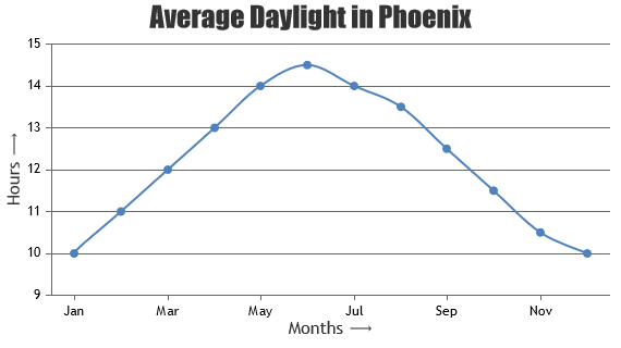
Vue.js Line Charts

Line Charts & Graphs are drawn by connecting datapoints by a straight line segment.

Vue.js Line Chart with Category Axis
Line Chart with Category Axis
Vue.js Dashed Line Chart
Dashed Line Chart
Vue.js Multi Series Line Chart
Multi Series Line Chart

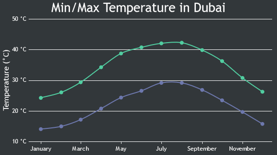
Vue.js Spline Charts

Spline Charts connects datapoints with a smooth curve & hence also referred to as Smooth Curved Line Chart.

Vue.js Spline Chart
Spline Chart
Vue.js Multi Series Spline Chart
Multi Series Spline Chart

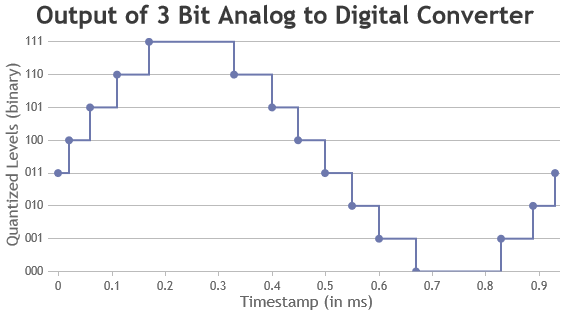
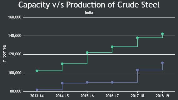
Vue.js Step Line Charts

Step Line Charts form a staircase like shape & hence also referred to as staircase charts.

Vue.js Step Line Chart
Step Line Chart
Vue.js Multi-Series Step-Line Chart
Multi-Series Step-Line Chart

Features used Commonly in Vue.js Line Chart

Most commonly used features in Vuejs Line Chart includes markers, line customization, zooming, panning, etc.

  • Marker type can be changed by setting markerType property.
  • Size of the marker can be changed by setting markerSize property.
  • Dash type of line can be changed to either solid or dashed or dotted by setting lineDashType property.
  • Thickness & color of line can be changed by setting lineThickness & color properties.
  • Zooming / Panning can be enabled by setting zoomEnabled property to true.

How to Improve Performance of Vue.js Line Chart?

In most of the cases, 100,000+ datapoints can render fast enough with default options of CanvasJS. However, if you are rendering very large number of datapoints, there are few tweaks that you can do in order to make the chart perform better.

  • Disable markers when there are large number of data. Showing makers with large dataset will make it look cluttered & makes chart slow.
  • If you are using dynamic charts, don’t recreate chart each time you add new datapoint. Instead, update datapoints array & call chart.render() as shown here.

Vue.js Line Chart Types

  • Vue.js Line Chart
  • Vue.js Spline Chart
  • Vue.js Step Line Chart

General Tips for Vue.js Line Charts

  • Use multiple axes when two dataseries have different units / scale ranges.
  • It is recommended to sort datapoints in ascending order of x values.
  • When you have more than 4 series, allow users to hide/unhide any series by clicking the legend
  • Having too many series in a chart makes it look cluttered. Experts suggest to have not more than 4 series in a chart.

Quick Links

  • Chart Docs
  • StockChart Docs
  • About Us
  • FAQs

Server Side Technologies

  • ASP.NET MVC Charts
  • PHP Charts
  • JSP Charts
  • Spring MVC Charts

Front Side Technologies

  • JavaScript Charts
  • jQuery Charts
  • React Charts
  • Angular Charts
  • JavaScript StockCharts

Contact

  • Fenopix, Inc.
  • 2093 Philadelphia Pike,
  • #5678, Claymont,
  • Delaware 19703
  • United States Of America

©2025 Fenopix Privacy Policy Cookies Policy Careers