• Demos
    • JavaScript Charts
    • JavaScript StockCharts
  • Download/NPM
    • Download CanvasJS
    • Install via NPM
  • Integrations
    Front End Technology Samples
    • React Charts
    • Angular Charts
    • Vue.js Charts New!
    • jQuery Charts
    • Dashboards
    Server Side Technology Samples
    • PHP Charts
    • Python Charts New!
    • ASP.NET MVC Charts
    • Spring MVC Charts
    • JSP Charts
  • License
  • Blog
  • Docs
    • Chart Documentation
    • StockChart Documentation
  • Support Forum
    • Chart Support
    • StockChart Support
  • My Account
My Account
  • KEY FEATURES
    • Chart with Index / Data Label
    • Chart with Zooming / Panning
    • Chart using JSON Data
    • Chart with Animation
    • Multi Series Chart
    • Chart with Multiple Axes
    • Chart with Crosshair
    • Chart with Scale Breaks
    • Chart with Logarithmic Axis
    • Performance with 50,000 Data Points
    • Responsive Charts
    • Chart with Drilldown
  • LINE CHARTS
    • Line Chart with Formatted Axes Labels
    • Dashed Line Chart
    • Multi Series Line Chart
    • Spline Chart
    • Multi Series Spline Chart
    • Step Line Chart
    • Multi Series Step Line Chart
  • BAR CHARTS
    • Bar Chart with Category Axis
    • Multi Series Bar Chart
    • Stacked Bar Chart
    • Stacked Bar 100% Chart
    • Stacked Bar 100% Chart with Indexlabel
  • COLUMN CHARTS
    • Column Chart with Category Axis
    • Multi Series Column Chart
    • Stacked Column Chart
    • Stacked Column 100% Chart
    • Stacked Column 100% Chart with Indexlabel
    • Waterfall Chart
    • Waterfall Chart with Indexlabel
  • AREA CHARTS
    • Area Chart with Date-Time Axis
    • Multi Series Area Chart
    • Spline Area Chart
    • Multi Series Spline Area Chart
    • Step Area Chart
    • Stacked Area Chart
    • Stacked Area 100% Chart
  • RANGE CHARTS
    • Range Column Chart
    • Multi Series Range Column Chart
    • Range Bar Chart
    • Multi Series Range Bar Chart
    • Range Area Chart
    • Multi Series Range Area Chart
    • Range Spline Area Chart
    • Multi Series Range Spline Area Chart
  • PIE & DOUGHNUT CHARTS
    • Pie Chart with Indexlabels
    • Pie Chart with Index Labels Placed Inside
    • Doughnut Chart
    • Doughnut Chart in Dark Theme
  • FUNNEL & PYRAMID CHARTS
    • Funnel Chart
    • Funnel Chart with Custom Neck
    • Pyramid Chart
  • FINANCIAL CHARTS
    • Candlestick Chart
    • Candlestick Chart from JSON
    • OHLC Chart
    • OHLC with Trendline
    • Box and Whisker Chart
    • Box and Whisker Chart with Customization
  • BUBBLE & SCATTER CHARTS
    • Scatter Chart
    • Scatter Chart with Custom Markers
    • Bubble Chart
  • COMBINATION CHARTS
    • Error chart
    • Error Line Chart
    • Pareto Chart
    • Combination of Column, Line and Area Chart
  • DYNAMIC CHARTS
    • Dynamic Line Chart
    • Dynamic Column Chart
    • Dynamic Multi Series Chart
  • STOCKCHARTS
    • StockChart with Numeric Axis
    • StockChart with Date-Time Axis
    • StockChart with SplineArea & Range Selector
  • ANGULAR, VUE.JS, JAVASCRIPT, JQUERY
    • Angular Charts
    • Vue.js Charts
    • jQuery Charts
    • JavaScript Charts
  • SERVER SIDE TECHNOLOGIES
    • ASP.NET MVC Charts
    • PHP Charts
    • Python Charts
    • JSP Charts
    • Spring MVC Charts

React Pie & Doughnut Charts

Download React Chart Samples
  • React Chart Samples
  • JavaScript Chart Samples
  • Angular Chart Samples
  • Vue.js Chart Samples
  • jQuery Chart Samples
  • PHP Chart Samples
  • Python Django Chart Samples
  • ASP.NET Chart Samples
  • JSP Chart Samples
  • Spring MVC Chart Samples
  • Dashboard Samples
  • JavaScript StockChart Samples

React Pie and Doughnut Charts are graphical representations of data commonly used to display proportions and percentages within a dataset in a circular form. A Pie Chart consists of slices, each representing a category or datapoint, with the size of each slice proportional to its value relative to the whole. On the other hand, a Doughnut Chart is similar to a Pie Chart but with a hole in the center, allowing for additional information or labels to be displayed in the middle.

React Pie & Doughnut Charts are commonly used to display categorical data, such as market share, survey responses or budget allocations where the focus is on comparing the relative sizes of different categories. CanvasJS React Chart Component support features like tooltip, legend, and interactivity to explore and understand data distribution quickly. It also comes with smooth animation and advanced customization options allowing developers to create highly interactive and visually appealing charts for their React applications.
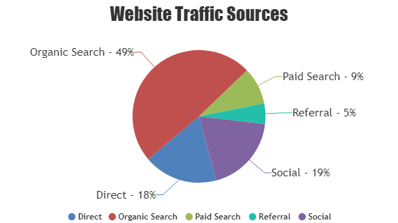
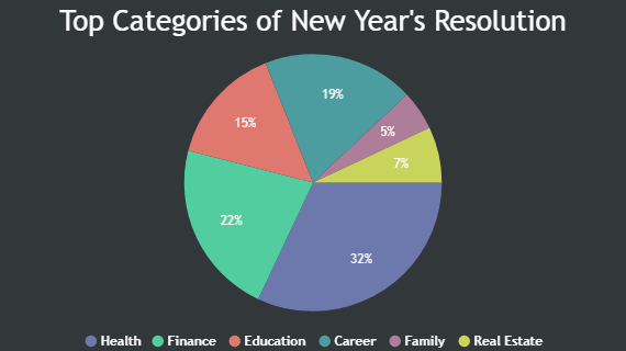
React Pie Charts

Pie Chart is a circular chart divided into sectors, each sector is proportional to the quantity it represents.

React Pie Chart with Indexlabels
Pie Chart with Indexlabels
React Pie Chart with Indexlabel placed Inside
Pie Chart with Indexlabel placed Inside

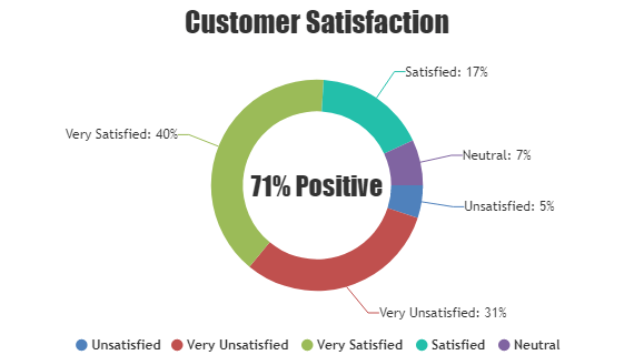
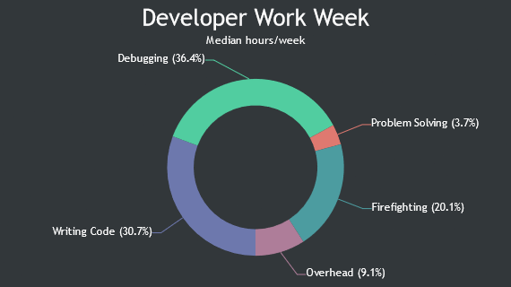
React Doughnut / Donut Charts

Doughnut Chart is a circular chart with a hollow center.

React Doughnut / Donut Chart
Doughnut Chart
React Doughnut / Donut Chart in Dark Theme
Doughnut Chart in Dark Theme

Features used Commonly in React Pie & Doughnut Charts:

Most commonly used features in React Pie & Doughnut Charts include exploding slices, rotating pie/doughnut, radius, etc.

  • Exploded Slices: You can explode or move slices away from the center of the chart to highlight specific categories by setting exploded property.
  • Start Angle: You can adjust the start angle of the chart to rotate the entire pie or doughnut, allowing for better alignment or emphasis on certain categories.
  • Inner Radius (Doughnut): You can configure the innerRadius of a doughnut chart to create a ring-shaped chart, allowing for additional information or labels to be displayed at the center.

React Pie & Doughnut Chart Types:

  • React Pie Chart
  • React Doughnut Chart

General Tips for React Pie & Doughnut Charts

  • Limit the Number of Slices: If possible, reduce the number of slices displayed in the chart. Pie charts with too many slices can become cluttered and difficult to read. Consider aggregating small values into an “other” category or grouping similar categories together.
  • Color Selection: Choose a color scheme that is visually appealing and enhances readability. Use contrasting colors to differentiate between slices and highlight important data points. You can add custom colorSet using addColorSet method.
  • Explode Slices: Experiment with exploding slices during initial render to draw attention towards specific datapoints. This can help emphasize important categories or highlight key trends within the dataset.

Quick Links

  • Chart Docs
  • StockChart Docs
  • About Us
  • FAQs

Server Side Technologies

  • ASP.NET MVC Charts
  • PHP Charts
  • JSP Charts
  • Spring MVC Charts

Front Side Technologies

  • JavaScript Charts
  • jQuery Charts
  • React Charts
  • Angular Charts
  • JavaScript StockCharts

Contact

  • Fenopix, Inc.
  • 2093 Philadelphia Pike,
  • #5678, Claymont,
  • Delaware 19703
  • United States Of America

©2025 Fenopix Privacy Policy Cookies Policy Careers