• Demos
    • JavaScript Charts
    • JavaScript StockCharts
  • Download/NPM
    • Download CanvasJS
    • Install via NPM
  • Integrations
    Front End Technology Samples
    • React Charts
    • Angular Charts
    • Vue.js Charts New!
    • jQuery Charts
    • Dashboards
    Server Side Technology Samples
    • PHP Charts
    • Python Charts New!
    • ASP.NET MVC Charts
    • Spring MVC Charts
    • JSP Charts
  • License
  • Blog
  • Docs
    • Chart Documentation
    • StockChart Documentation
  • Support Forum
    • Chart Support
    • StockChart Support
  • My Account
My Account
  • KEY FEATURES
    • Chart with Index / Data Label
    • Chart with Zooming / Panning
    • Chart using JSON Data
    • Chart with Animation
    • Multi Series Chart
    • Chart with Multiple Axes
    • Chart with Crosshair
    • Chart with Scale Breaks
    • Chart with Logarithmic Axis
    • Performance with 50,000 Data Points
    • Responsive Charts
    • Chart with Drilldown
  • LINE CHARTS
    • Line Chart with Formatted Axes Labels
    • Dashed Line Chart
    • Multi Series Line Chart
    • Spline Chart
    • Multi Series Spline Chart
    • Step Line Chart
    • Multi Series Step Line Chart
  • BAR CHARTS
    • Bar Chart with Category Axis
    • Multi Series Bar Chart
    • Stacked Bar Chart
    • Stacked Bar 100% Chart
    • Stacked Bar 100% Chart with Indexlabel
  • COLUMN CHARTS
    • Column Chart with Category Axis
    • Multi Series Column Chart
    • Stacked Column Chart
    • Stacked Column 100% Chart
    • Stacked Column 100% Chart with Indexlabel
    • Waterfall Chart
    • Waterfall Chart with Indexlabel
  • AREA CHARTS
    • Area Chart with Date-Time Axis
    • Multi Series Area Chart
    • Spline Area Chart
    • Multi Series Spline Area Chart
    • Step Area Chart
    • Stacked Area Chart
    • Stacked Area 100% Chart
  • RANGE CHARTS
    • Range Column Chart
    • Multi Series Range Column Chart
    • Range Bar Chart
    • Multi Series Range Bar Chart
    • Range Area Chart
    • Multi Series Range Area Chart
    • Range Spline Area Chart
    • Multi Series Range Spline Area Chart
  • PIE & DOUGHNUT CHARTS
    • Pie Chart with Indexlabels
    • Pie Chart with Index Labels Placed Inside
    • Doughnut Chart
    • Doughnut Chart in Dark Theme
  • FUNNEL & PYRAMID CHARTS
    • Funnel Chart
    • Funnel Chart with Custom Neck
    • Pyramid Chart
  • FINANCIAL CHARTS
    • Candlestick Chart
    • Candlestick Chart from JSON
    • OHLC Chart
    • OHLC with Trendline
    • Box and Whisker Chart
    • Box and Whisker Chart with Customization
  • BUBBLE & SCATTER CHARTS
    • Scatter Chart
    • Scatter Chart with Custom Markers
    • Bubble Chart
  • COMBINATION CHARTS
    • Error chart
    • Error Line Chart
    • Pareto Chart
    • Combination of Column, Line and Area Chart
  • DYNAMIC CHARTS
    • Dynamic Line Chart
    • Dynamic Column Chart
    • Dynamic Multi Series Chart
  • STOCKCHARTS
    • StockChart with Numeric Axis
    • StockChart with Date-Time Axis
    • StockChart with SplineArea & Range Selector
  • ANGULAR, VUE.JS, JAVASCRIPT, JQUERY
    • Angular Charts
    • Vue.js Charts
    • jQuery Charts
    • JavaScript Charts
  • SERVER SIDE TECHNOLOGIES
    • ASP.NET MVC Charts
    • PHP Charts
    • Python Charts
    • JSP Charts
    • Spring MVC Charts

React Line Charts & Graphs

Download React Chart Samples
  • React Chart Samples
  • JavaScript Chart Samples
  • Angular Chart Samples
  • Vue.js Chart Samples
  • jQuery Chart Samples
  • PHP Chart Samples
  • Python Django Chart Samples
  • ASP.NET Chart Samples
  • JSP Chart Samples
  • Spring MVC Chart Samples
  • Dashboard Samples
  • JavaScript StockChart Samples

React Line Charts display information as a series of data points connected by straight lines. Line Charts are commonly used to illustrate trends and patterns over time or for comparing two different datasets, showing how values change in relation to one another. React Component lets you create Line, Spline (Smooth Line) or Step Line (Staircase Shaped) Charts by changing type property in dataseries.

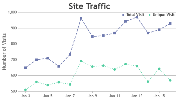
Line chart comes with customizable features to tailor the axis scale appearance by modifying parameters like interval, ticks, labels, etc. Markers and symbols can be strategically utilized to highlight significant datapoints or trends, while support for multiple dataseries enables effortless comparisons between different datasets within the same chart.

React Line Charts

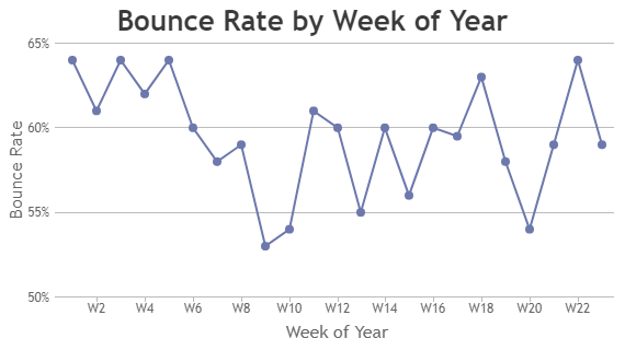
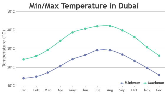
Line Charts (also referred as Line Plot or Line Graph) are drawn by connecting adjacent datapoints with a straight line.

React Line Chart with Formatted Axes Labels
Line Chart with Formatted Axes Labels
React Dashed Line Chart
Dashed Line Chart
React Multi Series Line Chart
Multi Series Line Chart

React Spline Charts

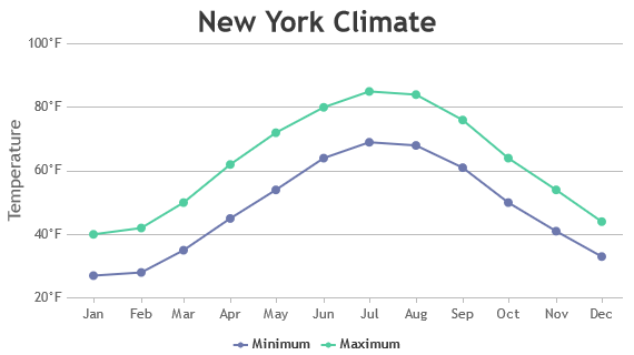
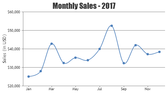
Spline Charts are also called as Smooth Curved Line Chart as the line connecting datapoints have smooth curves.

React Spline Chart
Spline Chart
React Multi Series Spline Chart
Multi Series Spline Chart

React Step Line Charts

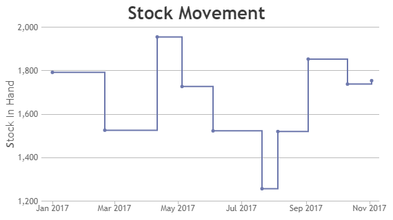
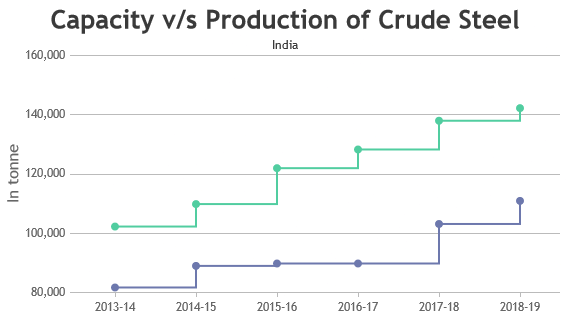
Step Line Charts are also known as step charts & sometimes staircase chart because of it’s shape.

React Step Line Charts
Step Line Chart
React Multi Series Step Line Chart
Multi Series Step Line Chart

Features used Commonly in React Line Chart

Most commonly used features in React Line Chart includes zooming, panning, customizing color, thickness & dash-type of the line, annotations, etc.

  • Zooming and Panning: You can zoom in and out of the chart or pan across different sections of the data for detailed analysis. This feature can be enabled by setting zoomEnabled property to true.
  • Line Styles: Customize the appearance of lines by changing lineColor, lineThickness and lineDashType to differentiate between multiple dataseries.
  • Indexlabels / Annotations: Indexlabel allows you to add text or shapes to the chart to provide additional context or highlight specific datapoint.
  • Tooltip: Interactive tooltips provide additional information about datapoints when users hover over them, aiding in data interpretation.

How to Improve Performance of React Line Chart?

Typically, React Line Charts perform well with default settings when you have up to 100,000 data points. However, if you are facing any issues with performance, there are few tweaks that you can do in order to make the chart render faster.

  • Reduce Data Points: Limit the number of datapoints displayed, especially if you’re dealing with large datasets. You can aggregate or down-sample data to reduce the number of points while maintaining the overall trend.
  • Avoid Markers: Avoid showing markers for all the datapoints if the dataset is large. Not only does it clutter the chart visually, but it also slows down rendering.
  • Optimize Tooltip Content: Keep tooltip content lightweight with essential information only. Complex calculations or data processing in tooltips can impact performance, especially with a large number of data points.

React Line Chart Types

  • React Line Chart
  • React Spline Chart
  • React Step Line Chart

General Tips for React Line Charts

  • Use Multiple Axes: If you are rendering multiple series with different range of values, it is better to use a different Axis for each series.
  • Limit the Number of Datapoints: Too many datapoints can clutter the chart and make it difficult to interpret. Consider aggregating or sampling data wherever possible to display effectively.
  • Interactivity: Enhance user engagement with interactive features like tooltips, zooming and panning, allowing users to explore data in-depth.

Quick Links

  • Chart Docs
  • StockChart Docs
  • About Us
  • FAQs

Server Side Technologies

  • ASP.NET MVC Charts
  • PHP Charts
  • JSP Charts
  • Spring MVC Charts

Front Side Technologies

  • JavaScript Charts
  • jQuery Charts
  • React Charts
  • Angular Charts
  • JavaScript StockCharts

Contact

  • Fenopix, Inc.
  • 2093 Philadelphia Pike,
  • #5678, Claymont,
  • Delaware 19703
  • United States Of America

©2025 Fenopix Privacy Policy Cookies Policy Careers