React Column Charts & Graphs
React Column Chart presents data in vertical bars, making it ideal for comparing discrete categories or showing proportions within a dataset. Each column represents a category or datapoint, with the height of the column corresponding to its value. Column charts are commonly used to visualize data such as sales figures, market share, or survey responses, where distinct categories need to be compared visually.
React Column Charts support features like zooming, panning, and exporting charts as images, allowing users to interact with and share their data effectively. With animations to enhance visual appeal and the ability to customize colors and styles.
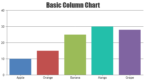
React Column Charts
Column Chart, also called as Vertical Bar Chart are useful to compare value between different categories / series.
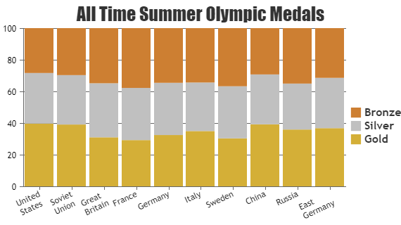
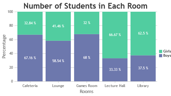
React Stacked Column Charts
Stacked Column Charts – columns from each dataseries are stacked vertically on top of each other and are used to show relation between individual value to the total sum.

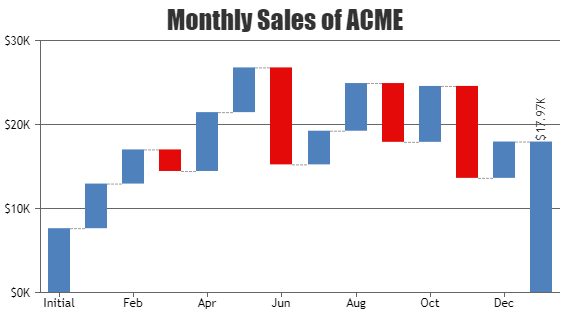
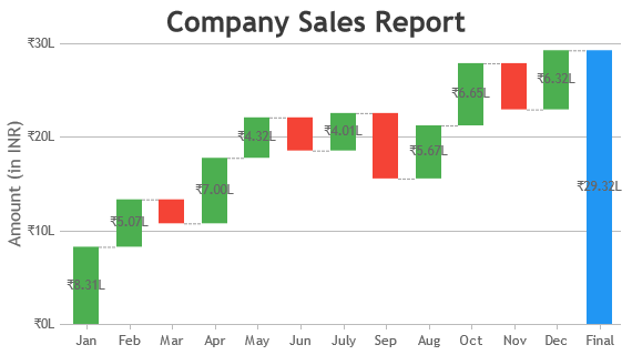
React Waterfall Charts
A waterfall chart is used for visualizing financial statements, comparing earnings and analyzing sales or product value over a period of time.
Features used Commonly in React Column Chart
Most commonly used features in React Column Chart includes indexlabels, drilldown, stacking, striplines, etc.
- Index/Data Labels: Show labels directly on the columns to display the exact value of each data point, improving readability and comprehension.
- Drill-Down: You can implement drill-down functionality to allow users to explore more detailed data by clicking on specific columns or categories.
- Stacking: Use Stacked Column Chart which stacks multiple dataseries on top of each other to compare their individual contributions against the total.
- Trend-Lines/StripLines: You can add Striplines to show threshold lines & highlight certain values or ranges within the chart, providing visual signals for target goals or critical thresholds.
How to Improve Performance of React Column Chart?
In most cases, React Column Charts render faster with the default options provided by the library. However, if you need to optimize for specific scenarios, here are some tweaks you can make to improve the chart’s rendering speed.
- Avoid Beveling: Avoid using bevel in column charts, especially when dealing with a large number of data points.
- Efficient Dynamic Updates: In dynamic charts, optimize performance by updating the datapoints array and calling the render() method towards the end instead of recreating/re-rendering the entire chart each time a new datapoint is added or updated. This approach minimizes overhead and ensures smoother updates, particularly in real-time or streaming scenarios.
React Column Chart Types
General Tips for React Column Charts
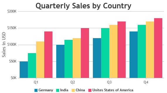
- Use Multiple Axes: Consider using multiple axes when two or more dataseries have different units or range of values. This ensures readability and prevents distortion of data.
- Limit Number of Series: Limit the number of series in a chart to prevent clutter. Experts recommend keeping the number of series to a maximum of 4 for better readability
- Enable Hiding / Unhiding Series: When there are more than 4 series, allow users to hide/unhide any series by clicking the legend. This feature maintains a clean appearance while allowing users to focus on any specific data.
- Remove Zero Baseline: Display a zero baseline in the vertical axis only when necessary. Column charts should ideally emphasize changes or variations in values. Including zero in the y-axis may not effectively highlight these variations, especially when they are small compared to the values themselves.