• Demos
    • JavaScript Charts
    • JavaScript StockCharts
  • Download/NPM
    • Download CanvasJS
    • Install via NPM
  • Integrations
    Front End Technology Samples
    • React Charts
    • Angular Charts
    • Vue.js Charts New!
    • jQuery Charts
    • Dashboards
    Server Side Technology Samples
    • PHP Charts
    • Python Charts New!
    • ASP.NET MVC Charts
    • Spring MVC Charts
    • JSP Charts
  • License
  • Blog
  • Docs
    • Chart Documentation
    • StockChart Documentation
  • Support Forum
    • Chart Support
    • StockChart Support
  • My Account
My Account
  • KEY FEATURES
    • Chart with Index / Data Label
    • Chart with Zooming / Panning
    • Chart using JSON Data
    • Chart with Animation
    • Multi Series Chart
    • Chart with Multiple Axes
    • Chart with Crosshair
    • Chart with Scale Breaks
    • Chart with Logarithmic Axis
    • Performance with 50,000 Data Points
    • Responsive Charts
    • Chart with Drilldown
  • LINE CHARTS
    • Line Chart with Formatted Axes Labels
    • Dashed Line Chart
    • Multi Series Line Chart
    • Spline Chart
    • Multi Series Spline Chart
    • Step Line Chart
    • Multi Series Step Line Chart
  • BAR CHARTS
    • Bar Chart with Category Axis
    • Multi Series Bar Chart
    • Stacked Bar Chart
    • Stacked Bar 100% Chart
    • Stacked Bar 100% Chart with Indexlabel
  • COLUMN CHARTS
    • Column Chart with Category Axis
    • Multi Series Column Chart
    • Stacked Column Chart
    • Stacked Column 100% Chart
    • Stacked Column 100% Chart with Indexlabel
    • Waterfall Chart
    • Waterfall Chart with Indexlabel
  • AREA CHARTS
    • Area Chart with Date-Time Axis
    • Multi Series Area Chart
    • Spline Area Chart
    • Multi Series Spline Area Chart
    • Step Area Chart
    • Stacked Area Chart
    • Stacked Area 100% Chart
  • RANGE CHARTS
    • Range Column Chart
    • Multi Series Range Column Chart
    • Range Bar Chart
    • Multi Series Range Bar Chart
    • Range Area Chart
    • Multi Series Range Area Chart
    • Range Spline Area Chart
    • Multi Series Range Spline Area Chart
  • PIE & DOUGHNUT CHARTS
    • Pie Chart with Indexlabels
    • Pie Chart with Index Labels Placed Inside
    • Doughnut Chart
    • Doughnut Chart in Dark Theme
  • FUNNEL & PYRAMID CHARTS
    • Funnel Chart
    • Funnel Chart with Custom Neck
    • Pyramid Chart
  • FINANCIAL CHARTS
    • Candlestick Chart
    • Candlestick Chart from JSON
    • OHLC Chart
    • OHLC with Trendline
    • Box and Whisker Chart
    • Box and Whisker Chart with Customization
  • BUBBLE & SCATTER CHARTS
    • Scatter Chart
    • Scatter Chart with Custom Markers
    • Bubble Chart
  • COMBINATION CHARTS
    • Error chart
    • Error Line Chart
    • Pareto Chart
    • Combination of Column, Line and Area Chart
  • DYNAMIC CHARTS
    • Dynamic Line Chart
    • Dynamic Column Chart
    • Dynamic Multi Series Chart
  • STOCKCHARTS
    • StockChart with Numeric Axis
    • StockChart with Date-Time Axis
    • StockChart with SplineArea & Range Selector
  • ANGULAR, VUE.JS, JAVASCRIPT, JQUERY
    • Angular Charts
    • Vue.js Charts
    • jQuery Charts
    • JavaScript Charts
  • SERVER SIDE TECHNOLOGIES
    • ASP.NET MVC Charts
    • PHP Charts
    • Python Charts
    • JSP Charts
    • Spring MVC Charts

React Bar Charts & Graphs

Download React Chart Samples
  • React Chart Samples
  • JavaScript Chart Samples
  • Angular Chart Samples
  • Vue.js Chart Samples
  • jQuery Chart Samples
  • PHP Chart Samples
  • Python Django Chart Samples
  • ASP.NET Chart Samples
  • JSP Chart Samples
  • Spring MVC Chart Samples
  • Dashboard Samples
  • JavaScript StockChart Samples

React Bar Charts are similar to Column Charts, with the width of the rectangle proportional to the datapoint's y-value. This characteristic brings Bar Charts the nickname "Horizontal Column Charts". In a Bar Chart, the vertical axis represents the x-axis, while the horizontal axis represents the y-axis. 
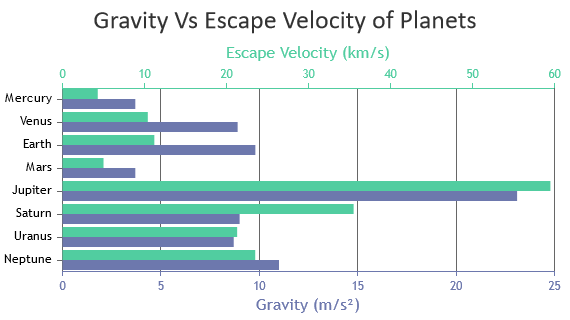
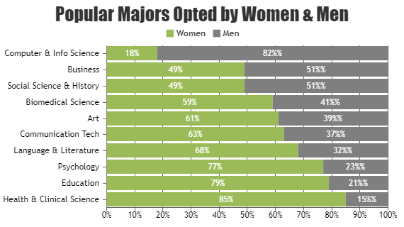
For multi-series bar charts, datapoints from different series sharing the same x-values are placed adjacent to one another and distinguished by their color. Typically, positive values are plotted towards the right side, and negative values towards the left, unless the y-axis is reversed. React Bar Charts also support Stacked Bar and Stacked Bar 100% Charts where datapoints from different series are stacked one on top of another.

React Bar Charts

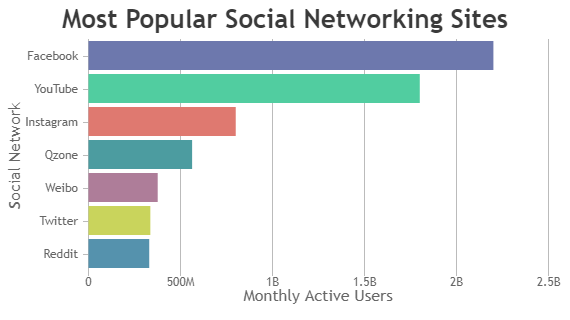
Bar Charts, also called as Horizontal Bar Charts, are useful to compare value between different categories / series.

React Bar Chart with Category Axis
Bar Chart with Category Axis
React Multi Series Bar Chart
Multi Series Bar Chart

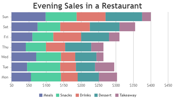
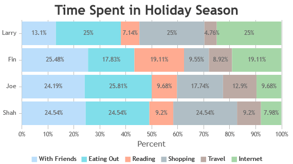
React Stacked Bar Charts

Stacked Bar Charts – bars from each dataseries are stacked horizontally on top of each other and are used to show relation between individual value to the total sum.

React Stacked Bar Chart
Stacked Bar Chart
React Stacked Bar 100% Chart
Stacked Bar 100% Chart
React Stacked Bar 100% Chart with Indexlabel
Stacked Bar 100% Chart with Indexlabel

Features Commonly used in React Bar Charts

Most commonly used features in React Bar Chart includes beveling the bars, index-labels, color, multiple axes, etc.

  • Beveling: You can add beveling effects to the bars for a 3D appearance, enhancing the visual appeal of the chart.
  • IndexLabels: To improve readability, you can show value of each datapoint directly on the bars.
  • Color: Customize the colors of bars to differentiate between dataseries or categories, making the chart visually appealing and easy to interpret.
  • Multiple Axes: Use multiple axes to display data with different units or range of values. This improves readability of charts.

How to Improve Performance of React Bar Chart?

React Bar Charts typically render efficiently with default settings in most scenarios. However, for situations requiring optimization, consider implementing the following tweaks to enhance rendering speed:

  • Avoid Beveling: Avoid bevel effects especially when dealing with a large number of data points.
  • Efficient Data Updates: Instead of re-rendering the chart with each datapoint update, consider batching the changes together & call render method once at the end.
  • React Component Lifecycle: Understanding React component lifecycle is crucial for minimizing unnecessary re-renders and optimizing performance.

React Bar Chart Types

  • React Bar Chart
  • React Stacked Bar Chart
  • React Stacked Bar 100% Chart

General Tips for React Line Charts

  • Data Filtering: Apply data filtering on the client-side to display only relevant bars, particularly when dealing with large datasets. Displaying only necessary data can improve rendering speed and user experience.
  • Enable Hiding / Unhiding Dataseries: Allow users to hide/unhide dataseries via legend interaction, crucial when there are more than 3-4 series.

Quick Links

  • Chart Docs
  • StockChart Docs
  • About Us
  • FAQs

Server Side Technologies

  • ASP.NET MVC Charts
  • PHP Charts
  • JSP Charts
  • Spring MVC Charts

Front Side Technologies

  • JavaScript Charts
  • jQuery Charts
  • React Charts
  • Angular Charts
  • JavaScript StockCharts

Contact

  • Fenopix, Inc.
  • 2093 Philadelphia Pike,
  • #5678, Claymont,
  • Delaware 19703
  • United States Of America

©2025 Fenopix Privacy Policy Cookies Policy Careers