Login to Ask a Question or Reply
Forum Replies Created by Vishwas R
-
Can you kindly share sample project along with sample data over Google-drive or Onedrive so that we can look at your code, understand it better and help you out?
—
Vishwas R
Team CanvasJSMay 24, 2018 at 10:48 am in reply to: Shared Tooltip is displayed mouseover above stacked column #20859Bimal,
The behaviour is designed so that toolTip is shown based on nearest x-values irrespective of y-values and chart-type. However toolTip will be shown only when you hover on column when its not shared.
—
Vishwas R
Team CanvasJSMay 23, 2018 at 10:41 am in reply to: Shared Tooltip is displayed mouseover above stacked column #20850Bimal,
We observe that the toolTIp gets hidden while panning the chart. Can you kindly create jsfiddle reproducing the issue so that we can understand your scenario better and help you out?
—
Vishwas R
Team CanvasJSrangeChanging and rangeChanged are triggered everytime when viewportMinimum or viewPortMaximum are updated while zooming, panning, or reset. If you like to perform some task within rangeChanging/rangeChanged for custom range, you can add a condition to check the range before the actual functionality.
rangeChanging: function(e) {
    if(e.axisX[0].viewportMinimum > customRangeMinimum && e.axisX[0].viewportMaximum < customRangeMaximum) {
        //Your code goes here
    }
}
—
Vishwas R
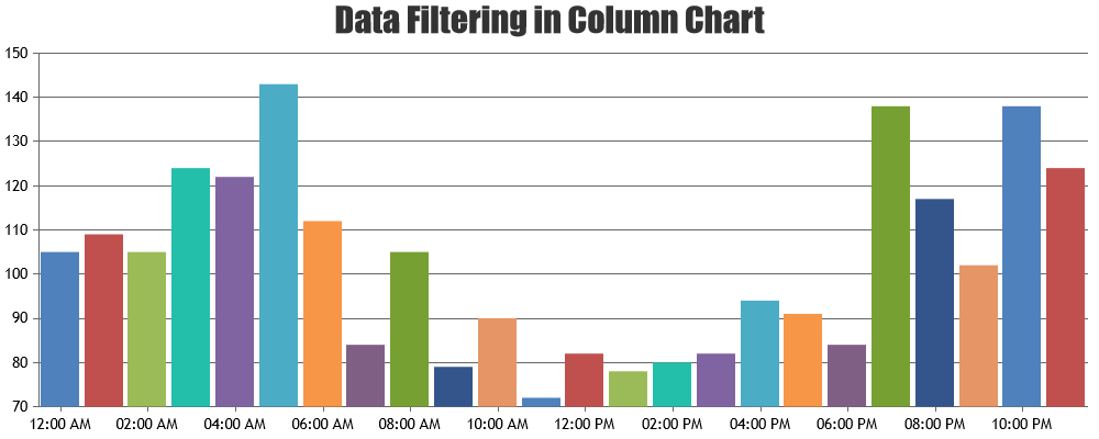
Team CanvasJSYou can perform data filtering based on range of zoomed region with the help of rangeChanging event. Initially you can read all data using AJAX and pass it to chart. Based on range of zoomed-region, you can filter the datapoints upon zooming. Below is the code snippet.
if (e.trigger === "zoom") {
    chart.options.data[0].dataPoints = [];
    if (((e.axisX[0].viewportMaximum - e.axisX[0].viewportMinimum) / hours) < 1) {
        for (var i = 0; i < dps.length; i++) {
            chart.options.data[0].dataPoints.push(dps[i]);
        }
    } else if (((e.axisX[0].viewportMaximum - e.axisX[0].viewportMinimum) / (hours)) < 24) {
        for (var i = 0; i < dps.length; i += 10) {
            chart.options.data[0].dataPoints.push(dps[i]);
        }
    }
}
Please take a look at this JSFiddle for an working example on the same.
moving the code to rangeChanged function it seems the chart is not render properly and i don’t understand why
In the JSFiddle that you have shared, you are generating new dataPoints with x-value as date-time which is outside the range you have zoomed. Because of this you may find chart to be blank after zooming into a certain region – without any dataPoints.
—
Vishwas R
Team CanvasJSDue to security reasons mail-clients doesn’t support JavaScript in mail. Due to this, its not possible to embed charts in the mail. However you can export chart as an image and embed image in the mail.
—
Vishwas R
Team CanvasJSWe have just released v2.1.2 with this bug fix. Please refer to the release blog for more information. Do download the latest version from our download page and let us know your feedback.
—
Vishwas R
Team CanvasJSDatapoint accepts x-value and y-value with optional label and z-value. In your case, you seem to be passing a property called ‘w’ instead of ‘y’ on clicking update button. Changing
chart.options.data[0].dataPoints[i] = {x:date1, w:w};tochart.options.data[0].dataPoints[i] = {x:date1, y:w};should work fine in your case.If you are still facing issue, kindly create JSFiddle reproducing the issue you are facing and share it with us, so that we can look into the code / chart-options being used, understand the scenario better and help you out.
—
Vishwas R
Team CanvasJSPlease take a look at Rendering Multiple Charts within a Page in ASP.NET MVC Samples. You can download ASP.NET MVC samples from download page.
—
Vishwas R
Team CanvasJSThis feature is not available as of now but it’s there in our roadmap.
However you can use panning feature to scroll position. You can also add timeline feature with the help of syncing multiple charts. Please take a look at this jsfiddle.
—
Vishwas R
Team CanvasJSWhy is there no way to define margins or offsets for these labels?
I tried adding spaces, html “<br />” elements etc, nothing works.Sorry, adding break is not available as of now. However you can achieve the same by setting labelMaxWidth, after which label gets wrapped.
I want ticks to only be visible for these 2 labels. Is this possible?
I tried setting “intervalType: ‘day’” and “interval” to the difference in days between these 2 dates, but canvas-js creates ticks for completely different days.Can you kindly create jsfiddle with sample data, so that we can understand your scenario better and help you out?
—
Vishwas R
Team CanvasJSSorry, this feature is not available as of now. However setting markerSize to ‘0’ will make marker to be visible only on mouseover with default size. Please take a look at this jsfiddle.
—
Vishwas R
Team CanvasJSRajesh Sudharsan,
Sorry, it’s not possible to load csv data from local machine unless its served from a local webserver or from same domain where html is hosted. It’s basically a browser restriction for security reasons. Please refer this page for more info on Cross-Origin Requests.
—
Vishwas R
Team CanvasJSRajesh Sudharsan,
For security reasons, browsers restrict cross-origin requests. Please refer this stackOverflow post for more information. Serving CSV file from local webserver and making an AJAX call to it or serving it from CORS enabled CSV hosting should work fine in this case. Please take a look at this jsfiddle.
Also can you please check the Browser Console if there are any errors. Can you kindly create jsfiddle reproducing the issue if you are facing any other issues?
—
Vishwas R
Team CanvasJS