Login to Ask a Question or Reply
Forum Replies Created by Vishwas R
-
Thanks for your interest in purchasing CanvasJS. I have forwarded your query to our sales team. They will get in touch with you soon and assist you purchase appropriate license :)
—
Vishwas R
Team CanvasJSYou can use toolTip contentFormatter to format the content to the be displayed in toolTip. Please take a look at this JSFiddle.
For further queries, kindly create JSFiddle along with sample data, so that we can look into working code, understand it better and help you out.
—
Vishwas R
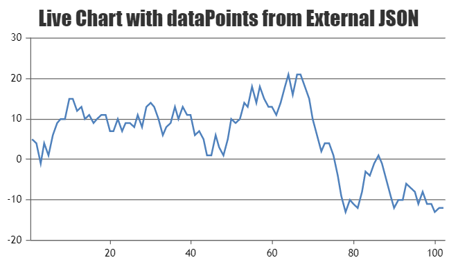
Team CanvasJSPlease refer this tutorial for step-to-step guide on rendering Live Updating Charts from JSON API & AJAX.
—
Vishwas R
Team CanvasJSYou can assign any valid string as dataSeries name either directly or by passing a variable that’s a string. Please take a look at this jsfiddle.
If you are looking for something else, can kindly create a jsfiddle and brief further about your requirement so that we can understand it better and help you out?
—
Vishwas R
Team CanvasJSSankalp,
Retrieving data from database has been handled in service.php which is loaded in index.php using AJAX request. You can combine both into a single php file according to your requirement / coding-style. Please take a look at this updated sample project.
The sample projects shared seems to be working fine, can you kindly check browser console for any errors? Also can you kindly brief more about the issue you are facing like screenshot of the output, whether the chart is rendering with just axis atleast or chart is not at all rendering, etc which helps us understand your scenario better and help you out?

Please refer PHP Chart from Database for an example on rendering chart in PHP from database. Also you can download & checkout PHP Samples from our download page.
—
Vishwas R
Team CanvasJSScale-breaks seems to be working fine in the use-case you have shared. However as you have mentioned in your other post, there seems to be issue when candlestick chart is combined with column chart. Please take a look at this updated jsfiddle where the scale-break that you have applied is working fine irrespective of chart-type.
Considering this as duplicate of your other post I’m closing this post.
—
Vishwas R
Team CanvasJSThanks for reporting the use-case, it seems to happen when candlestick is combined with column chart. We will look into the issue and get back to you at the earliest.
—
Vishwas R
Team CanvasJSSankalp,
It seems to be working fine. Can you kindly check if you have imported database and updated database username, password in service.php accordingly? Also can you kindly check the Browser Console for any errors?
Considering this as duplicate of your other post. So am closing this post.
—
Vishwas R
Team CanvasJSSankalp,
It seems to be working fine. Can you kindly check if you have imported database and updated database username, password in service.php accordingly? Also can you kindly check the Browser Console for any errors?
Kindly follow the instructions given the forums thread along with updating the database username & password in service.php.
—
Vishwas R
Team CanvasJSPlease take a look at this sample project for rendering CanvasJS Chart in ASP.NET Webforms. Refer ReadMe.txt file present in the sample project for setup related information.
—
Vishwas R
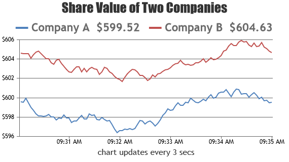
Team CanvasJSPlease take a look at this Gallery Page for an example on rendering dynamic multi-series line chart.
You can remove the extra dataPoints once the length of dataPoints reaches a threshold value with the help of shift method. Please refer to this documentation page for steep-to-step tutorial on Creating Dynamics Charts.
—
Vishwas R
Team CanvasJSJune 15, 2018 at 4:24 pm in reply to: want to highlight portion in line chart between two point #21128You can change the lineColor and color of selected region. Please take a look at this jsfiddle.
—
Vishwas R
Team CanvasJSJune 15, 2018 at 4:09 pm in reply to: java.io.IOException: Server returned HTTP response code: 403 for URL … #21127For security reasons, browsers restrict cross-origin requests. Please refer stackOverflow for more information.
Adding csv file to your project and loading it should work fine. Please download JSP Samples from our download page and checkout “Chart from CSV” example in the project.
If the issue still persist, kindly create a sample project and share it over Google-Drive or Onedrive so that we can look into the code, understand your scenario better and help you out.
—
Vishwas R
Team CanvasJSindexLabels/labels in Pie Chart are skipped whenever they get closer to other indexLabels – this behavior is by design. You can workaround this issue by either rotating the Pie Chart as shown in this JSFiddle or by showing indexLabel outside the Pie Chart as shown in this JSFiddle – indexLabel’s are placed better when they are outside.
It would be useful if you can create a JSFiddle demonstrating the issue with minimal code, so that we can look into your code, understand the scenario better and guide you accordingly.
—
Vishwas R
Team CanvasJS