Login to Ask a Question or Reply
Forum Replies Created by Vishwas R
-
You can set label of a stripLine using label property. With the help of addTo method, you can add stripLines at desired places after chart is rendered.
Please take a look at this updated JSFiddle, where you can change the color of axisX labels by passing labelFontColor property in specific dataPoint.
—
Vishwas R
Team CanvasJSWe have just released v2.2 with this improvement. Please refer to the release blog for more information.
—
Vishwas R
Team CanvasJSWe have just released v2.2 with this bug fix. Please refer to the release blog for more information.
—
Vishwas R
Team CanvasJSYou can sort dataPoints in alphabetical order. Please take a look at this JSFiddle.
—
Vishwas R
Team CanvasJSVisually both looks same. But in the previous example you need to handle color of the line, marker, toolTip content, etc where as in the current example provided its just a single property (fillOpacity) that makes your task simpler.
—
Vishwas R
Team CanvasJSWith couple of lines of code you can add “Save as CSV” as option within “More Options” of Chart Export feature. Please check this updated jsfiddle.
—
Vishwas R
Team CanvasJSPlease take a look at this jsfiddle.
Also please refer to the tutorial on Positioning Images over Chart for more info.
—
Vishwas R
Team CanvasJSThanks for your valuable suggestion on labelMinWidth. I will discuss with the team regarding.
Meanwhile, you can get reference of the chart components that are created and set the axis margin as shown in the jsfiddle.
—
Vishwas R
Team CanvasJSTooltip doesn’t capture any events. Setting
pointer-events: auto !important;along with setting height and overflow-y should work fine in your case. Please refer this documentation page for more information on toolTip. Also take a look at this JSFiddle for an example on same.
—
Vishwas R
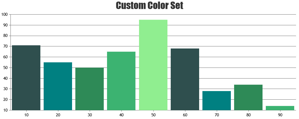
Team CanvasJSYou can add custom colorSet, which is an array of colors, to render chart data with custom colors.
Can you kindly create JSFiddle or share sample project reproducing the issue you are facing over Google-Drive or Onedrive so that we can understand your code & scenario better and help you out.
—
Vishwas R
Team CanvasJSExporting chart data as xlsx or csv is not supported as of now. However with couple of lines of code, you can achieve this. Please take a look at this JSFiddle.
—
Vishwas R
Team CanvasJSThanks for your feedback.
You can align axisY of multiple chart by setting margin based on axisX bounds. Please take a look at this JSFiddle.
—
Vishwas R
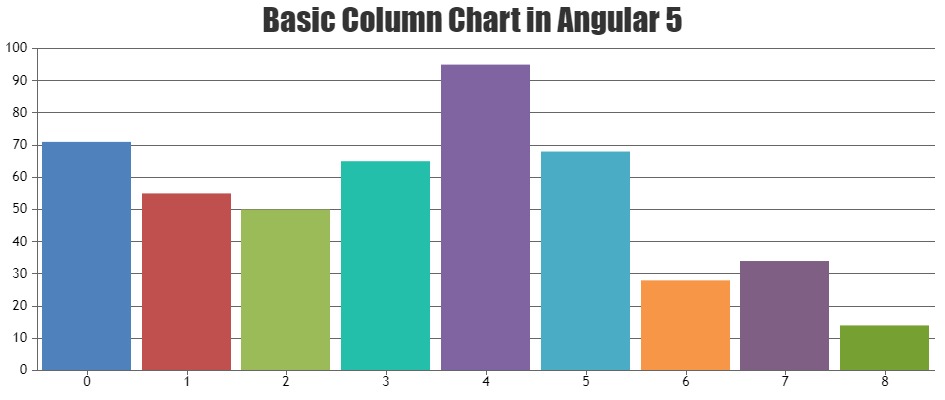
Team CanvasJSJune 26, 2018 at 11:24 am in reply to: Canvas JS issue with Angular5 for ColumnChart and StackedColumnChart #21247The package that you are using through npm is not an official package but from a third party.
You can download CanvasJS from our download page and save it (canvasjs.min.js) in source folder of your project (‘src/app’ or ‘src/app/assets/js’ or ‘src/app/lib’) and import the CanvasJS library to your app using
import * as CanvasJS from './canvasjs.min'(path may vary based on file location like ‘./assets/js/canvasjs.min’ or ‘./lib/canvasjs.min’).Out library works with all versions of Angular / AngularJS. Please take a look at this gallery page for examples on integrating CanvasJS in angular apps. Also take a look at this sample project for an example on adding CanvasJS in Angular 5 App.
—
Vishwas R
Team CanvasJSVineet,
You can fix the position of the toolTip by adding style to toolTip DOM (canvasjs-chart-tooltip class). Please take a look at this JSFiddle.
—
Vishwas R
Team CanvasJS