Login to Ask a Question or Reply
Forum Replies Created by Vishwas R
-
You can customize the color of marker using markerColor. Please refer documentation for more customization options.
—
Vishwas R
Team CanvasJSCan you kindly share sample project reproducing the issue you are facing over Google-Drive or Onedrive so that we can run it locally at our end, understand the scenario better and help you out.
—
Vishwas R
Team CanvasJSCan you kindly share sample project reproducing the issue you are facing over Google-Drive or Onedrive so that we can run it locally at our end, understand the scenario better and help you out.
Considering this as duplicate of canvasjs charts not working in vtiger dashboard widget, hence closing the same.
—
Vishwas R
Team CanvasJSMay 27, 2019 at 4:17 pm in reply to: How to update data dynamically without refreshing the web page? #25307You can update chart without refreshing the page by updating chart-options and re-rendering it. Please take a look at this documentation page and updated JSFiddle for the same.
—
Vishwas R
Team CanvasJSMay 27, 2019 at 4:17 pm in reply to: Displaying incorrect date time while converting epoch value #25306Epoch timestamp is in seconds whereas JavaScript uses milliseconds as timestamp. Converting epoch timestamp to JavaScript timestamp before passing it to chart should work fine in your case. You can convert epoch timestamp to JavaScript timestmap by multiplying epoch timestamp by 1000.
$javaScriptTimestamp = $epochTimestamp * 1000;Please refer this stackoverflow thread for more information on the same.—
Vishwas R
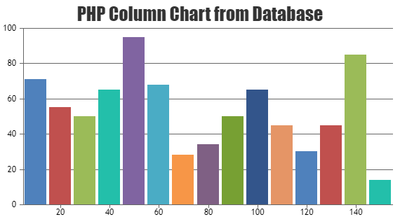
Team CanvasJSMay 27, 2019 at 4:17 pm in reply to: Canvas.js working in localhost but not working after upload to the Server #25305Please take a look at the gallery example on rendering chart in PHP with data from database. You can also download sample project from our download page to run it locally.
If this doesn’t help you fulfill your requirements or finding any difficulty in integrating CanvasJS in your PHP page, kindly share sample project along with sample database over Google-Drive or Onedrive so that we can run it locally at our end, understand the issue you are facing and help you out.
—
Vishwas R
Team CanvasJSReact Charts seems to be working fine, please download React Samples from our download page.
If the issue still persists, kindly create sample project and share it with us over Google-Drive or Onedrive so that we can run it at our end, understand the scenario better and help you resolve the same.
—
Vishwas R
Team CanvasJSEddie,
In case of multiseries column charts, columns get distributed across the actual value i.e. in case of 2 dataSeries, 1st column will occupy space towards left of the actual value and the 2nd column towards right of it so that both becomes visible.
You can show just positive values by setting minimum to some negative value instead of setting it to 0, setting it to negative value adds some padding making 1st column visible.
—
Vishwas R
Team CanvasJSlegendText is a property of dataSeries that’s used to set the text to be displayed in the legend for a particular dataSeries. Please refer documentation for more information along with live example.
—
Vishwas R
Team CanvasJSMay 24, 2019 at 3:50 pm in reply to: Render charts Cannot read property 'textBlock' of undefined error #25285Can you kindly share a JSFiddle reproducing the issue you are facing?
From what we have observed, sometimes things get delayed mostly when we are not able to reproduce the issue – as there are 30+types of charts with elements like title, subtitles, legend, axisX, axisY, dataPoints, stripLines, labels, indexLabels, etc – it would take time for us to actually land up with your use-case or we may not be able to reproduce the issue when you are passing invalid options.
Having a JSFiddle helps us in figuring out the issue and many a times we can just edit your code on JSFiddle to fix the issue right-away.
—
Vishwas R
Team CanvasJSBy setting showInLegend property to true, you can show legend to a dataSeries. Please refer to the documentation page on legend for more information and more customization options available.
—
Vishwas R
Team CanvasJSEddie,
It seems like you are either setting minimum or viewportMinimum in axisX (observation from image shared) because of which first dataPoint is partially visible. Removing the same or setting it to null should work fine in your case.
If you are not setting minimum / viewportMinimum but facing this issue, kindly share JSFiddle reproducing the issue you are facing, so that we can look into the code, understand the scenario better and help you out.
—
Vishwas R
Team CanvasJSAdding a loader image till chart is rendered is not available as an built-in feature, as of now. However, with few lines of code you can achieve this as shown in this JSFiddle.
—
Vishwas R
Team CanvasJSMay 22, 2019 at 3:37 pm in reply to: please give solution to load gif image when click on mark points button #25261Adding a loader image till chart is rendered is not available as an built-in feature, as of now. However, with few lines of code you can achieve this as shown in this JSFiddle.
Considering this as duplicate of loading image and hence closing the same.
—
Vishwas R
Team CanvasJSYou can use label property to show labels over axisX and setting axisYType to secondary will attach dataSeries to secondary y-axis. Please take a look at this JSFiddle for a working example with your set of dataPoints.
—
Vishwas R
Team CanvasJS