Login to Ask a Question or Reply
Forum Replies Created by Shashi Ranjan
-
When the axis-y maximum is set to 45 and its interval is set to 10, the axis label will not be shown at value 45. Also, if the stripLine value is the same as the actual maximum value of the axis, it overlaps with the axis label because of which it looks bold. To avoid making it look bold, you can ignore adding stripLines and set axis-y maximum as a multiple of its interval.
—
Shashi Ranjan
Team CanvasJSMarco,
For security reasons, browsers restrict reading local CSV files and cross-origin requests. Please refer to this StackOverflow post for more information. Serving CSV file from a local web server and making an AJAX call to it or serving it from CORS enabled CSV hosting should work fine in this case.
—
Shashi Ranjan
Team CanvasJSYou can achieve this requirement by using a line chart having different y-values(in descending order) over the same x-value.
If this doesn’t help, can you kindly share a pictorial representation or brief further with an example so that we can understand your requirements better and help you out?
—
Shashi Ranjan
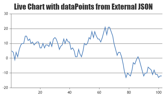
Team CanvasJSAs we do not have a working sample project that we can run locally to understand the issue better, we can suggest a few modifications you can make to your files for creating a dynamic chart in PHP using data from MySQL database. We will first start with php service
dynamicgraph.phpwhich will provide data from the database. Please take a look at below code snippet fordynamicgraph.phpservice:$username = "root"; $password = ""; $dbname = "test"; // Create connection $conn = new mysqli('',$username, $password, $dbname); // Check connection if ($conn->connect_error) { die("Connection failed: " . $conn->connect_error); } $sql = "SELECT Label, y_value FROM chart_table"; $result = $conn->query($sql); if ($result->num_rows > 0) { // output data of each row $obj = array(); while($row = $result->fetch_assoc()) { $element = array($row["Label"],$row["y_value"]); array_push($obj,$element); } echo json_encode($obj); } else { echo "0 results"; } $conn->close();You can call
dynamicgraph.phpservice at certain interval using AJAX call and render the chart with data received from the service. Please take a look the below code snippet for the same:window.onload = function () { var chart = new CanvasJS.Chart("chartContainer",{ title:{ text:"Rendering Chart from database" }, data: [{ type: "line", dataPoints : [], } ] }); $.getJSON("dynamicgraph.php", function(data) { $.each((data), function(key, value){ chart.options.data[0].dataPoints.push({label: value[0], y: parseInt(value[1])}); }); chart.render(); updateChart(); }); function updateChart() { $.getJSON("dynamicgraph.php", function(data) { chart.options.data[0].dataPoints = []; $.each((data), function(key, value){ chart.options.data[0].dataPoints.push({label: value[0], y: parseInt(value[1])}); }); chart.render(); }); } setInterval(function(){updateChart()}, 1000); }Please check this sample project for a working example with sample code for creating dynamic charts using data from MySQL database in PHP.
Also, please refer to this documentation page for step to step tutorial to create a Live Updating Charts from JSON API & AJAX.
—
Shashi Ranjan
Team CanvasJSJune 12, 2019 at 7:25 pm in reply to: Axis label intervals should get recomputed in chart's update workflow #25508Labels are shown at every interval of the axis. In the JSFiddle that you have shared, we observed that the interval over axisY (horizontal in case of bar chart) is getting changed when the height of the chart is updated. However, the labels of axisX (vertical in case of the bar chart) remain the same with height 200px and 400px as the interval calculated for both the heights are same.
—
Shashi Ranjan
Team CanvasJSThis format is termed as Timestamp. The Unix timestamp is a way to track time as a running total of seconds. This count starts at the Unix Epoch on January 1st, 1970 at UTC. Therefore, the Unix timestamp is merely the number of seconds between a particular date and the Unix Epoch. For more information, kindly read this Wikipedia article. In JavaScript, a timestamp is the number of milliseconds that have passed since January 1, 1970, hence you need to multiply the Unix timestamp by 1000 to convert it to JS timestamp.
—
Shashi Ranjan
Team CanvasJSBraemt,
You can use column chart for the comparison of price over time. Please take a look at this article for more information on choosing right chart for your data.
—
Shashi Ranjan
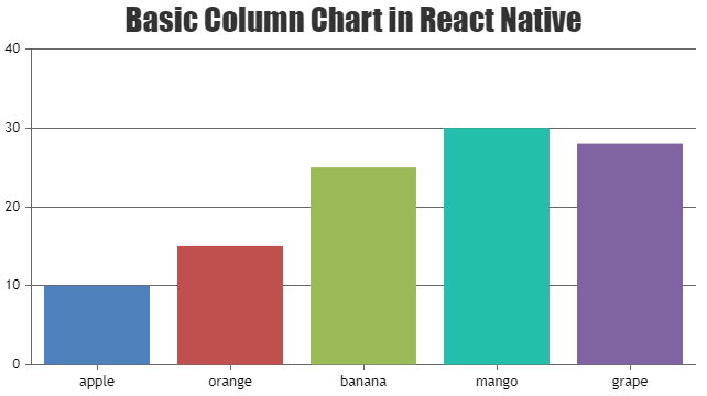
Team CanvasJSPlease take a look at this sample project for integration of CanvasJS Charts in React Native app.
—
Shashi Ranjan
Team CanvasJSThe image shared above seems to be broken. Can you please share the image with a valid link and brief description of your requirement so that we can understand your requirement better and help you out.
—
Shashi Ranjan
Team CanvasJSMay 16, 2019 at 7:52 pm in reply to: Code from "Creating Charts from CSV" is not working in my HTML document #25210It’s not possible to directly load a file via AJAX request. However, you can load/browse the file from local disk. Once the file is loaded, parsing it to the format accepted by CanvasJS should work fine. Please refer to this documentation page for the step-to-step tutorial on parsing CSV data and rendering the chart.
—
Shashi Ranjan
Team CanvasJS