Login to Ask a Question or Reply
Forum Replies Created by Priyanka M S
-
@cmarshaa@gmail.com,
I should declare Default value for the axis it should be defaultly 0 to 24
You can use axis minimum and axis maximum to set the axis range.
If this doesn’t solve your requirement, kindly share a JSFiddle depicting your requirements so that we can understand your requirements better and help you out.
__
Priyanka M S
Team CanvasJSOctober 26, 2018 at 6:04 pm in reply to: Auto refresh Graph with some particular time duration #23219Kindly share a sample project(along with sample data) over Google-Drive or onedrive reproducing the issue you are facing so that we can look into your code, understand it better and help you out.
__
Priyanka M S
Team CanvasJSYou can add an extra div on itemmousemove event of the legend. You can check out the example in the documentation of itemmousemove.
__
Priyanka M S
Team CanvasJSWe don’t have plans on supporting Sankey Charts in near future. But we will consider it for future releases.
__
Priyanka M S
Team CanvasJSPlease take a look at this sample project on rendering sparkline charts in table.
__
Priyanka M S
Team CanvasJSYou can add a condition to check if the category
serial_numberis present in toolTip contentFormatter. Please take a look at this jsfiddle.__
Priyanka M S
Team CanvasJSSuch as maybe that won’t work if we are using the paid version or something? Will this approach remain valid in future releases?
There will be no issues regarding your approach with future releases of CanvasJS.
__
Priyanka M S
Team CanvasJSWe will reconsider this feature to the product roadmap. But we will not be able to provide a definite timeline for the release with this feature, as we are working on other important features at this point in time.
__
Priyanka M S
Team CanvasJSmay I know how to convert 2018-10-04 to 02T11 format ?
You can use valueFormatString to format x-values along axisX and xValueFormatString to format x-values in indexLabel or toolTip according to your requirement.
and I want multiple line chart on this , is it possible ?
Yes. Please refer to our documentation rendering multi-series charts.
__
Priyanka M S
Team CanvasJSYou will need to create chart containers(div) dynamically in order to render multiple charts in a page as shown in the code snippet below:
var noOfCharts = 4;
var charts =[];

var chartOptions = {
    data: [
      {
        type: "column",
        dataPoints: [
          { x: 10, y: 71 },
          { x: 20, y: 55 },
          { x: 30, y: 50 },
          { x: 40, y: 65 },
          { x: 50, y: 95 },
          { x: 60, y: 68 },
          { x: 70, y: 28 },
          { x: 80, y: 34 },
          { x: 90, y: 14 }
        ]
      }
    ]
  };

for(var i = 0; i < noOfCharts; i++) {
  var chartDiv = document.createElement('div');
  chartDiv.setAttribute('id', 'chartContainer' + i);
  chartDiv.style.cssText = 'height: 300px; width: 100%;';
  document.getElementsByTagName('body')[0].appendChild(chartDiv);

  chartOptions.title = { text: "Chart " + (i+1)};
  charts[i] = new CanvasJS.Chart(chartDiv.id, chartOptions);
  charts[i].render();
}
Please take a look at this JSFiddle for a working example with sample code.
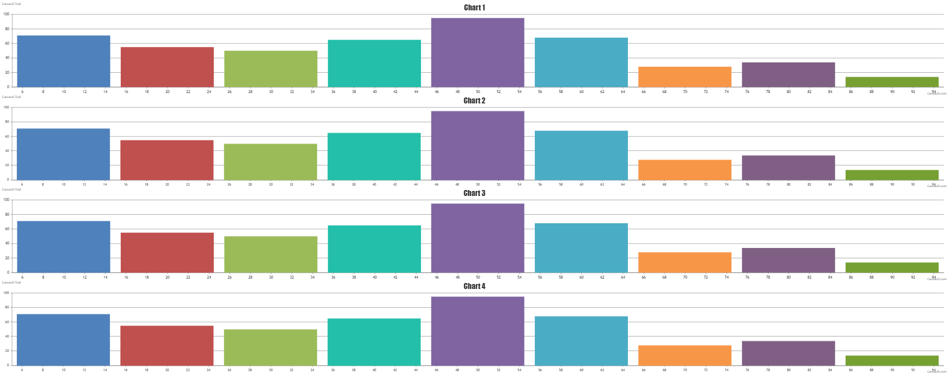
__
Priyanka M S
Team CanvasJSPlease take a look at this jsfiddle. You can also use scaleBreaks to achieve the same.
__
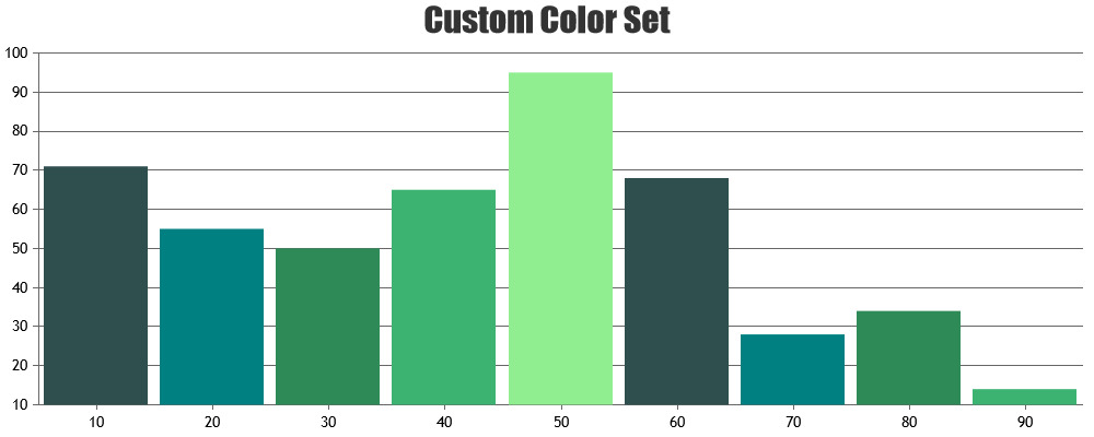
Priyanka M S
Team CanvasJSThe option to customize the themes are not available as of now. However, you can use customize the colorset of the chart. Please refer documentation for more customization options available with live examples.
__
Priyanka M S
Team CanvasJS