Login to Ask a Question or Reply
Forum Replies Created by Priyanka M S
-
himanshu,
Thanks for reporting the issue. We will look into the issue and fix it in future releases.
__
Priyanka M S
Team CanvasJSChanging font weight or color of the axis label for individual dataPoint is not possible as of now.
However, you can use stripLines to achieve the same. Please take a look at this jsfiddle, where the fontColor and fontWeight of stripLine labels are set to achieve a label as that of axis label.
__
Priyanka M S
Team CanvasJSIf viewportMinimum and viewportMaximum are not set/ reset, minimum and maximum values of axis will become the viewport’s range. So, when you are trying to reset viewportMinimum/viewportMaximum, do consider and reset minimum/maximum accordingly.
__
Priyanka M S
Team CanvasJSIn the jsfiddle provided, a dataSeries is created for every unique ‘grade’. In that case, the first dataSeries has 4 dataPoints where as the remaining 5 dataSeries has 3 dataPoints each, for which the axisX labels are rendered accordingly. Also in any multiseries chart, the labels rendered along axisX will be that of the last dataSeries. Because of which you can see the label ‘2018-2019’ repeated. By disabling shared tootTip, you can observe this behavior clearly.
__
Priyanka M S
Team CanvasJSCould you please create a sample project depicting your issue and share it over Onedrive or Google-Drive? So that we can look into the code, understand your scenario better and help you out.
__
Priyanka M S
Team CanvasJSCould you please create a sample project depicting your issue and share it over Onedrive or Google-Drive, so that we can look into the code, understand your scenario better and help you out?
__
Priyanka M S
Team Canvas JShimanshu,
If interval is not set, it gets automatically calculated based on the values of dataPoints. The spacing is different because the dataPoint x-values in both the examples(your fiddle and CanvasJS website) are different. The minimum, maximum and interval is calculated based on the dataPoints you provide and spacing is calculated accordingly.
__
Priyanka M S
Team CanvasJSindexLabels are skipped whenever they get closer to other labels – this behavior is by design. On reducing width of chart the index labels get close to each other and looks clumpsy. Hence few indexLabels gets skipped.
__
Priyanka M S
Team CanvasJSPlease take a look at this updated sample project.
Here are the few changes made to your project:
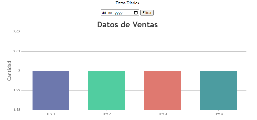
1. The variablesDE TAQUILLA 4was not defined with any values. Now it’s defined.
2. Make sure the dataPoints are available before the chart is rendered. The PHP code for SQL is written before the script for rendering chart.
3. Used JSON_NUMERIC_CHECK as parameter in json_encode() method in order to convert string value of dataPoint(PHP variable) to it’s corresponding numeric value.
__
Priyanka M S
Team CanvasJS[Update]
You can achieve stacked line chart with the help of stacked area chart by settingfillOpacity: 0. Please take a look at this jsfiddle.himanshu,
You can achieve stacked line chart with the help of stacked area chart by customizing it with
color: "transparent"and using lineColor, markerColor and toolTipContent properties based on your requirement. Please take a look at this jsfiddle.__
Priyanka M S
Team CanvasJS-
This reply was modified 7 years, 8 months ago by
Vishwas R.
Himanshu,
Axis minimum and maximum depends on the first data point value, last data point value and the interval. Hence, spacing to the left and right of chart will be calculated based on the axis minimum, maximum and interval.
The left x value given is that of 12 am, but the chart always starts from 11:30 no matter what the width of the chart is.
Axis X is a time scale and dataPoints are placed on the scale based on it’s values.
__
Priyanka M S
Team CanvasJSThe z-scaling of the largest bubble, depends on the z-scaling of the smallest bubble. If you have a reference dataPoint, which is considerably small compared to the remaining dataPoints, you can notice the actual difference in size among the dataPoints.
You can add a dummy/reference dataPoint and setting the
color: "transparent", toolTipContent: null, will make the dummy dataPoint invisible/ inactive. Please take a look at this jsfiddle, which has a reference dataPoint and reads user’s data from external JSON.__
Priyanka M S
Team CanvasJSWe are looking into it, and will get back to you at the earliest.
__
Priyanka M S
Team CanvasJSMohamed,
Crosshair is used to show the x & y axis values at the current mouse co-ordinates or the nearest data points. It is not possible to drag and drop Crosshair. However, you can achieve drag and drop functionality with striplines. Please take a look at this jsfiddle.
You can accept input value from user and place a stripline at specified position. Please take a look at this jsfiddle.
__
Priyanka M S
Team CanvasJS -
This reply was modified 7 years, 8 months ago by