Login to Ask a Question or Reply
Forum Replies Created by Manoj Mohan
-
You can achieve similar result in React by adding methods
calculateValuesInPixelanddrawHorizontalLinesin component and call respective methods in the ComponentDidMount lifecycle method as shown in the below code snippet.class App extends Component { constructor(props) { super(props); this.points = [ { x1: 35, x2: 75, y: 75}, //line 1 { x1: 35, x2: 75, y: 35} //line 2 ]; this.valuesInPixel = [ { x1: null, x2: null, y: null}, //line 1 { x1: null, x2: null, y: null} //line 2 ]; } calculateValuesInPixel = () => { for(var i = 0; i < this.points.length; i++) { this.valuesInPixel[i].x1 = this.chart.axisX[0].convertValueToPixel(this.points[i].x1); this.valuesInPixel[i].x2 = this.chart.axisX[0].convertValueToPixel(this.points[i].x2); this.valuesInPixel[i].y = this.chart.axisY[0].convertValueToPixel(this.points[i].y); } } drawHorizontalLines = () => { for(var i = 0; i < this.valuesInPixel.length; i++) { this.chart.ctx.beginPath(); this.chart.ctx.moveTo(this.valuesInPixel[i].x1, this.valuesInPixel[i].y); this.chart.ctx.lineTo(this.valuesInPixel[i].x2, this.valuesInPixel[i].y); this.chart.ctx.strokeStyle = "#FF0000"; this.chart.ctx.stroke(); } } componentDidMount() { this.calculateValuesInPixel(); this.drawHorizontalLines(); window.addEventListener('resize', this.drawHorizontalLines ); } componentDidUnMount() { window.removeEventListener('resize', this.drawHorizontalLines ); } . . . }Please check out this StackBlitz example for complete working code.
—-
Manoj Mohan
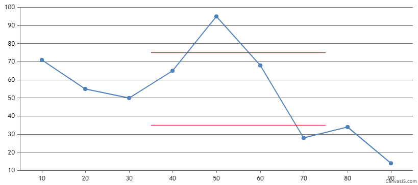
Team CanvasJSYou can draw additional lines as per your requirement using context of canvas as shown in this code snippet.
function calculateValuesInPixel(){
  for(var i = 0; i < points.length; i++){
    valuesInPixel[i].x1 = chart.axisX[0].convertValueToPixel(points[i].x1);
    valuesInPixel[i].x2 = chart.axisX[0].convertValueToPixel(points[i].x2);
    valuesInPixel[i].y = chart.axisY[0].convertValueToPixel(points[i].y);
  }
}

function drawHorizontalLines(){
  for(var i = 0; i < valuesInPixel.length; i++){
    chart.ctx.beginPath();
    chart.ctx.moveTo(valuesInPixel[i].x1, valuesInPixel[i].y);
    chart.ctx.lineTo(valuesInPixel[i].x2, valuesInPixel[i].y);
    chart.ctx.strokeStyle = "#FF0000";

    chart.ctx.stroke();
  }
}
Please take a look at this JSFiddle for complete working code.
—-
Manoj Mohan
Team CanvasJSThe striplines are drawn from left to right of plotarea in case of axisY and top to bottom of plotarea in case of axisX.
Can you kindly create a JSFiddle with your scenario and share it with us along with pictorial representation so that we can understand your requirement better and suggest you a possible solution?
—-
Manoj Mohan
Team CanvasJSSetting negative margin to x-axis will reduce the gap towards the bottom of the chart. However, as we are not sure about the entire chart options that being passed, we suggest you to create a JSFiddle with your scenario and share it with us so that we can understand it better and suggest you accordingly.
—-
Manoj Mohan
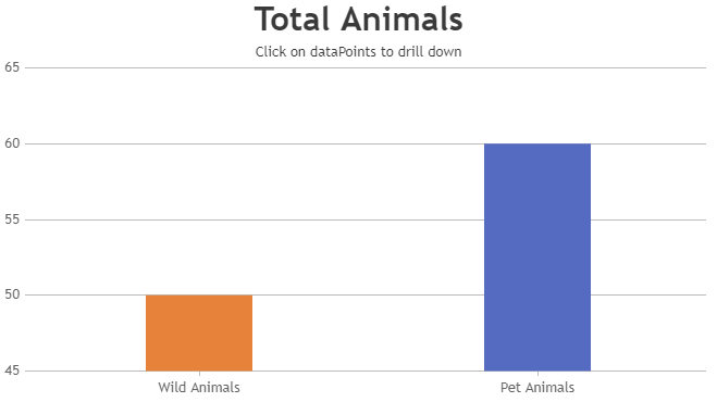
Team CanvasJSYou can create drilldown chart by updating the chart options dynamically on clicking dataPoints using click event handler. Please take a look at this JSFiddle for an example on multi-level drilldown chart.
—-
Manoj Mohan
Team CanvasJSIt seems the sample provided by you is restricted and requires permission. Can you please make the sample public so that we can access it? However, if you are looking to show percentage values in indexLabel, you can do so by using
"#percent"in the indexLabel.—-
Manoj Mohan
Team CanvasJSIn the code shared above, data is not getting updated as the template are rendered once with the data being sent and you are updating the chart dataPoint with same value on each interval. In order to update the data from database, you can create a route let say
/get_cart_ratewhich will serve the data from the database on request. Then, you can use fetch request to retrieve the value and update the dataPoints. Please take a look at the sample code below for the same@app.route("/get_cart_rate") def get_cart_rate(): cur = db.get_db().execute("SELECT item_name, quantity FROM cart_service order by id") rv = cur.fetchall() cur.close() index = [] data = {} for i in rv: index.append(i) for key, value in index: data[key] = data.get(key, 0) + value return jsonify(data) . . template file: function getData() { fetch("/get_cart_rate") .then(response => response.json()) .then(data => { dps = []; for (var label in data) { if (data.hasOwnProperty(label)) { dps.push({ label: label, y: data[label] }) } } chart.data[0].set("dataPoints", dps); setTimeout(getData, 4000); }); } setTimeout(getData, 2000);Also, check out this sample project for complete working code.

—-
Manoj Mohan
Team CanvasJSFebruary 2, 2022 at 6:46 pm in reply to: Error: Cannot read properties of null (reading ‘style’) #36860From the stackblitz example shared above, it seems like you are trying to update the dataPoints on clicking update button. You can update the datatPoints without recreating the chart as shown in our documentation page. Re-creating the chart on every update may impact the performance.
If this doesn’t resolve your issue, can you kindly brief us further about your requirement so that we can understand your scenario better and help you out?
—-
Manoj Mohan
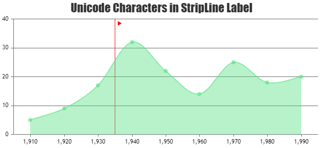
Team CanvasJSIn order to show flag on other side, you need to add one dummy stripline with label as unicode “\u2BC6”. Please take a look at the code snippet below to add dummy stripline
function addDummyStripeLine(value, chart) {
  	chart.axisX[0].addTo("stripLines", {
      label : "\u2BC6",
      value: 1935 + chart.axisX[0].convertPixelToValue(chart.axisX[0].stripLines[0].get("labelFontSize") + 5 + chart.axisY[0].bounds.x2) - chart.axisX[0].viewportMinimum,
      color: "transparent",
      labelFontColor: "red"
    })
  }
Also, check out this JSFiddle for complete working code.
—-
Manoj Mohan
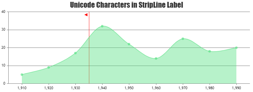
Team CanvasJSYou can position the stripLine label either “inside” or “outside” using labelPlacement property. To add arrow to stripLine label, you can use unicode as shown in the code snippet below
axisX:{
  stripLines:[
    {
      value:1935,
      label : "\u25B2",
      color: "red",
      labelFontColor: "red"
    }
  ]
}
Also, please check out this JSFiddle for complete code. You can refer to this Wikipedia page for a list of Unicode characters.
—-
Manoj Mohan
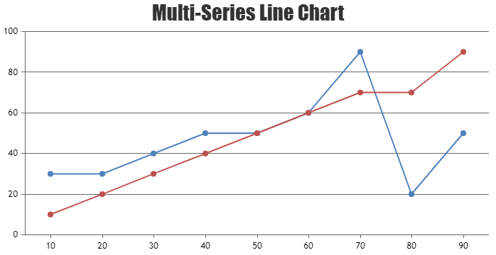
Team CanvasJSJanuary 27, 2022 at 6:47 pm in reply to: Interpolate the missing data as last value in Multiseries chart #36782In order to add missing dataPoint on each series, you can loop through each dataSeries and find the missing dataPoints and push into respective dataSeries as shown in the code snippet below.
function addMissingDataPoints(chart) {
	var missingValues = [];
  for(var i = 0; i < chart.options.data.length; i++) {
    missingValues[i] = [];
    var dataSeriesToBeChecked = chart.options.data[i];
    for(var j = 0; j < chart.options.data.length; j++) {
      if(j == i) continue;
      var currentDp = chart.options.data[j].dataPoints;
      for(var k = 0; k < currentDp.length; k++) {
        var dp = getPreviousDp(currentDp[k].x, dataSeriesToBeChecked.dataPoints);
        if(dp === true)
          continue;
        missingValues[i].push(dp);
      }
    }
  }

  for(var i = 0; i < chart.options.data.length; i++) {
    for(var j = 0; j < missingValues[i].length; j++) {
      // push the missing values
      chart.options.data[i].dataPoints.push(missingValues[i][j]);
    }
    //sorting the dataPoints so that missing values get adjusted to appropriate place
    chart.options.data[i].dataPoints.sort((a,b) => (a.x < b.x ? -1 : (a.x > b.x ? 1 : 0)))
  }
}

function getPreviousDp(xValue, dps) {
  for(var i=0; i<dps.length; i++) {
    if(dps[i].x == xValue) {
      return true;
    }
    if(dps[i].x > xValue)
      break;
  }
  return {x: xValue,  y: (i <= 0 ? null : dps[i-1].y)};
}
Please take a look at this JSFiddle for complete code.
—-
Manoj Mohan
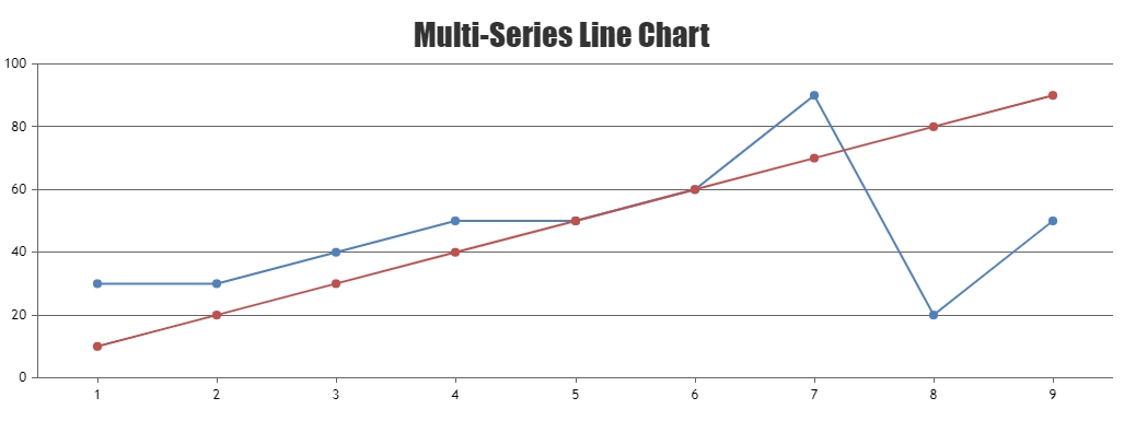
Team CanvasJSJanuary 21, 2022 at 6:24 pm in reply to: Interpolate the missing data as last value in Multiseries chart #36719You can loop through datapoints and add the missing datapoint before rendering the chart. Please find the code-snippet below.
for(i=0; i<chart.options.data.length; i++) {
	var dps = chart.options.data[i].dataPoints;
  for(var j = 1; j < dps.length; j++) {
    if(dps[j].x > (j+1))
      dps.splice(j, 0, {x: j+1, y: dps[j-1].y});
  }
}
Also, check out this JSFiddle for complete working sample.
—-
Manoj Mohan
Team CanvasJSCan you kindly create a sample project reproducing the issue you are facing and share it with us over Google-Drive or OneDrive so that we can look into the code, run it locally at our end to understand the scenario better and help you out?
—-
Manoj Mohan
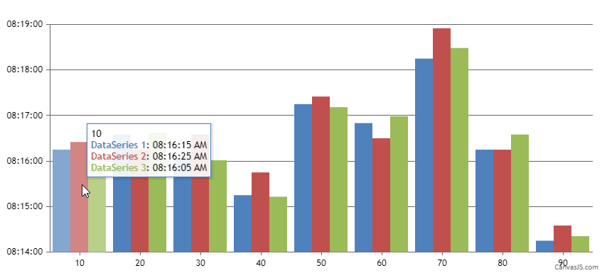
Team CanvasJSDecember 27, 2021 at 7:26 pm in reply to: Time in Axis Y and sync cross hair in multiple series #36585In order to display y values of all the dataSeries in a toolTip, you can loop through each of the e.entries and display the respective y values in appropriate format. Please check out the below code snippet.
contentFormatter: function (e) {
  var content = "";
  content += e.entries[0].dataPoint.x + "<br/>"
  for(var i=0; i<e.entries.length; i++) {
    content += "<span style= \"color:"+e.entries[i].dataSeries.color + "\">" + e.entries[i].dataSeries.name + "</span>: " + CanvasJS.formatDate(e.entries[i].dataPoint.y,"hh:mm:ss TT") + " <br/>";	//Formatting dateTime in ToolTip
  }
  return content;
}
Also, take a look at this JSFiddle for complete code.
—-
Manoj Mohan
Team CanvasJS
