Login to Ask a Question or Reply
Forum Replies Created by Manoj Mohan
-
@ali136m,
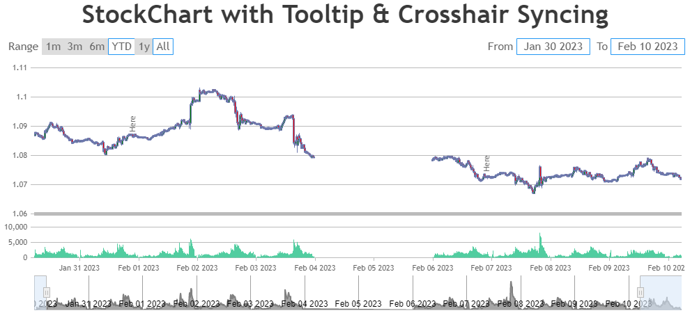
To overcome the issue you are facing, you can hide the dataseries which are outside of the viewport range by setting visible property to ‘false’ in rangeChanging event handler. Please take a look at the code snippet below for the same.
rangeChanging: function(e) {
  if(e.stockChart.charts[0].data.length > 1) {
    var chart = e.stockChart.charts[0];
    for(i=1; i<chart.data.length; i++) {
      if(chart.options.data[i].minMaxXValue[0] > e.maximum || chart.options.data[i].minMaxXValue[1] < e.minimum)
        chart.data[i].get('visible') && chart.data[i].set('visible', false, false);
      else
        !chart.data[i].get('visible') && chart.data[i].set('visible', true, false);
    }
  }
}
Also, check out this updated JSFiddle for complete working code.
—-
Manoj Mohan
Team CanvasJS@ali136m,
The range of an axis depends on multiple factors like dataseries attached to it, the datapoint values of all the dataseries visible in the viewport, etc. In your case, the issue might be happening due to datapoint values in line series. Removing the line series seems to be working fine as shown in this updated JSFiddle.

—-
Manoj Mohan
Team CanvasJSThe sample shared above seems to be working fine. If you are still facing issue, can you kindly share the sample reproducing the issue over Google-Drive or Onedrive so that we can look into your code, run it locally at our end to understand the scenario better and help you out?

—-
Manoj Mohan
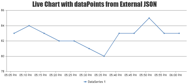
Team CanvasJSIt seems like you are not rendering the chart after updating the datapoints on ajax request. Calling
chart.render()after updating the datapoints will work fine in your case. Please take a look the code snippet below for the same.$.getJSON('https://trionacgm.fly.dev/api/v1/entries.json?count=12', function(data) { chart.options.data[0].dataPoints = []; $.each(data, function(key, value) { chart.options.data[0].dataPoints.push({ x: (value['date']), y: Number(value['sgv']) }); }); chart.render(); });Also, check out this JSFiddle for complete working code.

—-
Manoj Mohan
Team CanvasJS@anu,
Can you kindly share sample data and brief us more about your requirement so that we can understand your scenario better and help you out?
—
Manoj Mohan
Team CanvasJSCanvasJS is a JavaScript library that render charts on the client-side. To expose API for downloading chart, you will have to run it in a headless browser & serve the captured screenshot on request. Please take a look at this sample project which uses puppeteer to save the image in the sever side.
If this doesn’t fulfill your requirement, kindly brief us further about your requirement or an example so that we can understand your scenario better and help you out.
—-
Manoj Mohan
Team CanvasJSCan you please brief us further about your requirement along with a pictorial representation or an example so that we can understand your scenario better and help you out?
—-
Manoj Mohan
Team CanvasJSYou can get your extra data passed to datapoints using chart object as shown below
var pageName = chart.options.data[0].dataPoints[0].extraData[0].value
var alertMessage = chart.options.data[0].dataPoints[0].extraData[1].value
If you are still facing issue, kindly create a sample project reproducing the issue you are facing and share it with us over Google-Drive or Onedrive along with sample data so that we can look into your code, run it locally at our end to understand the scenario better and help you out?
—-
Manoj Mohan
Team CanvasJS[UPDATE]
We have just released Chart v3.14.0 Beta1 with this bug fix. Please refer to the release blog for more information. Do download the latest version from download page & let us know your feedback.
Thanks for the reporting the use-case. We will look into it further, understand the scenario better and get back to you at the earliest. Meanwhile, you can overcome this by setting y-axis interval to a value, 1 in this case. Please find the code-snippet below.
axisY:{
    title: "Axis Y Title",
    interval: 1
}
Also, please take a look at this updated JSFiddle for working code.
—-
Manoj Mohan
Team CanvasJS@avb,
As mentioned in the previous reply, you can enable zooming in the individual charts of stockchart by setting zoomEnabled to true. Please take a look at code snippet below.
.
.
.
charts: [{
  zoomEnabled: true,
  axisX: {
    crosshair: {
      enabled: true,
      valueFormatString: "MMM DD, YYYY HH:mm:ss"
    }
  }
.
.
.
Also check out this updated JSFiddle for the example.
—
Manoj Mohan
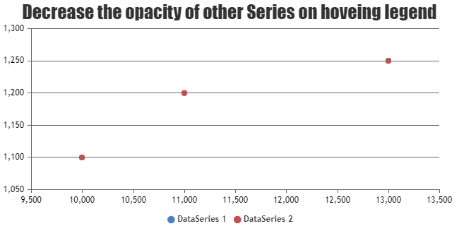
Team CanvasJSFebruary 7, 2023 at 7:08 pm in reply to: Adjust the priority of the data points displayed in the scatter plot #42167With the help of itemouseover and itemmouseout event handler of legend, you can highlight the dataseries of the respective hovered legend. Please take a look at this code-snippet below for the same.
itemmouseover: function(e){
  for(var i=0; i<e.chart.data.length; i++) {

    if(i != e.dataSeriesIndex)
      e.chart.options.data[i].fillOpacity = 0;
  }
  e.chart.render();
},
itemmouseout: function(e){
  for(var i=0; i<e.chart.data.length; i++) {
    if(i != e.dataSeriesIndex)
      e.chart.options.data[i].fillOpacity = null;
  }
  e.chart.render();
}
Also, check out this JSFiddle for complete working code.

—-
Manoj Mohan
Team CanvasJSCan you kindly create JSFiddle reproducing the issue you are facing and share it with us so that we can reproduce the issue at our end, understand the scenario better and help you out??
From what we have observed, sometimes things get delayed mostly when we are not able to reproduce the issue or not able to understand the exact requirements.
Having a JSFiddle helps us in figuring out the issue and many a times we can just edit your code on JSFiddle to fix the issue right-away.
—–
Manoj Mohan
Team CanvasJSPlease have a look at this gallery example on creating chart using JSON data received from ajax request in ASP.NET MVC. To add color in the datapoints, along with the above mentioned solution you need to add color property while parsing the JSON received from the service. Please check out the code snippet below for the same.
function addData(data) {
  for (var i = 0; i < data.length; i++) {
    dataPoints.push({
      x: new Date(data[i].x),
      y: data[i].y,
      color: data[i].color
    });
  }
  chart.render();
}
If you are still facing issue, kindly create a sample project reproducing the issue you are facing and share it with us over Google-Drive or Onedrive along with sample data so that we can look into your code, run it locally at our end to understand the scenario better and help you out?
—-
Manoj Mohan
Team CanvasJSPlease check out this gallery example for creating range bar chart in ASP.NET MVC. In order to add color to the datapoint, you can modify the DataPoint Model class to include color property as well as while creating DataPoint object include color required. Please take a look at the below code snippet for the same
/* DataPoint Model Class */
public DataPoint(string label, double[] y, string color)
{
  this.Label = label;
  this.Y = y;
  this.Color = color;
}

//Explicitly setting the name to be used while serializing to JSON.
[DataMember(Name = "label")]
public string Label = "";

//Explicitly setting the name to be used while serializing to JSON.
[DataMember(Name = "y")]
public double[] Y = null;

[DataMember(Name = "y")]
public string Color = null;
.
.
/* Controller */
dataPoints.Add(new DataPoint("Owl", new double[] { 200, 1200 }, "#369EAD"));
.
.
—-
Manoj Mohan
Team CanvasJS