Login to Ask a Question or Reply
Forum Replies Created by Manoj Mohan
-
We have released CanvasJS StockChart v1.15.15 GA with this fix. Please refer to the release blog for more information. Do download the latest version from download page & let us know your feedback.
—-
Manoj Mohan
Team CanvasJSThanks for reporting this use case. We will look into it and improve it in our future releases.
—-
Manoj Mohan
Team CanvasJSMarch 11, 2026 at 6:07 pm in reply to: Disable minimum chart point amount requirement for zoom #62014Marco,
Sorry, it is not possible to remove the restrictions as of now.
—-
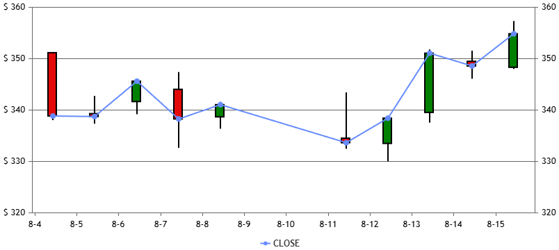
Manoj Mohan
Team CanvasJSIn the shared example, the line and candlestick charts are plotted on different axes, i.e., the primary and secondary y-axes, and their ranges are not aligned with each other. Because of this, it visually appears that the close line and close prices do not match. To overcome this, you can sync the ranges of both axes using the viewportMinimum and viewportMaximum properties of the y-axis, as shown in the code snippet below.
function syncYAxesRange(chart) {
  var viewportMinimum = +Infinity, viewportMaximum = -Infinity;

  if(chart.axisY)
    chart.axisY.forEach((axis) => {
      viewportMaximum = Math.max(axis.viewportMaximum, viewportMaximum);
      viewportMinimum = Math.min(axis.viewportMinimum, viewportMinimum);
    })

  if(chart.axisY2)
    chart.axisY2.forEach((axis) => {
      viewportMaximum = Math.max(axis.viewportMaximum, viewportMaximum);
      viewportMinimum = Math.min(axis.viewportMinimum, viewportMinimum);
    })

  if(chart.axisY)
    chart.axisY.forEach(axis => {
      axis.set("viewportMaximum", viewportMaximum, false);
      axis.set("viewportMinimum", viewportMinimum);
    })

  if(chart.axisY2)
    chart.axisY2.forEach((axis) => {
      axis.set("viewportMaximum", viewportMaximum, false);
      axis.set("viewportMinimum", viewportMinimum);
    })
}
syncYAxesRange(chart);
Also, check out this updated JSFiddle for complete working code.
—-
Manoj Mohan
Team CanvasJSJanuary 12, 2026 at 5:55 pm in reply to: Applying customBreak to Navigator breaks Axis labels #61827Thanks for reporting the use-case. We will debug and analyze the use-case further to understand the exact scenario and get back to you at the earliest.
—-
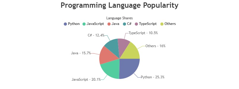
Manoj Mohan
Team CanvasJSOctober 9, 2025 at 5:56 pm in reply to: Is it possible to add heading text above the legend of a chart? #61514Adding title to the legend items is not possible as of now. However, you can use subtitles to make it look like title for the legend items by placing the legend at the top of the chart, as shown in the below code snippet.
subtitles: [{
  text: "Language Shares"
}],
legend: {
 verticalAlign: "top"
},
Check out this JSFiddle for complete code.
—-
Manoj Mohan
Team CanvasJSSeptember 30, 2025 at 5:52 pm in reply to: Contrast ratio of text present under ‘Page Title’ is less than 4.5:1. #61492Thank you for posting on the CanvasJS Forum! We’d be happy to help you with any CanvasJS related questions or issues you might have. We noticed that the URL in the shared Codepen redirects to a login page, which makes it challenging to review, and it doesn’t seem to involve CanvasJS charts in Codepen demo or login page.
Could you kindly let us know if you’re experiencing a specific issue with CanvasJS? If so, please share details like the CanvasJS version, a relevant code snippet, or a publicly accessible URL demonstrating the problem with a CanvasJS chart or feature.
—-
Manoj Mohan
Team CanvasJSJuly 25, 2025 at 6:32 pm in reply to: After using license code water mark and feature is not align properly #61246Kindly download commercial version of CanvasJS from My Account page. After downloading the commercial version, please replace the CanvasJS Trial Version source file in your application with the Commercial Version and make sure to clear the browser cache.
some of feature is not align properly
The trial version that you download from Download page is a fully featured version of CanvasJS chart along with credit link. Kindly try clearing the browser cache & see if that fixes the issue. If you are still facing the issue, kindly create a sample project reproducing the issue you are facing and share it over email to sales@canvasjs.com along with order details.
—-
Manoj Mohan
Team CanvasJSSorry, this feature is not available as an in-built feature for now.
—-
Manoj Mohan
Team CanvasJSTo interpret x-values as timestamps, set the xValueType to
dateTimein the dataSeries options.—-
Manoj Mohan
Team CanvasJSI have been trying to set the interval and interval type of the Chart X Axis in my React app and it is throwing a run-time error.
I am trying to set the interval type to “day” or “month”.
But it crashes!Browser can crash if the overall interval is too small because of interval & intervalType combination. You can avoid this by setting interval & intervalType, according to axis range, such that there are minimal labels to be rendered on the axis. If you are still facing the issue, kindly share the JSFiddle or CodePen reproducing the issue so that we can look into the options being passed, understand your scenario better and help you out.
I tried the same with the JSFiddle example given in the documentation and that has the same issue. It is failing with an error “Uncaught ReferenceError: CanvasJS is not defined”
There seems to be some issue in JSFiddle because of which the script mentioned in the resource section doesn’t get loaded. To overcome this, you can place the code to include
https://cdn.canvasjs.com/canvasjs.min.jsscript inside the html content and should work fine in your case.—-
Manoj Mohan
Team CanvasJSShannon,
Glad that you figured it out.
—-
Manoj Mohan
Team CanvasJSShannon,
Can you kindly create a JSFiddle reproducing the issue you are facing along with sample data (dummy data) & share it with us so that we can look into the code / chart-options being used, understand the scenario better and help you out?
—-
Manoj Mohan
Team CanvasJSMay 8, 2025 at 9:48 am in reply to: How to render non-continuous time intervals separately in CanvasJS StockCharts? #60904You can define interval groups and their associated styles (like color or lineDashType) in an object. Then, iterate through the dataPoints and assign each dataPoint to the appropriate dataSeries as per associated interval groups. Please take a look at this StackBlitz project for complete working code.
And also for each of those groups do we calculate the regression line separately?
You can use line chart to draw regression line. Please refer to this article for more information on performing regression analysis with CanvasJS.
—-
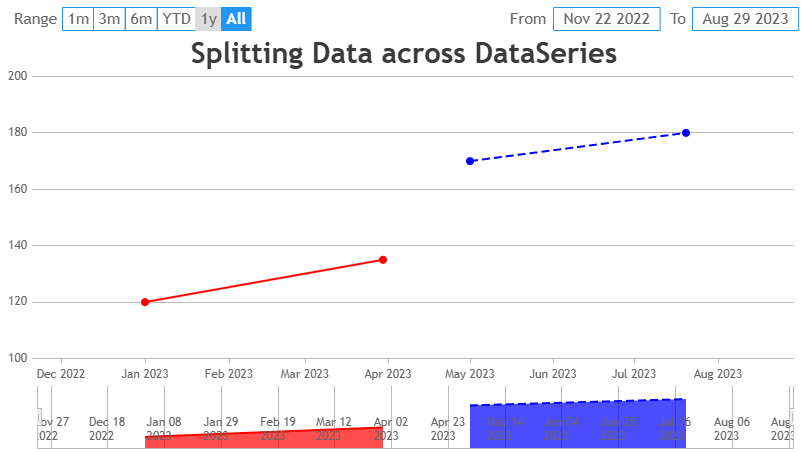
Manoj Mohan
Team CanvasJSMay 5, 2025 at 6:18 pm in reply to: How to render non-continuous time intervals separately in CanvasJS StockCharts? #60890Yes, you can achieve this in CanvasJS by splitting your data into multiple series, each representing a specific time period. Each series can have its own unique styling, such as different colors, line dash-type or markers. Since the x-axis is time-based, CanvasJS will automatically create gaps for the periods without data (like April or August) and the series will overlap if needed. Please have a look at the below code snippet for splitting the data across multiple dataseries.
data: [{
  type: "line",
  dataPoints: [
    { x: new Date(2023, 0, 1), y: 120 },
    { x: new Date(2023, 2, 30), y: 135 }
  ],
  color: "#FF0000"  // Red for Jan-Mar
}, {
  type: "line",
  dataPoints: [
    { x: new Date(2023, 4, 1), y: 170 },
    { x: new Date(2023, 6, 20), y: 180 }
  ],
  color: "#0000FF",  // Blue for May-Jul
  lineDashType: "dash"   // Dashed line style
}]
Also, check out this JSFiddle for complete code.
—-
Manoj Mohan
Team CanvasJS