Login to Ask a Question or Reply
You must be logged in to post your query.
Home › Forums › Chart Support › Creating a chart from data with SQL DB [PHP]
Creating a chart from data with SQL DB [PHP]
- This topic has 14 replies, 2 voices, and was last updated 7 years, 8 months ago by
Vishwas R.
Tagged: php sql canvasjs
-
August 6, 2018 at 3:39 am #22120
Hello, I would like to create a graph on the HTML page to present weather data that is stored in the SQL database. Unfortunately, I have no experience with Canvas JS. Internet forums have not solved my problems. Does anyone have any simple working example? How to do it?
Thank you in advance for your answer!
August 6, 2018 at 9:41 am #22123Please refer Chart Data from Database for an example on rendering chart with data from database.
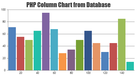
You can also download PHP samples from our Download Page and checkout the examples.—
Vishwas R
Team CanvasJSAugust 7, 2018 at 3:03 am #22142OK thanks!
I managed to create a graph so that everything started working, I had to connect the script: jquery.min.js
However, when I try to connect license files locally, nothing is displayed. The browser detects errors:– Uncaught ReferenceError: jQuery is not defined at jquery.canvasjs.min.js: 920
– Uncaught ReferenceError: $ is not defined at window.onloadWhat is the cause of such errors?
August 7, 2018 at 10:22 am #22145$ / jQuery is not definedis caused when jQuery is not loaded in the web-page. Including jQuery should work fine in your case.If this doesn’t solve the issue you are facing, kindly create a static HTML file reproducing the issue you are facing and share it over Google-Drive or Onedrive so that we can look into your code and help you out.
—
Vishwas R
Team CanvasJSAugust 7, 2018 at 7:18 pm #22155OK thanks!
Problem solved. I need to have 2 files connected: jquery.canvasjs.min and jquery.min.I have one more question:
My database stores the date in the format: 2018-08-04 13:28:2. I would like to extract only an hour and a minute and display them on the X axis.
Unfortunately, the “valueFormatString property” does not work. How can I solve this problem?August 8, 2018 at 9:36 am #22159Can you kindly share sample project along with sample database over Google-Drive or Onedrive so that we can look at your code, understand it better and help you out?
—
Vishwas R
Team CanvasJSAugust 8, 2018 at 7:42 pm #22166Ok, here is an example project with db: Google Drive
In addition, I would like to show data from the soil and humidity column on one graph. However, I can not add many y-axis. Can you help me?
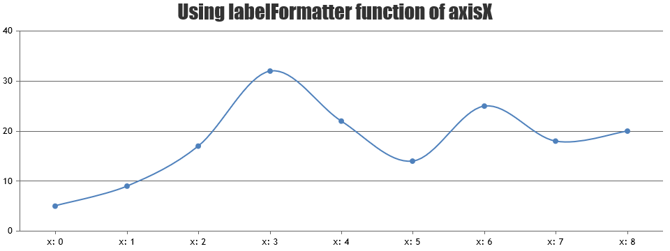
August 9, 2018 at 10:22 am #22169valueFormatString is used to format numbers and date time values (x-values) that appears on axisX but not for labels. Passing x-value to dataPoints should work fine in your case
dps.push({"x":new Date(result[i].time), "y":result[i].humidity});.To format labels, you can use labelFormatter.
—
Vishwas R
Team CanvasJSAugust 9, 2018 at 7:38 pm #22180It works! Thank you. I created a graph with two y-axes. How can I give them names and add a legend?
-
This reply was modified 7 years, 11 months ago by
d3bsky.
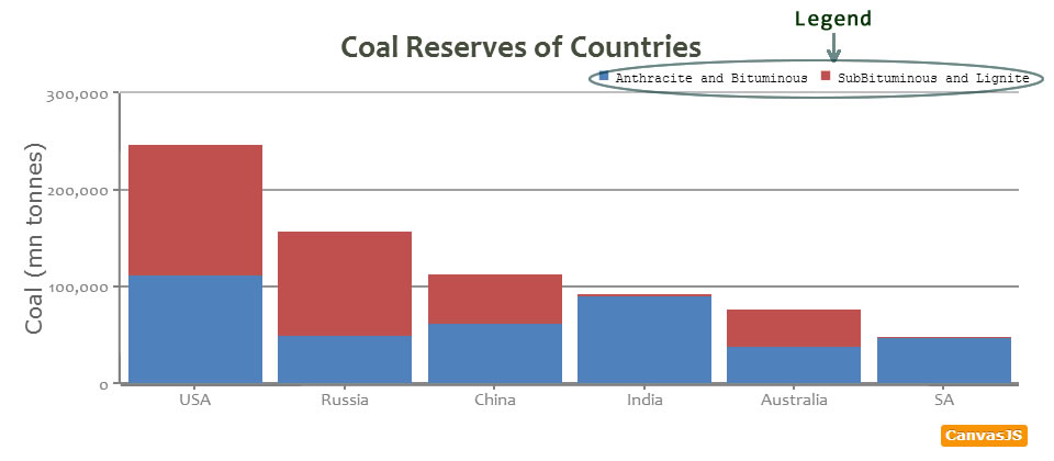
August 10, 2018 at 9:50 am #22185Legends will be shown for every dataSeries. You can enable legend by setting showInLegend property in dataSeries level to true. Text shown in legend can be set with the help of name or legendText.
—
Vishwas R
Team CanvasJSAugust 13, 2018 at 3:36 am #22225Thanks!
September 14, 2018 at 8:38 pm #22606Can I change the type of time displayed to 24 hour format? Using your advice, I display the hour using:
dps.push({"x":new Date(result[i].time), "y":result[i].temp});on the x-axis I have an hour, however, the date is displayed on the chart next to the value, eg: “02 Sep 18:” Can I change it?-
This reply was modified 7 years, 9 months ago by
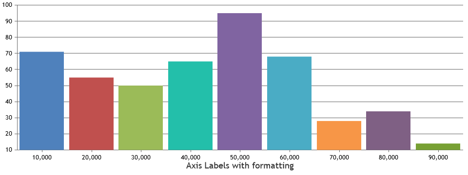
September 17, 2018 at 10:04 am #22620You can set valueFormatString to “HH:mm” to display hours in 24hours format along with minutes. You can customize the format of labels being displayed in axisX using valueFormatString, please refer documentation for more available options.
—
Vishwas R
Team CanvasJSOctober 13, 2018 at 7:03 pm #23043Thanks for help, nowhere I can change the information on how to change the format of the displayed date which is displayed when you hover over a point of the chart. How can I change this?
October 15, 2018 at 9:38 am #23049You can format x-value and y-value displayed in toolTip / indexLabel by setting xValueFormatString and yValueFormatString respectively whereas valueFormatString just defines the format of axis-labels.
xValueFormatString: "HH:mm",
yValueFormatString: "#,###.##"
—
Vishwas R
Team CanvasJS -
This reply was modified 7 years, 11 months ago by
Tagged: php sql canvasjs
You must be logged in to reply to this topic.