• Demos
    • JavaScript Charts
    • JavaScript StockCharts
  • Download/NPM
    • Download CanvasJS
    • Install via NPM
  • Integrations
    Front End Technology Samples
    • React Charts
    • Angular Charts
    • Vue.js Charts New!
    • jQuery Charts
    • Dashboards
    Server Side Technology Samples
    • PHP Charts
    • Python Charts New!
    • ASP.NET MVC Charts
    • Spring MVC Charts
    • JSP Charts
  • License
  • Blog
  • Docs
    • Chart Documentation
    • StockChart Documentation
  • Support Forum
    • Chart Support
    • StockChart Support
  • My Account
My Account
  • KEY FEATURES
    • Basic Chart
    • Chart with Animation
    • Chart with Zooming/Panning
    • Multi Series Chart
    • Chart with Multiple Axes
    • Chart with Logarithmic Axis
    • Chart with JSON Data
    • Dynamic Chart
    • Drilldown Chart
    • Responsive Chart
    • Synchronized Charts
  • LINE CHARTS
    • Line Chart
    • Dashed Line Chart
    • Multi Series Line Chart
    • Spline Chart
    • Multi Series Spline Chart
    • Step Line Chart
    • Multi Series Step Line Chart
  • BAR CHARTS
    • Bar Chart with Category Axis
    • Multi Series Bar Chart
    • Stacked Bar Chart
    • Stacked Bar 100% Chart
  • COLUMN CHARTS
    • Column Chart with Category Axis
    • Column Chart in Dark Theme
    • Multi Series Column Chart
    • Stacked Column Chart
    • Stacked Column 100% Chart
  • PIE & DOUGHNUT CHARTS
    • Pie Chart
    • Doughnut Chart
    • Doughnut Chart in Dark Theme
  • AREA CHARTS
    • Area Chart with Markers
    • Multi Series Area Chart
    • Spline Area Chart
    • Multi Series Spline Area Chart
    • Step Area Chart
    • Stacked Area Chart
    • Stacked Area 100% Chart
  • RANGE CHARTS
    • Range Column Chart
    • Multi Series Range Column Chart
    • Range Bar Chart
    • Multi Series Range Bar Chart
    • Range Area Chart
    • Multi Series Range Area Chart
    • Range Spline Area Chart
    • Multi Series Range Spline Area Chart
  • BUBBLE & SCATTER CHARTS
    • Bubble Chart with 3-Dimensional Data
    • Bubble Chart in Dark Theme
    • Scatter Chart
    • Multi Series Scatter Chart
  • FUNNEL & PYRAMID CHARTS
    • Funnel Chart with Index Labels
    • Funnel Chart without Neck
    • Pyramid Chart
  • FINANCIAL CHARTS
    • Candlestick Chart
    • Candlestick Chart from JSON Data
    • OHLC Chart
    • OHLC Chart from JSON Data
    • Box & Whisker Chart
    • Waterfall Chart
  • COMBINATION CHARTS
    • Pareto Chart
    • Error Bar Chart
    • Combination of Range Area & Line Chart
    • Combination of Candlestick & Line chart
  • DYNAMIC CHARTS
    • Dynamic Line Chart
    • Dynamic Column Chart
  • DATA BINDING
    • Chart with Data from CSV
    • Chart with Data from Database
    • Chart with Date-Time Axis from Database
  • JAVASCRIPT, JQUERY, REACT, ANGULAR, VUE.JS
    • JavaScript Charts
    • jQuery Charts
    • React Charts
    • Angular Charts
    • Vue.js Charts
  • SERVER SIDE TECHNOLOGIES
    • ASP.NET MVC Charts
    • PHP Charts
    • Spring MVC Charts
    • JSP Charts

Python Bubble & Scatter Charts in Django

Download Python Django Chart Samples
  • Python Django Chart Samples
  • JavaScript Chart Samples
  • React Chart Samples
  • Angular Chart Samples
  • Vue.js Chart Samples
  • jQuery Chart Samples
  • PHP Chart Samples
  • ASP.NET Chart Samples
  • JSP Chart Samples
  • Spring MVC Chart Samples
  • Dashboard Samples
  • JavaScript StockChart Samples

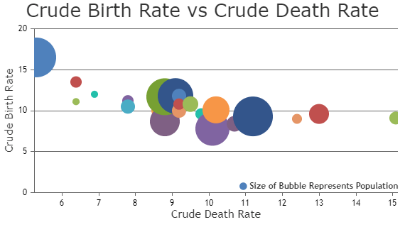
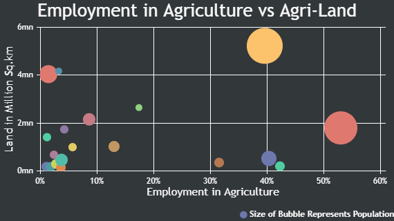
Python Bubble Chart allows you to display 3 dimensional data. Instead of plotting just two variables (x & y) that defines the position of the datapoint, Bubble Chart lets you add a third variable (z-value) to define relative size of the bubble. Bubble charts are useful in explaining complex data easily.

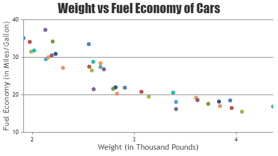
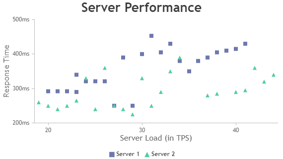
Python Scatter Charts represent data as a series of points over the axis coordinates. Hence they are also referred to as Point Charts / Scatter Plot.

Python Bubble Charts

Bubble Chart uses bubble-like symbols to depict data.

Python Bubble Chart with 3 Dimensional Data
Bubble Chart with 3-Dimensional Data
Python Bubble Chart in Dark Theme
Bubble Chart in Dark Theme

Python Scatter Charts

Scatter Chart represents data as a series of points.

Python Scatter Chart using Django
Scatter Chart
Python Multi Series Scatter Chart using Django
Scatter Chart

Features used Commonly in Python Bubble & Scatter Charts

Most commonly used features in Python Bubble & Scatter Charts include customizing markers, indexlabels, etc.

  • Size & type of the marker can be customized by setting markerSize & markerType properties.
  • Color of the marker can be changed by setting markerColor property.
  • Size of the marker can be customized by setting markerSize property
  • Indexlabel can be shown for particular datapoint by setting indexLabel property of datapoint.

Python Bubble & Scatter Chart Types

  • Python Bubble Chart
  • Python Scatter Chart

General Tips for Python Bubble & Scatter Charts

  • Use bubble chart when there are less number of datapoints as increase in the number of bubbles may result in congestion and overlapping.
  • Show legend to explain how different bubble sizes correspond with z-value.

Quick Links

  • Chart Docs
  • StockChart Docs
  • About Us
  • FAQs

Server Side Technologies

  • ASP.NET MVC Charts
  • PHP Charts
  • JSP Charts
  • Spring MVC Charts

Front Side Technologies

  • JavaScript Charts
  • jQuery Charts
  • React Charts
  • Angular Charts
  • JavaScript StockCharts

Contact

  • Fenopix, Inc.
  • 2093 Philadelphia Pike,
  • #5678, Claymont,
  • Delaware 19703
  • United States Of America

©2025 Fenopix Privacy Policy Cookies Policy Careers