Login to Ask a Question or Reply
Forum Replies Created by Vishwas R
-
You can combine error chart with column / bar chart to achieve your requirements. Please take a look at this JSFiddle.
—
Vishwas R
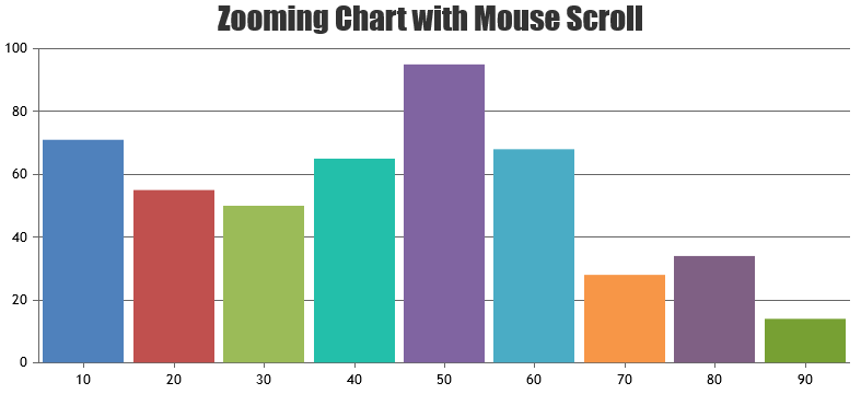
Team CanvasJSSetting zoomEnabled property to true will show zoom / pan & reset buttons, once the chart is zoomed.
zoomEnabled: true,
Please take a look at this updated JSFiddle.—
Vishwas R
Team CanvasJSAre you looking for programatically zooming / panning the chart? If so you can achieve it by changing viewportMinimum and viewportMaximum. Please take a look at this JSFiddle for the same.
—
Vishwas R
Team CanvasJSSeptember 3, 2019 at 6:31 pm in reply to: Can we move the position of the zoom and pan buttons #26642You can customize the position of zoom / pan button by changing the CSS of ‘canvasjs-chart-toolbar’ class. Please take a look at this JSFiddle for an example where zoom / pan buttons are positioned to the top-left of the chart.
—
Vishwas R
Team CanvasJSYou can pass data in sorted order with label instead of x-value to achieve your requirement. Please take a look at this JSFiddle.
In order to help us in understanding the issue, please have a reproducible demo of your chart. This one step can assure you a speedy response. Fork out our template JSFiddle and reproduce the chart at your end. Try to keep it to the bare minimum by removing unnecessary code.
From what we have observed, sometimes things get delayed mostly when we are not able to reproduce the issue or not able to understand the exact requirements or the solution that we provide may not work properly due to the variation in chart-options being used by you and us.
Having a JSFiddle helps us in figuring out the issue and many a times we can just edit your code on JSFiddle to fix the issue right-away.
—
Vishwas R
Team CanvasJSSudha,
Please refer this link (https://canvasjs.com/docs/charts/chart-options/data/click/) for documentation on click event.
—
Vishwas R
Team CanvasJSGustavo Montoya,
John,One of our representative will contact you over email with appropriate solution.
—
Vishwas R
Team CanvasJSTejal,
{} (Curly Braces) is used for keywords in legendText, please refer documentation for more info. Passing it as ‘{}’ should work fine in this case. Please take a look at this updated JSFiddle
—
Vishwas R
Team CanvasJSSudha,
You can use click event of dataSeries to get information related to dataPoint on clicking it. Please refer documentation for more information.
If this doesn’t help you fulfill your requirements, kindly share JSFiddle or an example and brief us more so that we can understand it better and help you out.
—
Vishwas R
Team CanvasJSCan you kindly create JSFiddle reproducing the issue you are facing so that we can look into the code, understand the scenario better and help you resolve the same?
In order to help us in understanding the issue, please have a reproducible demo of your chart. This one step can assure you a speedy response. Fork out our template JSFiddle and reproduce the chart at your end. Try to keep it to the bare minimum by removing unnecessary code.
From what we have observed, sometimes things get delayed mostly when we are not able to reproduce the issue or not able to understand the exact requirements or the solution that we provide may not work properly due to the variation in chart-options being used by you and us.
Having a JSFiddle helps us in figuring out the issue and many a times we can just edit your code on JSFiddle to fix the issue right-away.
—
Vishwas R
Team CanvasJSAxis labels are shown at every interval, which is auto-calculated such that the labels doesn’t overlap and makes chart look better. You can customize it to show labels at every value by setting interval property. Please refer documentation for more information.
—
Vishwas R
Team CanvasJSand part of the code:
var obj=jQuery.parseJSON(data);
console.log(obj[0].Avg005); (shows 64.44 in the console)
//value = parseFloat(obj[0].Avg005).toFixed(2); (I tried to force it to be decimal but it did not work either)
// dps.push({x: 5, y: value); (I tried to force it to be decimal but it did not work either)
dps.push({x: 5, y: obj[0]Avg005 });
dps.push({x: 10, y: obj[0]Avg010 });It seems like you are not parsing y-value properly. Parsing it properly as
dps.push({x: 5, y: parseFloat(obj[0].Avg005) });should work fine in this case.If you are still facing the issue, kindly create JSFiddle reproducing the issue you are facing so that we can look into the code, understand the scenario better and help you resolve the same?
In order to help us in understanding the issue, please have a reproducible demo of your chart. This one step can assure you a speedy response. Fork out our template JSFiddle and reproduce the chart at your end. Try to keep it to the bare minimum by removing unnecessary code.
From what we have observed, sometimes things get delayed mostly when we are not able to reproduce the issue or not able to understand the exact requirements or the solution that we provide may not work properly due to the variation in chart-options being used by you and us.
Having a JSFiddle helps us in figuring out the issue and many a times we can just edit your code on JSFiddle to fix the issue right-away.
—
Vishwas R
Team CanvasJS