Login to Ask a Question or Reply
Forum Replies Created by Vishwas R
-
Sorry, heatmap is not available as of now. However, you can achieve the same using Stacked Column 100% chart as mentioned earlier. Please refer to this article for more information on the same.
—
Vishwas R
Team CanvasJSIt seems your VB.Net code is creating two
<script>blocks with separatewindow.onloadfunctions, causing the second chart (“ITU Zones”) to overwrite the first (“QSOs by Hour”), resulting in a blank first chart. To fix this, either combine the instantiation and render of both the charts within a singlewindow.onloadfunction in one<script>block, or place a single<script>block withoutwindow.onloadat the end of the<body>tag to execute after the DOM loads. Both approaches ensure both charts render correctly in your Windows Forms app’s WebBrowser control.If the issue persists, kindly create sample project (sample / dummy data) reproducing the issue you are facing & share it with us via Google Drive or OneDrive so that we can run it at our end to understand the scenario better & help you out.
—
Vishwas R
Team CanvasJSChris,
Thanks for your feedback! You’re correct, buttons like “1M” and “6M” adjust the start date relative to the current end date, keeping the end fixed. For example, “1M” shows data from one month before the end date to the end date. We will revisit our documentation to address this.
We agree that the “YTD” behavior can be unintuitive and will revisit this in future releases.
—
Vishwas R
Team CanvasJSSorry, it’s not possible to position indexlabels at the center of the bar in range-bar charts. However, setting
indexLabelPlacement: "inside"will display the indexlabels inside the bar instead of the default outside position.—
Vishwas R
Team CanvasJSJune 2, 2025 at 4:36 pm in reply to: Adding a custom button in toolbar or beside the tool bar zoom/span. #61050You can add a custom button to the CanvasJS toolbar using DOM manipulation (e.g., append a button to .canvasjs-chart-toolbar). After chart.render(), you can create a button element, style it to match the toolbar and append it. Ensure the chart is rendered first, as the toolbar won’t exist otherwise. Please find the code-snippet below.
var toolbar = document.getElementsByClassName("canvasjs-chart-toolbar")[0];
var button = document.createElement("button");
toolbar.appendChild(button);
Please take a look at this JSFiddle for a working example.
—
Vishwas R
Team CanvasJSShannon,
When exporting a CanvasJS chart, only the native chart elements are included in the exported image. Custom DOM elements, such as external legends, are not part of the chart and therefore won’t appear in the export.
If your goal is to display custom legends and include them in the exported image, one workaround is to use dummy dataseries to represent those legends within the chart itself. This way, they become part of the chart and will be included in the export. Please checkout the code-snippet demonstrating how to create a dummy series for this purpose:
{
	type: "scatter",
	showInLegend: true,
	legendText: "Dummy Legend",
	legendMarkerType: "square",
	legendMarkerColor: "red",
	dataPoints: [{}] // Empty datapoint
}
This approach ensures that your custom legend appears in the chart area and is included when exporting.
—
Vishwas R
Team CanvasJSThe indexLabel property set on a datapoint overrides the indexLabel & indexLabelFormatter defined at the dataseries level, which is why it’s not working as expected in your case.
To resolve this, you can remove the indexLabel property from the individual data points. If you still want to show the indexLabel from the data point as one of the labels (while hiding others), you can use a custom property name (e.g., indexLabel1) and access it inside indexLabelFormatter, as shown below:
indexLabelFormatter: function(e) {
    if (e.index === 0)
        return " ";
    else
        return e.dataPoint.indexLabel1;
},
dataPoints: [
    { x: new Date(2014, 3, 1), y: [17, 33], indexLabel1: "RFP" },
    { x: new Date(2014, 3, 2), y: [18, 35], indexLabel1: "RFP" },
    { x: new Date(2014, 3, 3), y: [18, 32], indexLabel1: "RFP" },
    { x: new Date(2014, 3, 4), y: [18, 32], indexLabel1: "RFP" },
    { x: new Date(2014, 3, 5), y: [20, 35], indexLabel1: "RFP" },
    { x: new Date(2014, 3, 6), y: [20, 38], indexLabel1: "RFP" },
    { x: new Date(2014, 3, 7), y: [21, 32], indexLabel1: "RFP" }
]
—
Vishwas R
Team CanvasJSIt seems like the issue you’re facing with the ValueFormatString not working is due to the case sensitivity. The correct property name is valueFormatString in camelCase, not ValueFormatString. Please try updating it to valueFormatString and check if that resolves the problem. Please take a look at this JSFiddle for working code. If the issue persists, kindly create a JSFiddle reproducing the issue & share it with us so that we can look into the code/chart-options being used, understand the scenario better and help you out.
—
Vishwas R
Team CanvasJS@j,
the “Chromes console” says the next message when a open the section on web that has the graph:
[url=https://postimg.cc/w7PhZrCr][img]https://i.postimg.cc/w7PhZrCr/error-graph.jpg[/img][/url]It seems like you might be using an older version of CanvasJS. CanvasJS library was optimized for multiple readback operations starting from v3.7.11 GA. Please refer to this blog post for more information on the improvements and changes made. We recommend updating to the latest version of CanvasJS to take advantage of performance enhancements, bug fixes & new features. Upgrading to the latest version will ensure smoother operations, better compatibility & overall enhanced performance in your application.
—
Vishwas R
Team CanvasJSAdam Evans,
To achieve this, you can make use of the updated event to track the current x and y-values, and display those values dynamically in the legend. By utilizing shared tooltip, the values from different chart series can be synchronized and displayed consistently in the legend. Please take a look at this JSFiddle for an example of the same.
—
Vishwas R
Team CanvasJSMohammad Imtiyaz,
3D charts are not supported as of now.
—
Vishwas R
Team CanvasJSYou are encountering this issue because you’re modifying the axis minimum and maximum values within the rangeChanged event handler. Instead, performing all the necessary calculations within the rangeChanging event handler or calling stockChart.render() after completing the calculations in rangeChanged should resolve the problem. Please take a look at this updated JSFiddle for a working example.
—
Vishwas R
Team CanvasJSJames,
CanvasJS does support a feature similar to plotBands in Highcharts called stripLines. You can use stripLines in two ways:
- Single threshold (value): You can set a value for the stripLine to highlight a single threshold on the axis.
- Range (startValue and endValue): You can define both startValue and endValue to highlight a specific region, effectively creating a plotBand-like effect to emphasize a section of the chart between two axis values.
Please find the code-snippet for creating a stripLine (plotband) below:
axisY:{
  stripLines:[{
    startValue: 25,
    endValue: 32,
    color: "#d8d8d8"
  }]
}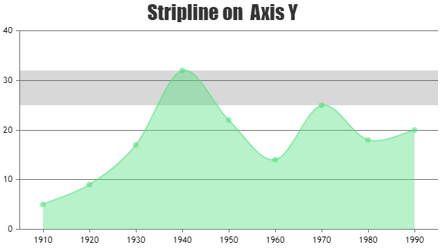
—
Vishwas R
Team CanvasJSWith your perpetual license, you can use CanvasJS for as long as you like without any additional payments. The “expired” message you’re seeing refers to the subscription for updates, which is free for the first year. During the first free update period, you can download the latest versions available. After this period, you can still download older versions, but you will no longer have access to new updates unless you renew your updates subscription.
For any sales-related queries, feel free to contact sales@canvasjs.com.
—
Vishwas R
Team CanvasJSCanvasJS React Charts seems to be working fine with the latest version of Next.js (v15.1.6) & React (v19.0.0GA). Please refer to this article for a tutorial on adding CanvasJS Chart in Next.js app.
Can you kindly try updating all the packages to latest & check if that works? If the issue still persists, kindly create a sample project reproducing the issue, upload it to Google-Drive or Onedrive & share the link with us so that we can run it locally at our end, understand the scenario better and help you out?
—
Vishwas R
Team CanvasJS