Login to Ask a Question or Reply
Forum Replies Created by Shashi Ranjan
-
You can use embeddable code editors like CodeMirror, Ace, etc.
—
Shashi Ranjan
Team CanvasJSCan you kindly create a JSFiddle reproducing the issue and share it with us so that we can look into the code, understand the scenario better and help you out?
—
Shashi Ranjan
Team CanvasJSCan you kindly share a pictorial representation or brief us further about your requirement so that we can understand your scenario better and help you out?
—
Shashi Ranjan
Team CanvasJSAs per the code snippet shared above, it looks like you are passing x-value as string in a dataPoint, whereas x-value can either be a numeric value or a dateTime value. Here is how you can make modify your index.html file:
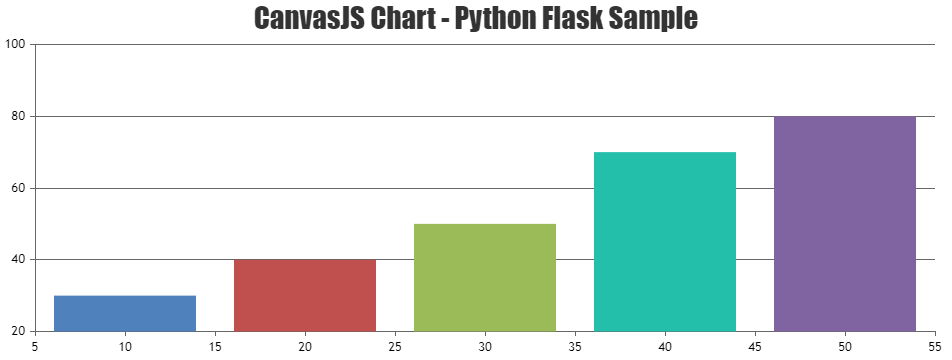
<html>
    <head>
        <meta name="viewport" content="width=device-width, initial-scale=1.0">
        <meta http-equiv="Content-Type" content="text/html; charset=utf-8" />
        <title>CanvasJS Chart Python Flask Sample</title>
        <script type="text/javascript" src="https://cdn.canvasjs.com/canvasjs.min.js"></script>
        <script type="text/javascript">
            window.onload = function() {
                var dps = [
                            {% for key,value in data.items() %}
                                { x: {{key}}, y: {{value}} },
                            {% endfor %}
                ];
                var chart = new CanvasJS.Chart("chartContainer", {
                    title:{
                        text: "CanvasJS Chart Python Flask Sample"
                    },
                    data: [
                    {
                        // Change type to "doughnut", "line", "splineArea", etc.
                        type: "column",
                        dataPoints: dps
                    }
                    ]
                });
                chart.render();
            }
        </script>
        <style type="text/css">
        </style>
    </head>
    <body>
        <div id="chartContainer" style="width: 100%; height: 300px;"></div>
    </body>
</html>
You can also take look at this sample project for a working example with sample code on the integration of CanvasJS with python flask.
If you are still facing the issue in integrating CanvasJS charts with python flask, kindly create a sample project reproducing the issue you are facing and share it with us(along with sample data) over Google-Drive or Onedrive so that we can run the sample locally at our end to understand the scenario better and help you out?
Considering this as duplicate of CanvasJS with Python Flask. Hence closing the same.
—
Shashi Ranjan
Team CanvasJSYou can achieve the above requirement by using the combination of Stacked Column and Column chart. Please take a look at this JSFiddle for the same.
—
Shashi Ranjan
Team CanvasJSStacked Column Charts are plotted when multiple Column Charts with aligned x values are plotted on the same scale. Using Target, Real and Project as the dataPoints of one of the dataSeries(say dataSeries1) and then creating new dataSeries(dataSeries2) for each of the Project(Project1) as its dataPoint and so on should work fine in your case. Kindly refer this gallery page for an example on a stacked column chart.
—
Shashi Ranjan
Team CanvasJSAugust 28, 2019 at 8:09 pm in reply to: How many graph points can be plotted in available space #26588Tejal,
The number of datapoints that can be displayed in 200px width chart could depends on factors like type of chart, height of the chart, etc. As an ideal scenario, you can render chart with few datapoints (lets say 10-15 datapoints) and then update it based on zoom-level with the help on rangeChanging event. Please take a look at this JSFiddle for an example on the same.
—
Shashi Ranjan
Team CanvasJSShweta,
You can use a column chart to achieve the above requirement. Also, by adding a custom option for each dataPoint you can set it’s color dynamically using the value associated with it as shown in this JSFiddle.
—
Shashi Ranjan
Team CanvasJSYou can use the step line chart to achieve the above requirement.
If this doesn’t suit your requirement, can you kindly help us with a pictorial representation or a live example of your requirement so that we can understand your scenario better and help you out with appropriate resources?
—
Shashi Ranjan
Team CanvasJSJohn,
Sorry, this feature is not supported as of now.
—
Shashi Ranjan
Team CanvasJSPriyank,
We are looking into your query and will get back to you at the earliest.
—
Shashi Ranjan
Team CanvasJS