Login to Ask a Question or Reply
Forum Replies Created by Manoj Mohan
-
Adding container’s offset (left and top) values along with dataPoint’s pixel value (using convertValueToPixel()) will give you the desired x and y postition of dataPoint from top left corner of the screen as shown in this JSFiddle.
—-
Manoj Mohan
Team CanvasJSPrathyush,
Please take a look at the following respective technologies pages for an example on rendering chart using data from database.
1. PHP
2. ASP.NET MVC
3. Spring MVC
4. JSP—-
Manoj Mohan
Team CanvasJSPlease take a look at this JSFiddle for creating a chart using data received from fetch method.
If you are still facing the issue, can you kindly create a sample project along with sample data and share it over google-drive or one-drive so that we can look into the code and understand it better and help you out?
—-
Manoj Mohan
Team CanvasJSJanuary 6, 2020 at 7:09 pm in reply to: Canvajs in Angular: ERROR ReferenceError: setButtonState is not defined #27912Sorry, exporting chart data as a CSV file is not available as an inbuilt feature as of now.
—-
Manoj Mohan
Team CanvasJSIn the JSFiddle that you have shared, it’s possible to zoom as the region gets validated since zoomType is set to ‘xy’. In this case, the zoomed region is valid because of number of dataPoints over axisX. And in the previous JSFiddle that has been shared the region is getting invalidated because of axisY.
—-
Manoj Mohan
Team CanvasJSJanuary 2, 2020 at 7:12 pm in reply to: How to animate dynamic updates using React functional components? #27848Chart animates only on the first/initial render, as of now.
I’ve read the guidance that the chart would need to be recreated on each update so that the animation would occur on first render
To achieve the above requirement, you can destroy and re-create the chart as shown in this example.
—-
Manoj Mohan
Team CanvasJSThe behavior is designed such that zooming is limited upto a certain region, so that user doesn’t end up zooming into a blank-region (region with no dataPoints). To zoom into a certain region, there should be a minimum of 3-4 dataPoints over the axis.
In your case, the zoom doesn’t work as there are less than 3-4 dataPoints with different values over the axisY.
We will reconsider this behavior for future releases.
—-
Manoj Mohan
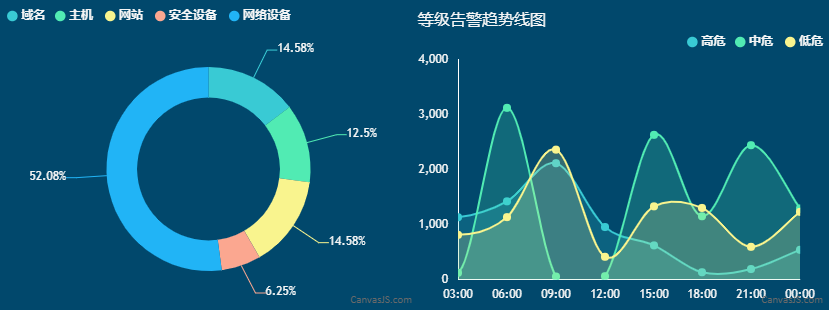
Team CanvasJSTo display the chart using set of year data on loop, you need to first create an array object as shown in below code snippet.
var data = [{
    "doughnut": [
      { label: "域名", y: 13 },
      { label: "主机", y: 13 },
      { label: "网站", y: 10 },
      { label: "安全设备", y: 6 },
      { label: "网络设备", y: 60 },
    ],
    "splineArea": [
      [
        { label: "00:00", y: 2000},
        { label: "03:00", y: 122},
        { label: "06:00", y: 3121},
        { label: "09:00", y: 54},
        { label: "12:00", y: 60},
        { label: "15:00", y: 2630},
        { label: "18:00", y: 1150},
        { label: "21:00", y: 2442},
        { label: "00:00", y: 1292}
      ],
      [
        { label: "00:00", y: 1130},
        { label: "03:00", y: 812},
        { label: "06:00", y: 1134},
        { label: "09:00", y: 2361},
        { label: "12:00", y: 413},
        { label: "15:00", y: 1330},
        { label: "18:00", y: 1301},
        { label: "21:00", y: 594},
        { label: "00:00", y: 1230}
      ],
      [
        { label: "00:00", y: 1220},
        { label: "03:00", y: 1132},
        { label: "06:00", y: 1421},
        { label: "09:00", y: 2114},
        { label: "12:00", y: 954},
        { label: "15:00", y: 620},
        { label: "18:00", y: 132},
        { label: "21:00", y: 190},
        { label: "00:00", y: 540}
      ]
    ]
  },
  .
  .
}]
You can update the chart data every 2 seconds by looping through above created array object and updating chart options. Please take a look at below code snippet for the same.
var i = 0;
function updateChart() {
    chart.options.data[0].dataPoints = jsonData[i].splineArea[0];
    chart.options.data[1].dataPoints = jsonData[i].splineArea[1];
    chart.options.data[2].dataPoints = jsonData[i].splineArea[2];
    chart1.options.data[0].dataPoints = jsonData[i].doughnut;
    chart.render();
    chart1.render();
    i = (i+1) % jsonData.length;
    setTimeout(updateChart, 2000);
}
Also, check out this JSFiddle for complete working code.
—-
Manoj Mohan
Team CanvasJSSorry, it’s not possible to remove space between columns on zooming as of now.
—-
Manoj Mohan
Team CanvasJS