Login to Ask a Question or Reply
Home › Forums › Chart Support › Custom X Axis Order By (Asc/Desc) › Reply To: Custom X Axis Order By (Asc/Desc)
April 7, 2021 at 7:37 pm
#33893
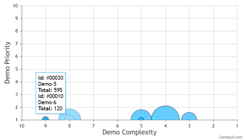
Since the chart contains multiple dataPoints with the same x and y values, I would suggest you go to ahead with Multi Series charts to better visualize the data. In this case, you can use the shared property for toolTip as well, as shown in this code-snippet below,
toolTip: {
   shared: true
},
Please take a look at this updated JSFiddle for an example on a multi-series bubble chart with shared toolTip

—
Adithya Menon
Team CanvasJS