• Demos
    • JavaScript Charts
    • JavaScript StockCharts
  • Download/NPM
    • Download CanvasJS
    • Install via NPM
  • Integrations
    Front End Technology Samples
    • React Charts
    • Angular Charts
    • Vue.js Charts New!
    • jQuery Charts
    • Dashboards
    Server Side Technology Samples
    • PHP Charts
    • Python Charts New!
    • ASP.NET MVC Charts
    • Spring MVC Charts
    • JSP Charts
  • License
  • Blog
  • Docs
    • Chart Documentation
    • StockChart Documentation
  • Support Forum
    • Chart Support
    • StockChart Support
  • My Account
My Account
  • KEY FEATURES
    • Basic Chart
    • Chart with Animation
    • Chart with Zooming/Panning
    • Multi Series Chart
    • Chart with Multiple Axes
    • Chart with Logarithmic Axis
    • Chart with JSON Data
    • Dynamic Chart
    • Drilldown Chart
    • Responsive Chart
    • Synchronized Charts
  • LINE CHARTS
    • Line Chart
    • Dashed Line Chart
    • Multi Series Line Chart
    • Spline Chart
    • Multi Series Spline Chart
    • Step Line Chart
    • Multi Series Step Line Chart
  • BAR CHARTS
    • Bar Chart with Category Axis
    • Multi Series Bar Chart
    • Stacked Bar Chart
    • Stacked Bar 100% Chart
  • COLUMN CHARTS
    • Column Chart with Category Axis
    • Column Chart in Dark Theme
    • Multi Series Column Chart
    • Stacked Column Chart
    • Stacked Column 100% Chart
  • PIE & DOUGHNUT CHARTS
    • Pie Chart
    • Doughnut Chart
    • Doughnut Chart in Dark Theme
  • AREA CHARTS
    • Area Chart with Markers
    • Multi Series Area Chart
    • Spline Area Chart
    • Multi Series Spline Area Chart
    • Step Area Chart
    • Stacked Area Chart
    • Stacked Area 100% Chart
  • RANGE CHARTS
    • Range Column Chart
    • Multi Series Range Column Chart
    • Range Bar Chart
    • Multi Series Range Bar Chart
    • Range Area Chart
    • Multi Series Range Area Chart
    • Range Spline Area Chart
    • Multi Series Range Spline Area Chart
  • BUBBLE & SCATTER CHARTS
    • Bubble Chart with 3-Dimensional Data
    • Bubble Chart in Dark Theme
    • Scatter Chart
    • Multi Series Scatter Chart
  • FUNNEL & PYRAMID CHARTS
    • Funnel Chart with Index Labels
    • Funnel Chart without Neck
    • Pyramid Chart
  • FINANCIAL CHARTS
    • Candlestick Chart
    • Candlestick Chart from JSON Data
    • OHLC Chart
    • OHLC Chart from JSON Data
    • Box & Whisker Chart
    • Waterfall Chart
  • COMBINATION CHARTS
    • Pareto Chart
    • Error Bar Chart
    • Combination of Range Area & Line Chart
    • Combination of Candlestick & Line chart
  • DYNAMIC CHARTS
    • Dynamic Line Chart
    • Dynamic Column Chart
  • DATA BINDING
    • Chart with Data from CSV
    • Chart with Data from Database
    • Chart with Date-Time Axis from Database
  • JAVASCRIPT, JQUERY, REACT, ANGULAR, VUE.JS
    • JavaScript Charts
    • jQuery Charts
    • React Charts
    • Angular Charts
    • Vue.js Charts
  • SERVER SIDE TECHNOLOGIES
    • ASP.NET MVC Charts
    • PHP Charts
    • Spring MVC Charts
    • JSP Charts

Python Combination Charts in Django

Download Python Django Chart Samples
  • Python Django Chart Samples
  • JavaScript Chart Samples
  • React Chart Samples
  • Angular Chart Samples
  • Vue.js Chart Samples
  • jQuery Chart Samples
  • PHP Chart Samples
  • ASP.NET Chart Samples
  • JSP Chart Samples
  • Spring MVC Chart Samples
  • Dashboard Samples
  • JavaScript StockChart Samples

Python Combination Chart lets you display different chart types in a single chart. Library supports combining line, column, area, range, financial charts, etc. & render them in a single chart. They are also referred to as Combo / Mixed Charts.

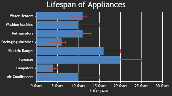
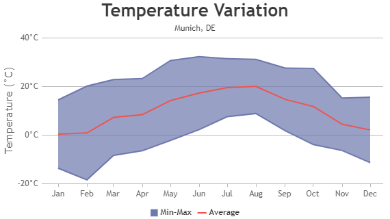
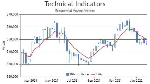
Combination of Python Range & Line Charts are typically used to show range (high & low values) along with their average simultaneously. Similarly, in case of financial charts like Candlestick & OHLC, Line & Column Charts are used in showing technical indicators.

Python Combination Charts

Combination Charts are formed by combining multiple chart types in a single chart.

Python Pareto Chart using Django
Pareto Chart
Python Error Bar Chart using Django
Error Bar Chart
Python Range Area & Line Chart Combination
Range Area & Line Chart Combination
Python Candlestick & Line Chart Combination
Candlestick & Line Chart Combination

Features Commonly used in Python Combination Charts

Most commonly used features in Python Combination Charts include showing legends, hiding / unhiding dataseries on legend click, colors, etc.

  • You can show dataseries name in legend using showInLegend property.
  • You can hide / unhide dataseries on clicking the legend items by toggling visible property of dataseries.
  • Color of dataseries can be changed by setting color property.

General Tips for Python Combination Charts

  • While combining area chart with any other chart type, always render area chart first & then the other types. Otherwise area chart will end up hiding other charts.
  • While combining multiple chart types, consider using opacity to improve visibility.
  • In case of financial charts, most of the technical indicators can be added to chart using line chart.

Quick Links

  • Chart Docs
  • StockChart Docs
  • About Us
  • FAQs

Server Side Technologies

  • ASP.NET MVC Charts
  • PHP Charts
  • JSP Charts
  • Spring MVC Charts

Front Side Technologies

  • JavaScript Charts
  • jQuery Charts
  • React Charts
  • Angular Charts
  • JavaScript StockCharts

Contact

  • Fenopix, Inc.
  • 2093 Philadelphia Pike,
  • #5678, Claymont,
  • Delaware 19703
  • United States Of America

©2025 Fenopix Privacy Policy Cookies Policy Careers