Python Pie & Doughnut Charts using Django
Python Pie Charts are created by dividing circle into slices that are proportional to their contribution to the whole. Pie charts are also referred to as Circular Charts. Python Doughnut (Donut) Chart is a variation of Pie Chart with a hollow center.
Index / Data labels (annotations) can be added to each slice of the pie & doughnut chart. Library automatically adjusts the position of the index labels so that more labels can be shown without overlapping & more readability.
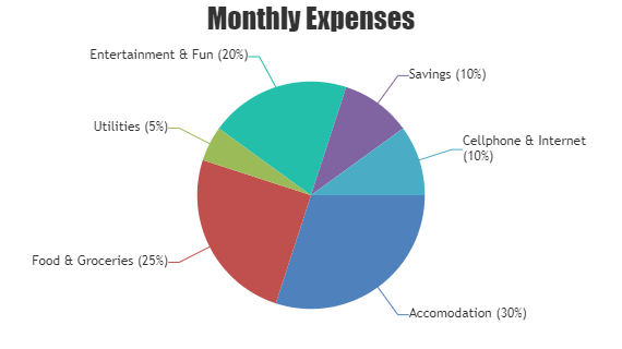
Python Pie Charts
Pie Chart is a circular chart divided into slices proportional to the value it represents.
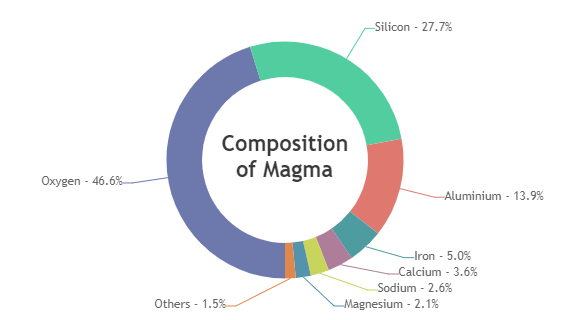
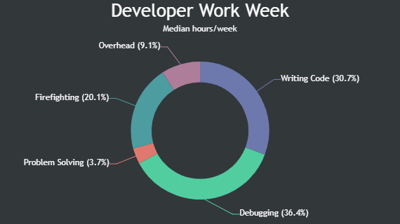
Python Doughnut Charts
Doughnut Chart is a circular chart with a hollow center.
Features Commonly used in Python Pie Charts
Most commonly used features in Python Pie & Doughnut Charts include startAngle, radius, innerRadius, exploded, etc.
- You can rotate the pie / doughnut chart by setting startAngle.
- Size of the pie / doughnut can be controlled by setting radius property.
- In case of doughnut chart, the inner radius can be increased/ decreased by setting innerRadius property.
- Slice of pie / doughnut chart can be exploded during the initial chart render by setting exploded property.
Python Pie & Doughnut Chart Types
General Tips for Python Pie Charts
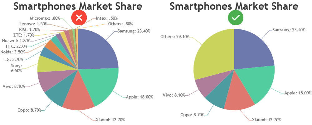
- Pie charts generally don’t need legends. It’s cleaner to label your data directly using indexlabels.
- Avoid using of Pie charts in a time series analysis, use it only to show comparison for one point of time.
- Limit the number of slices by merging smaller categories. Pie / Doughnut charts with a large number of slices can be difficult to read.