• Demos
    • JavaScript Charts
    • JavaScript StockCharts
  • Download/NPM
    • Download CanvasJS
    • Install via NPM
  • Integrations
    Front End Technology Samples
    • React Charts
    • Angular Charts
    • Vue.js Charts New!
    • jQuery Charts
    • Dashboards
    Server Side Technology Samples
    • PHP Charts
    • Python Charts New!
    • ASP.NET MVC Charts
    • Spring MVC Charts
    • JSP Charts
  • License
  • Blog
  • Docs
    • Chart Documentation
    • StockChart Documentation
  • Support Forum
    • Chart Support
    • StockChart Support
  • My Account
My Account
  • KEY FEATURES
    • Basic Chart
    • Chart with Animation
    • Chart with Zooming/Panning
    • Multi Series Chart
    • Chart with Multiple Axes
    • Chart with Logarithmic Axis
    • Chart with JSON Data
    • Dynamic Chart
    • Drilldown Chart
    • Responsive Chart
    • Synchronized Charts
  • LINE CHARTS
    • Line Chart
    • Dashed Line Chart
    • Multi Series Line Chart
    • Spline Chart
    • Multi Series Spline Chart
    • Step Line Chart
    • Multi Series Step Line Chart
  • BAR CHARTS
    • Bar Chart with Category Axis
    • Multi Series Bar Chart
    • Stacked Bar Chart
    • Stacked Bar 100% Chart
  • COLUMN CHARTS
    • Column Chart with Category Axis
    • Column Chart in Dark Theme
    • Multi Series Column Chart
    • Stacked Column Chart
    • Stacked Column 100% Chart
  • PIE & DOUGHNUT CHARTS
    • Pie Chart
    • Doughnut Chart
    • Doughnut Chart in Dark Theme
  • AREA CHARTS
    • Area Chart with Markers
    • Multi Series Area Chart
    • Spline Area Chart
    • Multi Series Spline Area Chart
    • Step Area Chart
    • Stacked Area Chart
    • Stacked Area 100% Chart
  • RANGE CHARTS
    • Range Column Chart
    • Multi Series Range Column Chart
    • Range Bar Chart
    • Multi Series Range Bar Chart
    • Range Area Chart
    • Multi Series Range Area Chart
    • Range Spline Area Chart
    • Multi Series Range Spline Area Chart
  • BUBBLE & SCATTER CHARTS
    • Bubble Chart with 3-Dimensional Data
    • Bubble Chart in Dark Theme
    • Scatter Chart
    • Multi Series Scatter Chart
  • FUNNEL & PYRAMID CHARTS
    • Funnel Chart with Index Labels
    • Funnel Chart without Neck
    • Pyramid Chart
  • FINANCIAL CHARTS
    • Candlestick Chart
    • Candlestick Chart from JSON Data
    • OHLC Chart
    • OHLC Chart from JSON Data
    • Box & Whisker Chart
    • Waterfall Chart
  • COMBINATION CHARTS
    • Pareto Chart
    • Error Bar Chart
    • Combination of Range Area & Line Chart
    • Combination of Candlestick & Line chart
  • DYNAMIC CHARTS
    • Dynamic Line Chart
    • Dynamic Column Chart
  • DATA BINDING
    • Chart with Data from CSV
    • Chart with Data from Database
    • Chart with Date-Time Axis from Database
  • JAVASCRIPT, JQUERY, REACT, ANGULAR, VUE.JS
    • JavaScript Charts
    • jQuery Charts
    • React Charts
    • Angular Charts
    • Vue.js Charts
  • SERVER SIDE TECHNOLOGIES
    • ASP.NET MVC Charts
    • PHP Charts
    • Spring MVC Charts
    • JSP Charts

Python Column Charts using Django Framework

Download Python Django Chart Samples
  • Python Django Chart Samples
  • JavaScript Chart Samples
  • React Chart Samples
  • Angular Chart Samples
  • Vue.js Chart Samples
  • jQuery Chart Samples
  • PHP Chart Samples
  • ASP.NET Chart Samples
  • JSP Chart Samples
  • Spring MVC Chart Samples
  • Dashboard Samples
  • JavaScript StockChart Samples

Python Column Charts represent data in the form of rectangular bars with height proportional to y-value. Bars are plotted vertically & sometimes referred to as vertical bar charts. Library comes bundled with different variants of Column Charts like Column, Multi-Series Column, Stacked Column & Stacked Column 100% Charts.

Python Column Charts

Column Charts are useful in comparing values between datapoints of different categories or values.

Python Column Chart with Category Axis
Column Chart with Category Axis
Python Column Chart in Dark Theme
Column Chart in Dark Theme
Python Multi Series Column Chart in Django
Multi Series Column Chart

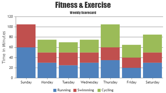
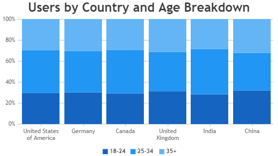
Python Stacked Column Charts

Stacked Column Chart comprises of multiple column series stacked one on top of another.

Python Stacked Column Chart using Django
Stacked Column Chart
Python Stacked Column 100% Charts
Stacked Column 100% Chart

Features Commonly used in Python Column Charts

Most commonly used features in Python Column Chart includes animation, beveling the column, datapoint max-width, color, etc.

  • Animation can be enabled by setting animationEnabled property to true.
  • You can customize datapoint/dataseries colors as per your application theme by adding custom colorSet.
  • Beveling / Chisel effect can be applied on each column by setting bevelEnabled property to true.
  • Datapoint max-width can be set using dataPointMaxWidth property.
  • Color of the column can be set by using color property.

Python Column Chart Types

  • Python Column Chart
  • Python Stacked Column Chart
  • Python Stacked Column 100% Chart

General Tips for Python Column Charts

  • Use multiple axes when two dataseries have different units / scale ranges.
  • When you have more than 4 series, allow users to hide/unhide any series by clicking the legend.
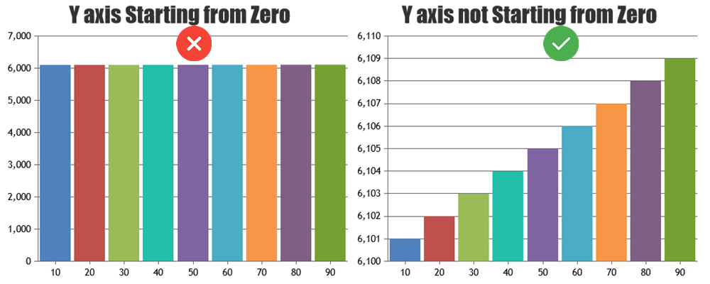
  • Show zero baseline in vertical axis if and only if it’s required. Column charts should ideally show changes / variations in value clearly. Including zero in y-axis might not make the variations obvious when the variation in y values are small compared to their value. Include Zero in Python Column Chart

Quick Links

  • Chart Docs
  • StockChart Docs
  • About Us
  • FAQs

Server Side Technologies

  • ASP.NET MVC Charts
  • PHP Charts
  • JSP Charts
  • Spring MVC Charts

Front Side Technologies

  • JavaScript Charts
  • jQuery Charts
  • React Charts
  • Angular Charts
  • JavaScript StockCharts

Contact

  • Fenopix, Inc.
  • 2093 Philadelphia Pike,
  • #5678, Claymont,
  • Delaware 19703
  • United States Of America

©2025 Fenopix Privacy Policy Cookies Policy Careers