Login to Ask a Question or Reply
Forum Replies Created by Manoj Mohan
-
Sorry, it’s not possible to remove space between columns on zooming as of now.
—-
Manoj Mohan
Team CanvasJSDecember 23, 2019 at 7:13 pm in reply to: Chart.js bubble chart x axis to be in range from 0AM-1AM to 23PM-24PM #27787You can achieve your requirement in CanvasJS using bubble chart and date and time axis.
—-
Manoj Mohan
Team CanvasJSDecember 20, 2019 at 8:57 pm in reply to: Start month is not displayed on X-Axis in Stacked Area graph #27770We are trying to show month-wise data in the Stacked Area graph. Months are displayed on the x-axis and data is displayed on the y-axis. But the start month is not displayed on the x-axis. Our requirement is Start Month should be displayed at start of the x-axis. Can you please suggest how to do that. For referece, see the jsfiddle link with example code
Sorry, it’s not possible to control the starting point of label, as of now.
Additionally, double quotes are not displayed on legends. I have given the legends data as below
name: “Inventory within \”Do Not Use\” period”.
My expectation is Do Not Use should be in quotes. But no quotes are displayed.You can use unicode to display quotes in legend text as shown in this JSFiddle.
—-
Manoj Mohan
Team CanvasJSPlease take a look at this gallery page for an example on creating dynamic charts in CanvasJS. Also, take a look at this documentation page for step-to-step tutorial on rendering multiple charts in a single page.

—-
Manoj Mohan
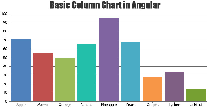
Team CanvasJSWe don’t have official npm package published yet, the npm package that you were using (v1.8.0) is not an official one. Please take a look at Angular Gallery for examples on integrating CanvasJS in Angular project. Also you can download sample project from our download page and run it locally to understand it better.
—-
Manoj Mohan
Team CanvasJSIt’s not possible to control the starting point of label, as of now. We will reconsider this behaviour in future releases.
—–
Manoj Mohan
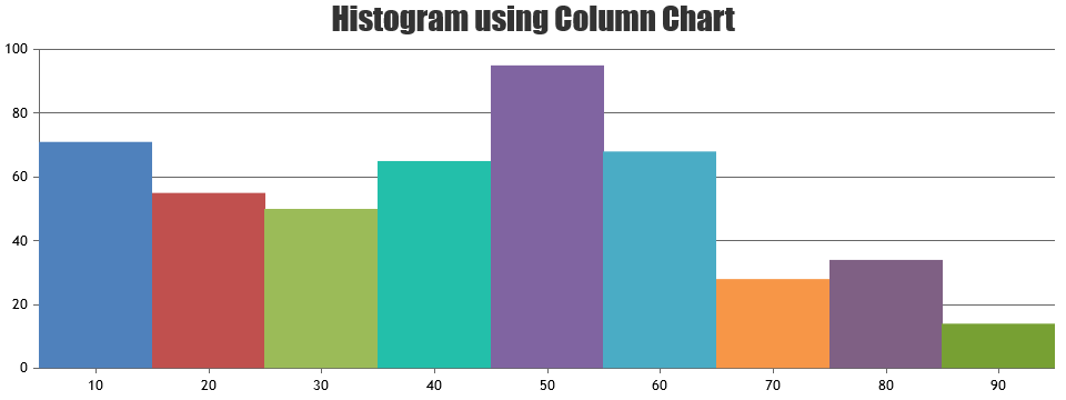
Team CanvasJSBy setting dataPointWidth based on axis width and number of dataPoints in column chart, histogram chart can be rendered. Please take a look below code snippet for the same
chart.set("dataPointWidth",Math.ceil(chart.axisX[0].bounds.width/chart.data[0].dataPoints.length),true);Please check this JSFiddle for complete code.

—
Manoj Mohan
Team CanvasJSDecember 19, 2019 at 9:46 am in reply to: How to animate dynamic updates using React functional components? #27742Chart animates only on the first / initial render, as of now. We will re-consider this behavior for future releases.
—
Manoj Mohan
Team CanvasJSWalterw,
Can you kindly share a sample csv so that we can reproduce the issue at our end and help you out?
—-
Manoj Mohan
Team CanvasJSYou can use labelFormatter to format crosshair labels based on your requirement.
—-
Manoj Mohan
Team CanvasJSDecember 6, 2019 at 9:15 pm in reply to: Canvajs in Angular: ERROR ReferenceError: setButtonState is not defined #27643Jason,
Glad that you have figured it out :)
Also, you can checkout at this gallery page for more examples for integrating CanvasJS Chart in Angular app. You can also download Angular sample project from our download page that you can run locally.

—-
Manoj Mohan
Team CanvasJS