Login to Ask a Question or Reply
Forum Replies Created by Ananya
-
There have been bug fixes and improvements with regards to indexLabels in the previous versions. You might be using an older version of CanvasJS, which might be the reason you are facing this issue. Kindly download the latest version of CanvasJS Charts from our download page, update it in your application, and let us know if the issue still persists.
Considering this as duplicate of Issue in chart indexLabel, and hence closing the same.
—
Ananya Deka
Team CanvasJSThere have been bug fixes and improvements with regards to indexLabels in the previous versions. You might be using an older version of CanvasJS, which might be the reason you are facing this issue. Kindly download the latest version of CanvasJS Charts from our download page, update it in your application, and let us know if the issue still persists.
—
Ananya Deka,
Team CanvasJSindexLabelPlacement set to inside seems to be working fine. Kindly create a JSFiddle reproducing the issue you are facing and share it with us, so that we can look into the code and help you out. Also, please ensure you are using the latest version of CanvasJS in your application.
—
Ananya Deka
Team CanvasJSYou can format crosshair labels using labelFomatter, similar to axis labels. Also, toolTipContent overrides contentFormatter, and hence we suggest you to use just contentFormatter. To format x-values from different series in different formats, you can update
formatDateInUTCto acceptformatStringas shown in this updated JSFiddle.—
Ananya Deka
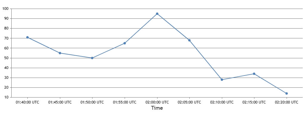
Team CanvasJSBy default, JavaScript Date objects are displayed based on the client’s local timezone. If you wish to format the displayed date object in UTC, you can use labelFormatter and contentFormatter to format the labels and the tooltip content, respectively.
Please take a look at this JSFiddle for a working example of the same.

—
Ananya Deka
Team CanvasJSKindly check if you are using the latest version of CanvasJS, which includes bug fixes, and improvements. If the issue still persists, please share a JSFiddle demonstrating your use case, so we can understand your scenario better and help you out.
—
Ananya Deka,
Team CanvasJSYou can use the showAt() method to programmatically move the crosshair along the axis. This method allows you to position the crosshair at any specific value on axisX (or axisY), which can help you achieve the scrolling effect you want. Please find the code-snippet below.
var xValue = 10, timeoutId;
function moveCrosshair() {

  if (xValue > 90) {
    clearTimeout(timeoutId);
    return;
  }
  chart.axisX[0].crosshair.showAt(xValue);
  xValue += 10;
  timeoutId = setTimeout(moveCrosshair, 500);
}
moveCrosshair();
Please take a look at this JSFiddle for a working example.
If this does not fulfill your requirements, could you please brief us more about it, so that we can understand your scenario better and help you out?
—
Ananya Deka
Team CanvasJSThe issue you’re facing happens as CanvasJS places each datapoint based on its exact timestamp. When the number of datapoints per day varies—like 96 points on some days and 24 on others—the chart ends up spacing them unevenly since it’s reflecting the actual time intervals between points.
To get around this and ensure even spacing between datapoints, you have a couple of options. One is to aggregate your data so that each day contributes the same number of points, such as daily averages or fixed hourly intervals. This way, the timestamps will be evenly spaced, and the chart will render more uniformly.
Another approach is to use the label property instead of actual x values. This turns the x-axis into a category axis, which places each point at equal intervals regardless of its timestamp. It’s especially useful if you don’t need precise time scaling and just want the chart to look balanced visually.
—
Ananya Deka
Team CanvasJSYou can pass any custom property within striplines, which can then be accessed programmatically. For instance, you might include a custom property like “data” in your stripline object and this won’t be displayed, but it will be available for use in your code.
stripLines:[
    {
        value: 1940,
        label: "In the 40s",
        data: "my stripline"
    }
]
The property can later be accessed through the chart options as
chart.options.axisX.stripLines[0].data.—
Ananya Deka
Team CanvasJS-
This reply was modified 11 months, 1 week ago by
Ananya.
It is not possible to align the axes, as their minimum and maximum values are independent of each other. However, for your particular scenario you can set the maximum and minimum properties of Axis Y according to that of Axis Y2. Please take a look at this JSFiddle for an example of the same.
—
Ananya Deka
Team CanvasJSPlease create a sample project reproducing the issue you are facing and share it with us over Google-Drive or Onedrive, so that we can run it locally on our end, understand the scenario better and help you out.
—
Ananya Deka
Team CanvasJS-
This reply was modified 1 year, 3 months ago by
Ananya.
January 6, 2025 at 6:21 pm in reply to: Multi Series Range Area Charts without shared tooltip #60364In Range Area Chart with
tooltip.shared = false, tooltip is shown only when the mouse hovers over a specific datapoint, displaying the start and end values for that range. In multi-series chart, it will not combine values from different series and will show information for the hovered datapoint only. Whentooltip.shared = true, the tooltip appears even when not hovering directly over a datapoint, displaying information for the nearest datapoint based on the x-value and y-values across all the series.—
Ananya Deka
Team CanvasJS -
This reply was modified 11 months, 1 week ago by