Login to Ask a Question or Reply
You must be logged in to post your query.
Home › Forums › Report Bugs › X-axis labels are not aligned vertical with the data points
X-axis labels are not aligned vertical with the data points
- This topic has 14 replies, 4 voices, and was last updated 8 years, 3 months ago by
Vishwas R.
-
November 6, 2017 at 5:36 pm #17452
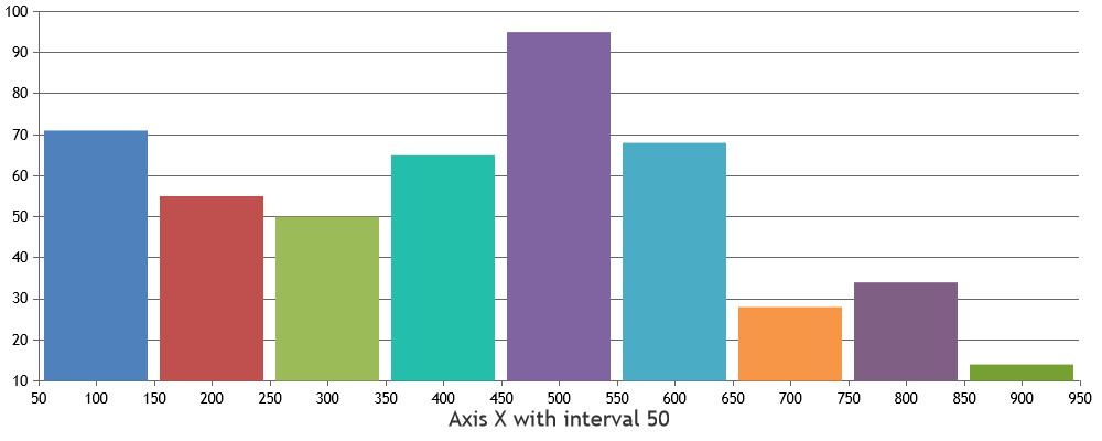
I have a line chart like this. The data point and graph seems little bit forwarded than the x axis label
November 7, 2017 at 11:17 am #17459Labels are generally not shown for all the dataPoints & the dataPoints may be rendered beyond the last dataPoint as well. This is because axis labels are rendered with fixed interval.
The plot in your case might be extending beyond the label
6-11-17as there might be a dataPoint beyond it with difference in some hours. If you are still facing the issue, kindly create a JSFiddle reproducing the issue and share it with us so that we can look into it and help you out.—
Suyash Singh
Team CanvasJSNovember 7, 2017 at 2:26 pm #17460Does this have any relation with ajax? I used two graphs one using ajax response data and the issue exists with the ajax one, any thing related with the way graphs are rendered?
November 8, 2017 at 10:41 am #17477No, the way dataPoints are rendered should not be related to AJAX calls. Can you please create a jsfiddle reproducing the issue so that we can look into it and help you out better?
___
Suyash Singh
Team CanvasJSNovember 8, 2017 at 10:43 am #17478April 16, 2018 at 1:51 pm #20336I am facing the same issue, could anyone help me
April 16, 2018 at 2:20 pm #20337Can you kindly create jsfiddle reproducing the issue you are facing so that we can look into it and help you out?
—
Vishwas R
Team CanvasJSApril 16, 2018 at 4:07 pm #20339please check the following chart properties
———————————————————–
var properties = {
legend:{“fontSize”:13,
“verticalAlign”:”top”,
“horizontalAlign”:”right”},
dataPointMaxWidth:15,axisX:{
gridThickness:0,
labelFontSize:12,
tickThickness:0,
tickLength:18,
/* interval:1, */
labelAngle:0,
intervalType:”day”,
stripLines:[],
valueFormatString:”M/D”,
titleFontFamily:”MonteserratRegular”,
labelFontFamily:”MonteserratRegular”,
labelFontColor:”#282c37″},axisY:{
titleFontSize:15,
gridThickness:1,
labelFontSize:12,
tickThickness:0,
tickLength:5,
stripLines:[],
title:”count”,
maximum:100,
minimum:0,
gridColor:”#CCC”,
titleFontFamily:”MonteserratRegular”,
labelFontFamily:”MonteserratRegular”,
labelFontColor:”#282c37″},title:{
text:”UNIT COUNT”,
fontSize:17,
fontFamily:”MonteserratSemiBold”,
fontWeight:”normal”,
margin:-5,
padding:10,
fontColor:”#282c37″,
horizontalAlign:”left”},
animationEnabled:false,data:[
{
showInLegend:true,
dataSourceId:”MachineMetrics.InputUnitCount”,
type:”column”,
color:”#3AC9D6″,
legendText:”Units”,
dataPoints:[
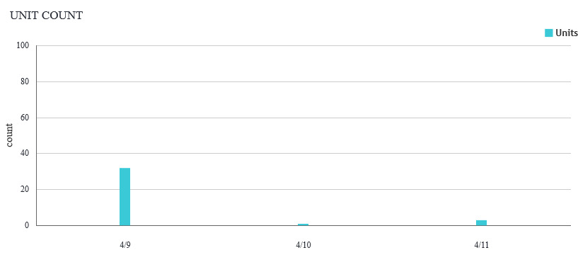
{x:new Date(“2018-04-09T01:30:00.000Z”),formatedTime:”4/9/2018 07:00 AM”,currentLevel:”End”,y:32,id:”5aa3768a24e5167d64390c55″,useExtras:false,Units:32,unit:”count”},
{x:new Date(“2018-04-10T01:30:00.000Z”),formatedTime:”4/10/2018 07:00 AM”,currentLevel:”End”,y:1,id:”5aa3768a24e5167d64390c55″,useExtras:false,Units:1,unit:”count”},
{x:new Date(“2018-04-12T01:30:00.000Z”),formatedTime:”4/12/2018 07:00 AM”,currentLevel:”End”,y:3,id:”5aa3768a24e5167d64390c55″,useExtras:false,Units:3,unit:”count”}],
toolTipContent:”Units: {Units} {unit}<br>Time: {formatedTime}<br>”,”cursor”:”pointer”}],backgroundColor:”#FFFFFF”
};var chart = new CanvasJS.Chart(“chartContainer”,
properties);chart.render();
April 16, 2018 at 4:28 pm #20342Hi
I have updated my code, please help me
April 16, 2018 at 6:02 pm #20344please note this is properties what i used to plot graph
var properties = {
legend:{“fontSize”:13,
“verticalAlign”:”top”,
“horizontalAlign”:”right”},
dataPointMaxWidth:15,axisX:{
interval:1,
intervalType:”day”,
valueFormatString:”M/D”,
},axisY:{
titleFontSize:15,
gridThickness:1,
labelFontSize:12,
tickThickness:0,
tickLength:5,
stripLines:[],
title:”count”,
maximum:100,
minimum:0,
gridColor:”#CCC”,
titleFontFamily:”MonteserratRegular”,
labelFontFamily:”MonteserratRegular”,
labelFontColor:”#282c37″},title:{
text:”UNIT COUNT”,
fontSize:17,
fontFamily:”MonteserratSemiBold”,
fontWeight:”normal”,
margin:-5,
padding:10,
fontColor:”#282c37″,
horizontalAlign:”left”},
animationEnabled:false,data:[
{
showInLegend:true,
dataSourceId:”MachineMetrics.InputUnitCount”,
type:”column”,
color:”#3AC9D6″,
legendText:”Units”,
dataPoints:[
{x:new Date(“2018-04-09T01:30:00.000Z”),y:32},
{x:new Date(“2018-04-10T01:30:00.000Z”),y:1},
{x:new Date(“2018-04-11T01:30:00.000Z”),y:32},
{x:new Date(“2018-04-12T01:30:00.000Z”),y:3}],
}],backgroundColor:”#FFFFFF”
};April 16, 2018 at 6:05 pm #20345Axis labels are not rendered for every dataPoint instead its rendered at every interval. However if you like to show label for every dataPoint, you can use label property instead of x-value. Please take a look at this updated JSFiddle.
—
Vishwas R
Team CanvasJSApril 16, 2018 at 6:12 pm #20346I found some things if I put datapoint x value like this { x: new Date(2012, 01, 1), y: 26}, it is working fine
but if we do this in following way it will create problem {x:new Date(“2018-04-09T01:30:00.000Z”),y:32},
Any help
April 16, 2018 at 6:47 pm #20347@Vishwas R Thanks for the reply, but we need date time in X-axis, we can’t change it as the label, bcz date time values getting from the server.
We are working on Licenced Version CanvasJs
please look the following code, I have removed all unwanted lines, please play with that code
Also the same thing will work if we apply new Date(2011,01,01) format, then why it is not working in following format x: new Date(“2018-04-09”)
var chart = new CanvasJS.Chart(“chartContainer”,
{
dataPointMaxWidth: 15,
axisX: {
interval: 1,
intervalType: “day”,
valueFormatString: “M/D”,
},axisY: {
title: “count”,
gridColor: “#CCC”
},data: [
{
showInLegend: true,
type: “column”,
legendText: “Units”,
dataPoints: [
{
x: new Date(“2018-04-09”),
y: 32
},
{
x: new Date(“2018-04-10”),
y: 1
}],
}],});
—————————————————————————————————-
if you change dataPoint with following format, it will work fine
dataPoints: [
{
x: new Date(2018,04,09),
y: 32
},
{
x: new Date(2018,04,10),
y: 1
}],-
This reply was modified 8 years, 3 months ago by
mhdajmalik.
-
This reply was modified 8 years, 3 months ago by
April 17, 2018 at 10:26 am #20356You can use one of the valid JavaScript date-time formats. When you use
x: new Date(2018,04,09),, 4 corresponds to May where as when you usex: new Date(“2018-04-09”),, 4 corresponds to April. Because of change in month, you may observe label properly positioned to the dataPoint in one case and not positioned in another case. As of now we don’t have option to control the starting point of the axis labels, however you can try axis interval and intervalType to fit into your requirement. If that doesn’t help you out, kindly create jsfiddle with your requirement so that we can understand it better and help you out?—
Vishwas R
Team CanvasJS -
This reply was modified 8 years, 3 months ago by
You must be logged in to reply to this topic.