Login to Ask a Question or Reply
You must be logged in to post your query.
Home › Forums › Chart Support › How to set the label and bar color based on the array value
How to set the label and bar color based on the array value
- This topic has 3 replies, 2 voices, and was last updated 7 years, 11 months ago by
Vishwas R.
-
August 10, 2018 at 1:07 pm #22191
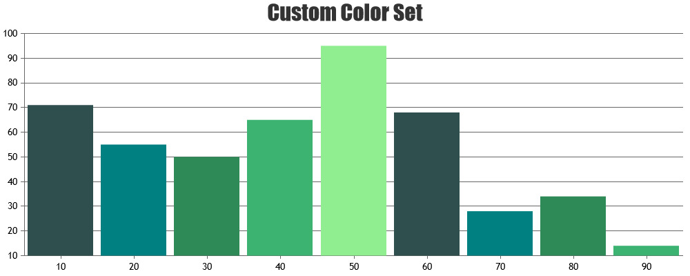
i need the output same like below. now i have set hard coded value for each of the bar, but how can i set it dynaically.. anybody can give me idea for that.. Thanks in Advance..
<script type=”text/javascript”>
window.onload = function () {
var dataPoints = [];
var label1 = [“High”, “Low”, “Medium”, “High”, “Low”, “Medium”, “High”, “Low”,”Medium”];var color = [“red”, “green”, “blue”, “red”, “green”, “blue”, “red”, “green”, “blue”];
var label = [“Jan”, ” “, ” “, “Feb”, ” “, ” “,”March”,” “,” “,” “];
label.toString();
var jsonData =
[{ “y”:90},
{“y”:40},{“y”:70},{“y”:70},{“y”:50},{“y”:30},
{“y”:60},{“y”:50},{“y”:40}];for (var i = 0; i < jsonData.length; i++) {
dataPoints.push({
//x: jsonData[i].x,
y: jsonData[i].y, label:label[i], color:color[i], indexLabel: label1[i],
});
}var chart = new CanvasJS.Chart(“chartContainer”, {
animationEnabled: true,
theme: “light2″, //”light1”, “light2”, “dark1”, “dark2”title:{
text: “Month wise Risk Analysis”
},axisY: {
title: “Total Count”,
lineThickness:0,
tickThickness:0,
gridThickness: 0,
stripLines: [
{
value: 0,
showOnTop: true,
color: “gray”,
thickness: 2
}
]
},
axisX:{
lineThickness:0,
tickThickness:0,
title: “Months”,
//valueFormatString:” “,//space
},
legend: {
cursor:”pointer”,
itemclick : toggleDataSeries
},
toolTip: {
shared: true,
content: toolTipFormatter
},
data: [{
type: “stackedColumn”,
//indexLabel: “High”,//indexLabel: “{y}”,
label: “label”,
indexLabelPlacement: “outside”,
indexLabelOrientation: “horizontal”,
//showInLegend: true,
//color: “gold”,
//name: “Male”,
//indexLabel: “{x}, {y}”,
//indexLabelPlacement: “outside”,
// indexLabelOrientation: “horizontal”,
dataPoints: dataPoints//dataPoints: [
//{ y: 80, label: “Jan”, color: “red”,indexLabel: “High”, indexLabelFontColor: “white”},
//{ y: 40, label: “Jan”, color: “green”, indexLabel: “low”, indexLabelFontColor: “white”},
//{ y: 50, label: “Jan”, color: “blue”,indexLabel: “Medium”,indexLabelFontColor: “white”},
//{ y: 90, label: “Feb”, color: “red”, indexLabel: “High”, indexLabelFontColor: “white”},
//{ y: 30, label: “Feb”, color: “green”, indexLabel: “low”, indexLabelFontColor: “white”},
//{ y: 60, label: “Feb”, color: “blue”, indexLabel: “Medium”, indexLabelFontColor: “white”},
//{ y: 70, label: “March”, color: “red”, indexLabel: “High”, indexLabelFontColor: “white”},
//{ y: 25, label: “March”, color: “green”, indexLabel: “low”, indexLabelFontColor: “white”},
//{ y: 50, label: “March”, color: “blue”, indexLabel: “Medium” , indexLabelFontColor: “white”},
//]},]
});
chart.render();function toolTipFormatter(e) {
var str = “”;
var total = 0 ;
var str3;
var str2 ;
for (var i = 0; i < e.entries.length; i++){
var str1 = “<span style= \”color:”+e.entries[i].dataSeries.color + “\”>” + e.entries[i].dataSeries.name + “</span>: “+ e.entries[i].dataPoint.y + “ <br/>” ;
total = e.entries[i].dataPoint.y + total;
str = str.concat(str1);
}
str2 = “” + e.entries[0].dataPoint.label + “ <br/>”;
//str3 = “<span style = \”color:Tomato\”>Total: </span>” + total + “<br/>”;
return (str2.concat(str));
}function toggleDataSeries(e) {
if (typeof (e.dataSeries.visible) === “undefined” || e.dataSeries.visible) {
e.dataSeries.visible = false;
}
else {
e.dataSeries.visible = true;
}
chart.render();
}}
</script>
<script type=”text/javascript” src=”https://www.gstatic.com/charts/loader.js”></script>August 10, 2018 at 2:34 pm #22194August 10, 2018 at 3:12 pm #22196Thank You Viswas R.. can you help me for one thing, suppose i removed any one data from the json data, then next of bar should be taken place..
in my example, i have three bar for each of he month, suppose some one remove “High” data then next bar should become “high”..
August 13, 2018 at 10:33 am #22231
You must be logged in to reply to this topic.