Home Forums StockChart Support How to render non-continuous time intervals separately in CanvasJS StockCharts?

How to render non-continuous time intervals separately in CanvasJS StockCharts?

Viewing 2 posts - 1 through 2 (of 2 total)
  • #60883

    How to render non-continuous time intervals separately in CanvasJS StockCharts?
    I’m using CanvasJS StockCharts and I have a dataset that covers an entire year (e.g., from January 1st to December 31st).
    I want to plot data from multiple specific time periods, such as:
    • January 1st to March 30th
    • May 1st to July 20th
    • September 1st to December 31st

    Here are the specific requirements I want to achieve:
    • I want the x-axis to remain continuous — it’s okay if there are gaps where there is no data (i.e., April, August, etc.).
    • I want each time interval to be shown as a separate, visually distinct series (e.g., different colors, line styles, or markers).
    • The time intervals may overlap — meaning one data series might overlap with another on the x-axis.
    • Ideally, I would like the chart to clearly distinguish between the different intervals visually, even if they are close together or overlap.

    Is it possible to do this using multiple dataSeries in CanvasJS?
    Would splitting the data manually into multiple series be the right approach, or is there a more recommended way to handle this kind of non-uniform, overlapping time periods?

    #60890

    @redcncsas,

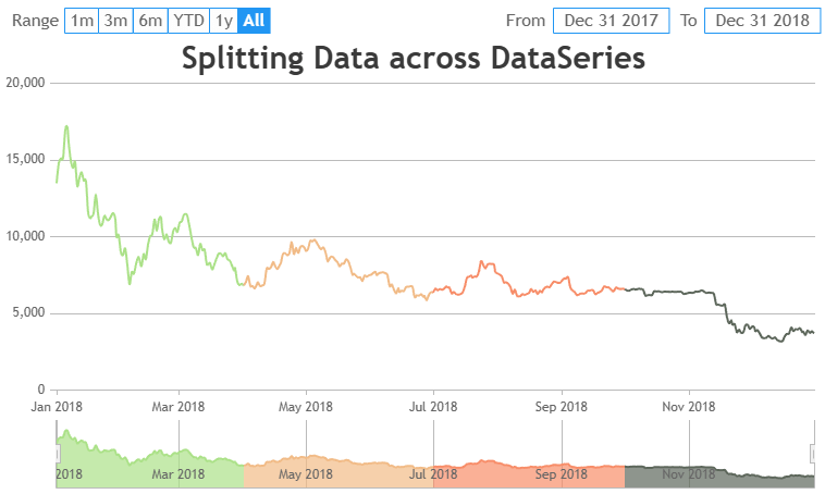
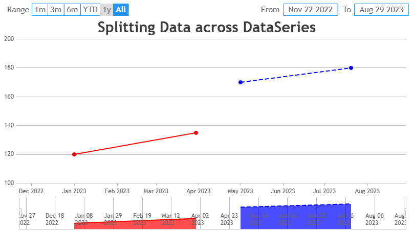
    Yes, you can achieve this in CanvasJS by splitting your data into multiple series, each representing a specific time period. Each series can have its own unique styling, such as different colors, line dash-type or markers. Since the x-axis is time-based, CanvasJS will automatically create gaps for the periods without data (like April or August) and the series will overlap if needed. Please have a look at the below code snippet for splitting the data across multiple dataseries.

    
    data: [{
      type: "line",
      dataPoints: [
        { x: new Date(2023, 0, 1), y: 120 },
        { x: new Date(2023, 2, 30), y: 135 }
      ],
      color: "#FF0000"  // Red for Jan-Mar
    }, {
      type: "line",
      dataPoints: [
        { x: new Date(2023, 4, 1), y: 170 },
        { x: new Date(2023, 6, 20), y: 180 }
      ],
      color: "#0000FF",  // Blue for May-Jul
      lineDashType: "dash"   // Dashed line style
    }]

    Also, check out this JSFiddle for complete code.

    Splitting data across multiseries in StockChart

    —-
    Manoj Mohan
    Team CanvasJS

Viewing 2 posts - 1 through 2 (of 2 total)

You must be logged in to reply to this topic.