@nancy-gale,
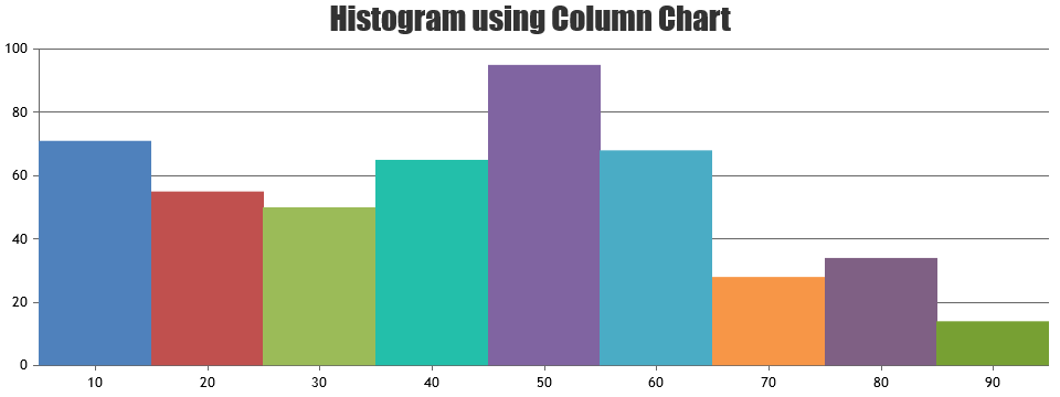
When the chart is zoomed, you can find whether a dataPoint is within the viewport range or outside with the help of rangeChanged event.
rangeChanged: function(e) {
  var dpsWithinViewport = 0;
  for(var j = 0; j < e.chart.data[0].dataPoints.length; j++) {
    var dataPoint = e.chart.data[0].dataPoints[j];
    if(dataPoint.x >= e.axisX[0].viewportMinimum && dataPoint.x <= e.axisX[0].viewportMaximum) {
      dpsWithinViewport++;
    }
  }
  if(e.trigger === "reset")
    updateDataPointWidth(e.chart, e.chart.data[0].dataPoints.length);
  else
    updateDataPointWidth(e.chart, dpsWithinViewport);
}
Please take a look at this JSFiddle for nearest possible solution to set the dataPointWidth by finding the number of dataPoints within the viewport range.

—
Vishwas R
Team CanvasJS