Login to Ask a Question or Reply
You must be logged in to post your query.
Home › Forums › Chart Support › Descriptive statistics etc for multi-series column charts
Descriptive statistics etc for multi-series column charts
- This topic has 3 replies, 2 voices, and was last updated 7 years, 7 months ago by
Priyanka M S.
Tagged: Column, descriptive statistics, error, multi-series, scatter
-
November 19, 2018 at 11:22 pm #23486
When the columns of a multi-series chart with discrete x axis values are added, they appear to centre around a notional X value, but the columns themselves have their own centre line which varies according to how many series there are.
When error bars are added, they naturally centre on the column’s centre lines.
However when trying to indicate outliers or to plot the actual values themselves (there is a trend opposing the increasing use of histograms in science communications and instead plotting ‘raw’ data – ‘R’ for example is able to do this), these points always sit on the notional X value grid, not on the centre of the multi-series column like the error bars do.
I have included sample code below.
I also note that box and whisker plots are not able to operate as multi-series in the same way as column charts do.
My question is:
Is there a way to get the scatter points to follow the centre line of columns? Or is there a need for a new type, say errorDots, which might accept a dataPoint argument like {y: [1,2,3,4,5]} to represent 5 points vertically above one another on the centre line of a column? If so, is there a need to expand this to allow highlighting of one or more points, such as {y: [1,2,{3, markerColor:red},4,5]}?window.onload = function () { var chart = new CanvasJS.Chart("chartContainer", { animationEnabled: true, title:{ text: "Early and late expression for cells, Class 1 to 4" }, axisY:{ title: "Relative expression rate" }, toolTip: { shared: true }, data: [ { type: "column", name: "Early", toolTipContent: "{label} <br> <b>{name}:</b>", dataPoints: [ { y: 14, label: "Class 1" }, { y: 16, label: "Class 2" }, { y: 12, label: "Class 3" }, { y: 35, label: "Class 4" } ] },{ type: "error", name: "Standard Error", whiskerLength:10, whiskerColor: "#000000", stemColor: "#000000", dataPoints: [ { y: [13, 16], label:"Class 1" }, { y: [14, 17], label:"Class 2" }, { y: [9, 13], label:"Class 3" }, { y: [30, 36], label:"Class 4" } ] },{ type: "scatter", name: "Early", markerColor: "#000000", dataPoints: [ { y: 14}, { y: 16}, { y: 9}, { y: 25} ] },{ type: "column", name: "Late", dataPoints: [ { y: 10, label: "Class 1" }, { y: 13, label: "Class 2" }, { y: 11, label: "Class 3" }, { y: 30, label: "Class 4" } ] },{ type: "error", name: "Standard Error", whiskerLength:10, whiskerColor: "#000000", stemColor: "#000000", dataPoints: [ { y: [1, 12], label:"Class 1" }, { y: [6, 16], label:"Class 2" }, { y: [9, 15], label:"Class 3" }, { y: [12, 40], label:"Class 4" } ] },{ type: "scatter", name: "Late", markerColor: "#000000", dataPoints: [ { y: 3}, { y: 25}, { y: 4}, { y: 22} ] }] }); chart.render(); }November 20, 2018 at 6:18 pm #23492The behavior is by design as error charts will be dependent on other data series, which shows the uncertainty of the data series attached to it whereas, scatter charts are independent of any other data series and occupies its space with respect to the position of x-value on axisX.
__
Priyanka M S
Team CanvasJSNovember 20, 2018 at 7:50 pm #23493Many thanks for that, however dot & box plots are becoming more fashionable as a means of presenting simultaneously the raw data and the statistical summary. For example,
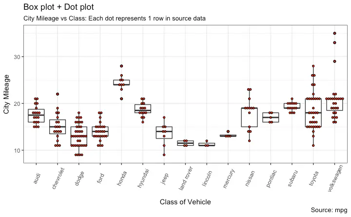
The same principle of plotting raw data as dots inside the width of a column is also an important means of conveying information. I was informed by one of your colleagues that scatter plot could be used to show outliers and other data points in combination with a multi-series column graph, but I was unable to make this work.November 21, 2018 at 11:39 am #23502We will reconsider this behavior for combining scatter chart with multi-series column charts. However, the combination of scatter chart and a single series column chart works fine as of now.
__
Priyanka M S
Team CanvasJS
Tagged: Column, descriptive statistics, error, multi-series, scatter
You must be logged in to reply to this topic.