Login to Ask a Question or Reply
You must be logged in to post your query.
Home › Forums › Chart Support › Date AxisX (Trend) + Group and Stack
Date AxisX (Trend) + Group and Stack
- This topic has 6 replies, 4 voices, and was last updated 2 years, 8 months ago by
CynthiaMancuso.
-
August 27, 2023 at 9:20 pm #43640
I am having trouble figuring out the combination of chart type, dataseries and datapoints configuration needed to support trend, group and stack all in one.
Measures returned from the database are grouped on three columns:
1. datetime part (for time series trend on X axis)
2. dimension column for group by element
3. another dimension column for stack by elementChart desire:
X axis trends date
# of column/bars per datetime part = # of group by value
# of stacks within each column/bar = # of stack by values existing within group by value.Is this possible?
August 28, 2023 at 6:47 pm #43649Jason,
Can you kindly brief us further on your requirement with a pictorial representation or an example so that we can understand your requirement better and suggest an appropriate solution?
—
Thangaraj Raman
Team CanvasJSAugust 29, 2023 at 9:28 am #43655Thanks for the quick response. As an example of what I am looking for, please see: https://canvasjs.com/forums/topic/date-axisx-trend-group-and-stack/
Imagine with the following data return, I am defining my dataSeries and dataPoints arrays:
[
{
“trend”: “2021-01-01”,
“year”: 2021,
“group”: “Partner 1”,
“stack”: “Expense”,
“value”: “2000”
},
{
“trend”: “2021-01-01”,
“year”: 2021,
“group”: “Partner 1”,
“stack”: “Contribution”,
“value”: “5000”
},
{
“trend”: “2021-01-01”,
“year”: 2021,
“group”: “Partner 1”,
“stack”: “Income”,
“value”: “1000”
},
{
“trend”: “2021-01-01”,
“year”: 2021,
“group”: “Partner 2”,
“stack”: “Expense”,
“value”: “3000”
},
{
“trend”: “2021-01-01”,
“year”: 2021,
“group”: “Partner 2”,
“stack”: “Contribution”,
“value”: “2000”
},
{
“trend”: “2021-01-01”,
“year”: 2021,
“group”: “Partner 2”,
“stack”: “Income”,
“value”: “3000”
},
{
“trend”: “2022-01-01”,
“year”: 2022,
“group”: “Partner 1”,
“stack”: “Expense”,
“value”: “1500”
},
{
“trend”: “2022-01-01”,
“year”: 2022,
“group”: “Partner 1”,
“stack”: “Contribution”,
“value”: “3000”
},
{
“trend”: “2022-01-01”,
“year”: 2022,
“group”: “Partner 1”,
“stack”: “Income”,
“value”: “2000”
},
{
“trend”: “2022-01-01”,
“year”: 2022,
“group”: “Partner 2”,
“stack”: “Expense”,
“value”: “1000”
},
{
“trend”: “2022-01-01”,
“year”: 2022,
“group”: “Partner 2”,
“stack”: “Contribution”,
“value”: “1000”
},
{
“trend”: “2022-01-01”,
“year”: 2022,
“group”: “Partner 2”,
“stack”: “Income”,
“value”: “4000”
},
{
“trend”: “2023-01-01”,
“year”: 2023,
“group”: “Partner 1”,
“stack”: “Expense”,
“value”: “2500”
},
{
“trend”: “2023-01-01”,
“year”: 2023,
“group”: “Partner 1”,
“stack”: “Contribution”,
“value”: “1000”
},
{
“trend”: “2023-01-01”,
“year”: 2023,
“group”: “Partner 1”,
“stack”: “Income”,
“value”: “3000”
},
{
“trend”: “2023-01-01”,
“year”: 2023,
“group”: “Partner 2”,
“stack”: “Expense”,
“value”: “2000”
},
{
“trend”: “2023-01-01”,
“year”: 2023,
“group”: “Partner 2”,
“stack”: “Contribution”,
“value”: “1000”
},
{
“trend”: “2023-01-01”,
“year”: 2023,
“group”: “Partner 2”,
“stack”: “Income”,
“value”: “3500”
}
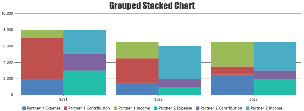
]For this particular use case my goal would be to produce a column chart with annual trends on the x axis, with each year having a side-by-side column for each group property value, where each column is then stacked independently based on each stack property value.
August 31, 2023 at 5:06 pm #43673Jason,
It is not possible to render a grouped-stacked chart over a single axis as of now. However, you can render each stack over a different axis to achieve the same.
Please check this JSFiddle for a working example.
—
Thangaraj Raman
Team CanvasJSSeptember 1, 2023 at 3:21 am #43676I see. I was thinking it would be something like this. Thank you for the full working example.
October 13, 2023 at 12:04 pm #43880Thank you for the info, you made my day.
November 7, 2023 at 1:32 pm #44021To achieve a chart with a date axis, group by elements, and stacked elements, you’ll need to use a charting library that supports these features. Define data series for each group by element, ensuring that each data point contains values for stackable elements. Set up colors or visual distinctions to represent groupings and use legends for clarity. The specific steps may vary depending on the charting tool you’re using.
You must be logged in to reply to this topic.