You must be logged in to post your query.
Home › Forums › Chart Support › Convert to date format
Tagged: data type conversion
I am getting JSON data from a python script (for drawing candlestick chart) in following format. [{"y": [10714.7, 10717.95, 10714.3, 10717.5], "x": "2018/01/16 14:26:00"}, {"y": [10718.0, 10718.0, 10713.45, 10716.2], "x": "2018/01/16 14:27:00"}, {"y": [10716.6, 10722.0, 10716.1, 10719.15], "x": "2018/01/16 14:28:00"}]
[{"y": [10714.7, 10717.95, 10714.3, 10717.5], "x": "2018/01/16 14:26:00"}, {"y": [10718.0, 10718.0, 10713.45, 10716.2], "x": "2018/01/16 14:27:00"}, {"y": [10716.6, 10722.0, 10716.1, 10719.15], "x": "2018/01/16 14:28:00"}]
The date/time is in string format. (There are thousands of records, I have indicated a few.)
Now the help requested is, how do I convert the date/time in correct format for the entire data by replacing old values in-place. Thanks.
I gave it a try.
var rawData = [ {"y": [10714.7, 10717.95, 10714.3, 10717.5], "x": "2018/01/16 14:26:00"}, {"y": [10718.0, 10718.0, 10713.45, 10716.2], "x": "2018/01/16 14:27:00"}, {"y": [10716.6, 10722.0, 10716.1, 10719.15], "x": "2018/01/16 14:28:00"} ] for (i = 0; i < 3; i++){rawData[i]["x"]=new Date(rawData[i]["x"]);}
Mostly, it is ok. But the it gives Date, not DateTime.
I tried new Date(rawData[i]["x"]).format("isoDateTime") But error.
new Date(rawData[i]["x"]).format("isoDateTime")
What I maybe missing? Thanks.
Now, almost done. I have set valueFormatString: "DD-MMM-YYYY HH-mm", for axisX.
valueFormatString: "DD-MMM-YYYY HH-mm",
1) If there are a few records,date time are displayed twice on x-axis. 2) As the no. of records increases in the same day, X-axis labels are not displayed for in-between records. Displayed after every 10 records. 3) If there is data for different dates, obviously there is no data during off-market hours. But X-axis space is reserved for these empty slots. You can view it in the jsfiddle below. What should be corrected? This jsfiddle shows the result.
Thanks.
Since EDIT is disabled in above post, creating a new reply. multiple dates jsfiddle can be viewed here.
@d_vineet,
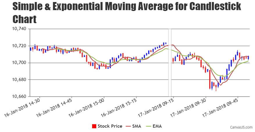
Axis labels are shown at every interval, which is auto-calculated such that the labels don’t overlap and make the chart look better. Labels are not shown for dataPoint but at every interval of axis. However, you can set the interval and intervalType to display the labels at a specific interval as shown in the code snippet below –
interval: 15, intervalType: "minute",
Also, to shrink the region of axis on which dataPoints are not displayed you can use scaleBreaks as shown below –
scaleBreaks: { type: "straight", customBreaks: [{ startValue: new Date(2018,00,16,15,30), endValue: new Date(2018,00,17,09,14) }] },
Kindly take a look at this updated JSFiddle for an example.
___________ Indranil Deo Team CanvasJS
You must be logged in to reply to this topic. Login/Register