Login to Ask a Question or Reply
You must be logged in to post your query.
Home › Forums › Chart Support › combining candlestick chart and line chart (moving average line)
combining candlestick chart and line chart (moving average line)
- This topic has 42 replies, 4 voices, and was last updated 7 years, 12 months ago by
Vineet Deodhar.
Tagged: candlestick chart
-
November 14, 2017 at 1:10 pm #17558
I am very much excited by the simplicity of canvasjs.
Wish to use it for my purpose.
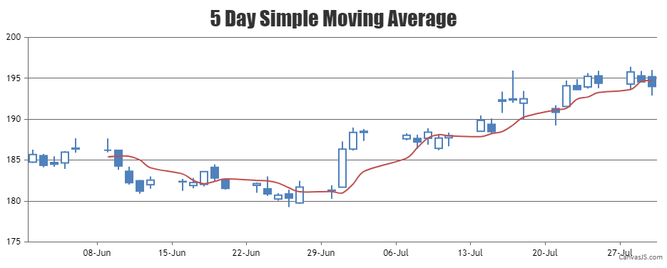
I need candlestick chart with overlapped moving average lines on same canvas.
Can it be done?
Thanks in advance.-
This topic was modified 8 years, 4 months ago by
Vineet Deodhar. Reason: spelling
November 15, 2017 at 12:13 pm #17580Thank you for your interest in CanvasJS.
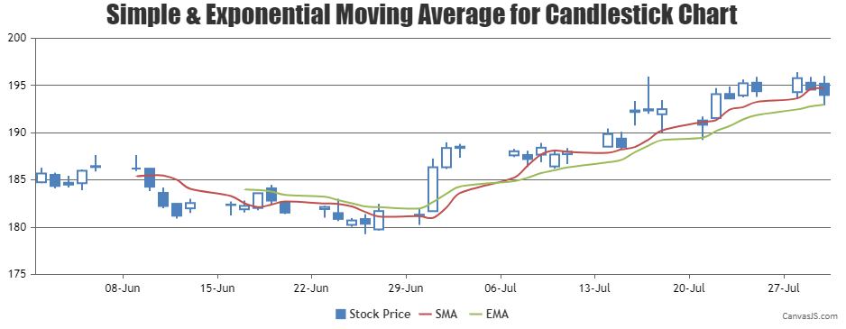
Yes, it can be done. You can combine Candlestick chart with Spline chart, where spline represents the moving averages. You can loop through the candlestick series and use its corresponding dataPoints to dynamically calculate the spline series as shown in the code snippet below –function calculateMovingAverage(chart) { // return if there are insufficient dataPoints if(chart.options.data[0].dataPoints.length <= 5) return; else { // Add a new line series for Moving Averages chart.options.data.push({ type: "spline", markerSize: 0, name: "SMA", dataPoints: [] }); var total; for(var i = 5; i < chart.options.data[0].dataPoints.length; i++) { total = 0; for(var j = (i - 5); j < i; j++) { total += chart.options.data[0].dataPoints[j].y[3]; } chart.options.data[1].dataPoints.push({ x: chart.options.data[0].dataPoints[i].x, y: total / 5 }); } } }Please have a look at this JSFiddle for a working example.

___
Suyash Singh
Team CanvasJSNovember 15, 2017 at 1:13 pm #17581Thanks Suyash Singh for your reply.
Its really great to learn that my need can be satisfied by your library.
Also, your reply was thorough and even more informative than I asked. (you provided js code for moving averages).
Thanks for that.Furhter, may I ask– 1) what js code would be right for having Exponential Moving Averages instead of SMA.
2) I need 5 EMAs. So I think I can pass those many json datasets in the way you have specified. Right?November 16, 2017 at 1:15 pm #176051) what js code would be right for having Exponential Moving Averages instead of SMA.
Yes, you can extend the code further to render Exponential Moving Averages. Please check the below code snippet for calculating Exponential Moving Averages –
function calculateExponentialMovingAverage(chart, emaPeriod) {
  var currentEma = 0, prevEma = 0, temp = 0;

  // Return if there are insufficient dataPoints
  if(chart.options.data[0].dataPoints.length <= emaPeriod) return;

  else {
    chart.options.data.push({
      type: "spline",
      markerSize: 0,
      name: "EMA",
      yValueFormatString: "#,##0.00",
      showInLegend: true,
      dataPoints: []
    });
    for(var i = emaPeriod - 1; i < chart.options.data[0].dataPoints.length; i++) {
      if(i === emaPeriod - 1) {
        // Calculate Simple average upto emaPeriod
        for(var j = 0; j < emaPeriod; j++)
          temp += chart.options.data[0].dataPoints[j].y[3];
        currentEma = temp / emaPeriod;
      } else
        currentEma = chart.options.data[0].dataPoints[i].y[3] * 2 / (emaPeriod + 1) + prevEma * (1 - 2 / (emaPeriod + 1));

      chart.options.data[chart.options.data.length - 1].dataPoints.push({
        x: chart.options.data[0].dataPoints[i].x,
        y: currentEma
      });
      prevEma = currentEma;
    }
  }
}
Also, kindly take a look at this updated JSFiddle.
2) I need 5 EMAs. So I think I can pass those many json datasets in the way you have specified. Right?
Yes, you can add multiple EMA’s to the chart by adding them to data-series array.

___
Suyash Singh
Team CanvasJSNovember 16, 2017 at 9:29 pm #17616Thank you very much for your support.
January 16, 2018 at 4:47 pm #18861Hello Suyash Singh,
I need to make moving average for a week with column and bar chart. Data should show in Column chart and moving average of two points for 7 days data should be by line chart on bar chart. Please HELP by giving a example.
Regards
January 16, 2018 at 5:10 pm #18862Hello Suyash Singh,
I need to make moving average for a week with Column and Line charts. Data should show in Column chart for seven days and moving average of two points for 7 days data should be by line chart on bar chart. Please HELP by giving a example.
I am taking data from Database. This is Production numeric value.
Regards
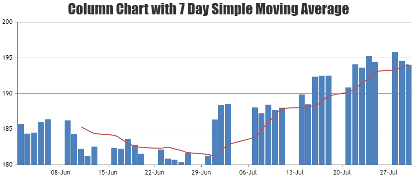
January 17, 2018 at 12:41 pm #18877To calculate 7 days Simple Moving Average you can loop through the column series, then sum up consecutive 7 days y-value and use the same in spline series representing Simple Moving Average as shown in the below code snippet –
function calculateMovingAverage(chart) {
  var numOfDays = 7;
  // return if there are insufficient dataPoints
  if(chart.options.data[0].dataPoints.length <= numOfDays) return;
  else {
    // Add a new line series for  Moving Averages
    chart.options.data.push({
      type: "spline",
      markerSize: 0,
      name: "SMA",
      yValueFormatString: "#,##0.00",
      dataPoints: []
    });
    var total;
    for(var i = numOfDays; i < chart.options.data[0].dataPoints.length; i++) {
      total = 0;
      for(var j = (i - numOfDays); j < i; j++) {
        total += chart.options.data[0].dataPoints[j].y;
      }
      chart.options.data[1].dataPoints.push({
        x: chart.options.data[0].dataPoints[i].x,
        y: total / numOfDays
      });
    }
  }
}
Please take a look at this JSFiddle on Column Chart with 7 Day Simple Moving Average. Also kindly have a look at:
1. Creating charts from database in ASP.NET MVC Application.
2. ASP.NET Download Samples
___
Suyash Singh
Team CanvasJSJanuary 17, 2018 at 3:03 pm #18879Thank you so much Suyash. I will try this example..
I am very new to Canvas JS..
I am making chart with following code..Where should I call moving average function and what should I pass in below code.
If you kindly let me know that will be great help..<script type=”text/javascript” src=”js/canvasjs.min.js”></script>
<script type=”text/javascript” src=”js/highcharts.js”></script>
<script type=”text/javascript” src=”js/highcharts-more.js”></script>
<script type=”text/javascript” src=”js/exporting.js”></script>
<script type=”text/javascript” src=”js/script.js”></script>
<script type=”text/javascript”>
window.onload = function () {var xVal1 = 0;
var yVal1 = 100;
var dataLength = 100; // number of dataPoints visible at any pointd
var dataResult = 0;var dps3 = []; // dataPoints
CanvasJS.addColorSet(“greenShades”,
[//colorSet Array
“#600080”,
“#669900”]);
var chart3 = new CanvasJS.Chart(“chartContainerGas”, {
theme: “theme3”,
colorSet: “greenShades”,
animationEnabled: true,
animationDuration: 2000,
backgroundColor: “transparent”,
title: {
//text: “Variance Report for Gas Production”
},
axisX: {
valueFormatString: “MMM”,
interval: 1,
intervalType: “month”},
axisY: {
includeZero: false},
data: [{
type: “line”,
dataPoints: dps3
}]
});
var xVal3 = 0;
var yVal3 = 100;
var month = 0;
var year = 0;
var day = 0;
var dataArray = null;
var dataLength = 100; // number of dataPoints visible at any point
var updateChart3 = function () {
// alert(window.location.search.slice(1));
var query = window.location.search.slice(1);
$.ajax({
url: “GasProductionGraph.aspx/GetGasChartData”,
type: “POST”,
data: “{‘Month’:'” + query + “‘}”,
contentType: “application/json; charset=utf-8”,
dataType: “json”,
async: false,
context: document.body,
success: function (data3) {
for (var j = 0; j < data3.d.length; j++) {
dataArray = data3.d[j].split(‘-abc-‘);xVal3 = parseInt(dataArray[0]);
yVal3 = parseInt(dataArray[1]);
month = parseInt(dataArray[2]);
year = parseInt(dataArray[3]);
day = parseInt(dataArray[4]);dps3.push({
x: new Date(year, month, day),
y: yVal3
});
}
},
error: function (result) {
// alert(“Error”);
}
});
chart3.render();
};
//// generates first set of dataPoints
updateChart3();}
January 18, 2018 at 11:19 am #18891calculateMovingAverage()should be called before callingchart.render(). Please replacechart3.render();bycalculateMovingAverage(chart3); chart3.render();___
Suyash Singh
Team CanvasJSJanuary 29, 2018 at 9:24 pm #18976Thank You so much. I made this graph with your help..
January 29, 2018 at 9:36 pm #18979Hello Sir,
I want to make another moving average line for some other field on the same chart. Currently, I am having Bar for Produced Part and Moving Average for Produced part, Now I want to have another Moving Average for some other Field on the same graph, how should I do? Currently my code is like this… I need to lines on bar graph
window.onload = function () {
var xVal1 = 0;
var yVal1 = 100;
var dataLength = 100; // number of dataPoints visible at any pointd
var dataResult = 0;var dps3 = []; // dataPoints
CanvasJS.addColorSet(“skyblueShades”,
[//colorSet Array
“#2E8B57”,
“#669900”,
“#1BCDD1”]);
var chart3 = new CanvasJS.Chart(“chartContainerGas”, {
theme: “theme3”,
colorSet: “greenShades”,
animationEnabled: true,
animationDuration: 2000,
backgroundColor: “transparent”,
title: {
text: “Total Produced Part & Scrap Percentage”
},
axisX: {
title: “Overall Percentage”, labelAngle: 180, labelFontSize: 15, labelWrap: false
},
axisY: {
title: “Produced Parts”
},data: [{
type: “column”,
//indexLabel: “”,
indexLabelFontColor: “red”, indexLabelFontSize: 30,
dataPoints: dps3
}]
});
var xVal3 = 0;
var xVal31 = 0;
var indexlabelva = 0;
var yVal3 = 100;
var yVal31 = 100;
var dataLength = 100; // number of dataPoints visible at any point
var updateChart3 = function () {
var query = document.getElementById(‘ctl00_ContentPlaceHolder1_sdate’).value + “—” + document.getElementById(‘ctl00_ContentPlaceHolder1_edate’).value
$.ajax({
url: “TrendlineChartPreAssembly.aspx/GetGasChartData”,
type: “POST”,
data: “{‘Dates’:'” + query + “‘}”,
contentType: “application/json; charset=utf-8”,
dataType: “json”,
async: false,
context: document.body,
success: function (data3) {
for (var j = 0; j < data3.d.length; j++) {
xVal3 = parseInt(data3.d[j].split(‘-abc-‘)[0]);
yVal3 = parseInt(data3.d[j].split(‘-abc-‘)[3]);
indexLabel: parseInt(data3.d[j].split(‘-abc-‘)[6]);
dps3.push({
x: xVal3,
y: yVal3, label: (data3.d[j].split(‘-abc-‘)[2]), name: (data3.d[j].split(‘-abc-‘)[4]), indexLabel: (data3.d[j].split(‘-abc-‘)[6]) + ” %”, indexLabelFontColor: “red”});
}
},
error: function (result) {
// alert(“Error”);
}
});
calculateMovingAverage(chart3);
calculateMovingAverageScrap(chart3);
chart3.render();// Function to calculate n-Day Simple moving average
function calculateMovingAverage(chart) {
var numOfDays = 2;
// return if there are insufficient dataPoints
if (chart.options.data[0].dataPoints.length <= numOfDays) return;
else {
// Add a new line series for Moving Averages
chart.options.data.push({
type: “spline”,
markerSize: 0,
name: “SMA”,
yValueFormatString: “#,##0.00”,
dataPoints: []
});
var total;
for (var i = numOfDays; i < chart.options.data[0].dataPoints.length; i++) {
total = 0;
for (var j = (i – numOfDays) ; j < i; j++) {total += chart.options.data[0].dataPoints[j].y;
}
chart.options.data[1].dataPoints.push({
x: chart.options.data[0].dataPoints[i].x,
y: total / numOfDays}); //alert(numOfDays);
}
}
}// Function to calculate n-Day Simple moving average
function calculateMovingAverageScrap(chart) {
var numOfDays = 2;
// return if there are insufficient dataPoints
if (chart.options.data[0].dataPoints.length <= numOfDays) return;
else {
// Add a new line series for Moving Averages
chart.options.data.push({
type: “spline”,
markerSize: 0,
name: “SMA”,
yValueFormatString: “#,##0.00”,
dataPoints: []
});
var total;
for (var i = numOfDays; i < chart.options.data[0].dataPoints.length; i++) {
total = 0;
for (var j = (i – numOfDays) ; j < i; j++) {total += chart.options.data[0].dataPoints[j].y;
}
chart.options.data[1].dataPoints.push({
x: chart.options.data[0].dataPoints[i].x,
y: total / numOfDays}); //alert(numOfDays);
}
}
}
};
//// generates first set of dataPoints
updateChart3();
$(function () {
$(“#<%= sdate.ClientID%>”).datepicker({ dateFormat: ‘yy-mm-dd’ });
$(“#<%= edate.ClientID%>”).datepicker({ dateFormat: ‘yy-mm-dd’ });
});
}Please help..
I followed this example
https://jsfiddle.net/canvasjs/tq339Lm1/
Regards,
Nisha
January 29, 2018 at 9:50 pm #18980Hello Sir,
I want to make another moving average line for some other field on the same chart. Currently, I am having Bar for Produced Part and Moving Average for Produced part, Now I want to have another Moving Average for some other Field on the same graph, how should I do? Currently my code is like this… I need to lines on bar graph..
below code works fine with one moving average.. need another moving average.. please help.
window.onload = function () {
var xVal1 = 0;
var yVal1 = 100;
var dataLength = 100; // number of dataPoints visible at any pointd
var dataResult = 0;var dps3 = []; // dataPoints
CanvasJS.addColorSet(“skyblueShades”,
[//colorSet Array
“#2E8B57”,
“#669900”,
“#1BCDD1”]);
var chart3 = new CanvasJS.Chart(“chartContainerGas”, {
theme: “theme3”,
colorSet: “greenShades”,
animationEnabled: true,
animationDuration: 2000,
backgroundColor: “transparent”,
title: {
text: “Total Produced Part & Scrap Percentage”
},
axisX: {
title: “Overall Percentage”, labelAngle: 180, labelFontSize: 15, labelWrap: false
},
axisY: {
title: “Produced Parts”
},data: [{
type: “column”,
//indexLabel: “”,
indexLabelFontColor: “red”, indexLabelFontSize: 30,
dataPoints: dps3
}]
});
var xVal3 = 0;
var xVal31 = 0;
var indexlabelva = 0;
var yVal3 = 100;
var yVal31 = 100;
var dataLength = 100; // number of dataPoints visible at any point
var updateChart3 = function () {
var query = document.getElementById(‘ctl00_ContentPlaceHolder1_sdate’).value + “—” + document.getElementById(‘ctl00_ContentPlaceHolder1_edate’).value
$.ajax({
url: “TrendlineChartTraying.aspx/GetGasChartData”,
type: “POST”,
data: “{‘Dates’:'” + query + “‘}”,
contentType: “application/json; charset=utf-8”,
dataType: “json”,
async: false,
context: document.body,
success: function (data3) {
for (var j = 0; j < data3.d.length; j++) {
xVal3 = parseInt(data3.d[j].split(‘-abc-‘)[0]);
yVal3 = parseInt(data3.d[j].split(‘-abc-‘)[3]);
indexLabel: parseInt(data3.d[j].split(‘-abc-‘)[6]);
dps3.push({
x: xVal3,
y: yVal3, label: (data3.d[j].split(‘-abc-‘)[2]), name: (data3.d[j].split(‘-abc-‘)[4]), indexLabel: (data3.d[j].split(‘-abc-‘)[6]) + ” %”, indexLabelFontColor: “red”});
}
},
error: function (result) {
// alert(“Error”);
}
});
calculateMovingAverage(chart3);chart3.render();
// Function to calculate n-Day Simple moving average
function calculateMovingAverage(chart) {
var numOfDays = 2;
// return if there are insufficient dataPoints
if (chart.options.data[0].dataPoints.length <= numOfDays) return;
else {
// Add a new line series for Moving Averages
chart.options.data.push({
type: “spline”,
markerSize: 0,
name: “SMA”,
yValueFormatString: “#,##0.00”,
dataPoints: []
});
var total;
for (var i = numOfDays; i < chart.options.data[0].dataPoints.length; i++) {
total = 0;
for (var j = (i – numOfDays) ; j < i; j++) {total += chart.options.data[0].dataPoints[j].y;
}
chart.options.data[1].dataPoints.push({
x: chart.options.data[0].dataPoints[i].x,
y: total / numOfDays}); //alert(numOfDays);
}
}
}
};
//// generates first set of dataPoints
updateChart3();
$(function () {
$(“#<%= sdate.ClientID%>”).datepicker({ dateFormat: ‘yy-mm-dd’ });
$(“#<%= edate.ClientID%>”).datepicker({ dateFormat: ‘yy-mm-dd’ });
});January 30, 2018 at 10:22 am #18984The functions
calculateMovingAverage()andcalculateMovingAverageScrap()will generate the same set of dataPoints as essentially they are same. Can you please brief us further about your requirements along with a jsfiddle with your sample data, or pictorial representation, so that we can understand your requirements better and help you out.
___
Suyash Singh
Team CanvasJSJanuary 30, 2018 at 1:30 pm #18986Hello Suyash,
Please check following link:
https://jsfiddle.net/SRDEVELOPER/QwZuf/820/I need chart like this. One bar and two moving average with different field.
I need moving average of both lines
var chart = new CanvasJS.Chart(“chartContainer”,{
title:{
text: “Multiple Y Axis”
},
axisX:{
valueFormatString: “####”,
interval: 1
},
axisY:[{
title: “Linear Scale”,
lineColor: “#369EAD”,
titleFontColor: “#369EAD”,
labelFontColor: “#369EAD”
},
{
title: “Logarithmic Scale”,
logarithmic: true,
lineColor: “#C24642”,
titleFontColor: “#C24642”,
labelFontColor: “#C24642”
}],
axisY2:[{
title: “Linear Scale”,
lineColor: “#7F6084”,
titleFontColor: “#7F6084”,
labelFontColor: “#7F6084”
},
{
title: “Logarithmic Scale”,
logarithmic: true,
interval: 1,
lineColor: “#86B402”,
titleFontColor: “#86B402”,
labelFontColor: “#86B402”
}],data: [
{
type: “column”,
showInLegend: true,
name: “Axis Y-1”,
xValueFormatString: “####”,
dataPoints: [
{ x: 2006, y: 6 },
{ x: 2007, y: 2 },
{ x: 2008, y: 5 },
{ x: 2009, y: 7 },
{ x: 2010, y: 1 },
{ x: 2011, y: 5 },
{ x: 2012, y: 5 },
{ x: 2013, y: 2 },
{ x: 2014, y: 2 }
]
},
{
type: “spline”,
showInLegend: true,
axisYIndex: 1, //Defaults to Zero
name: “Axis Y-2”,
xValueFormatString: “####”,
dataPoints: [
{ x: 2006, y: 15 },
{ x: 2007, y: 3 },
{ x: 2008, y: 20 },
{ x: 2009, y: 10 },
{ x: 2010, y: 30 },
{ x: 2011, y: 10 },
{ x: 2012, y: 600 },
{ x: 2013, y: 20 },
{ x: 2014, y: 2 }
]
},
{
type: “spline”,
showInLegend: true,
axisYType: “secondary”,
axisYIndex: 1, //When axisYType is secondary, axisYIndex indexes to secondary Y axis & not to primary Y axis
name: “Axis Y2-2”,
xValueFormatString: “####”,
dataPoints: [
{ x: 2006, y: 86 },
{ x: 2007, y: 15 },
{ x: 2008, y: 27 },
{ x: 2009, y: 78 },
{ x: 2010, y: 46 },
{ x: 2011, y: 70 },
{ x: 2012, y: 50 },
{ x: 2013, y: 60 },
{ x: 2014, y: 50 }
]
}
]
});chart.render()
Please let me know if anything is clear..
-
This topic was modified 8 years, 4 months ago by
Tagged: candlestick chart
You must be logged in to reply to this topic.