Hi there!,
I was wondering if it would be possible to have custom labels for the Y axis.
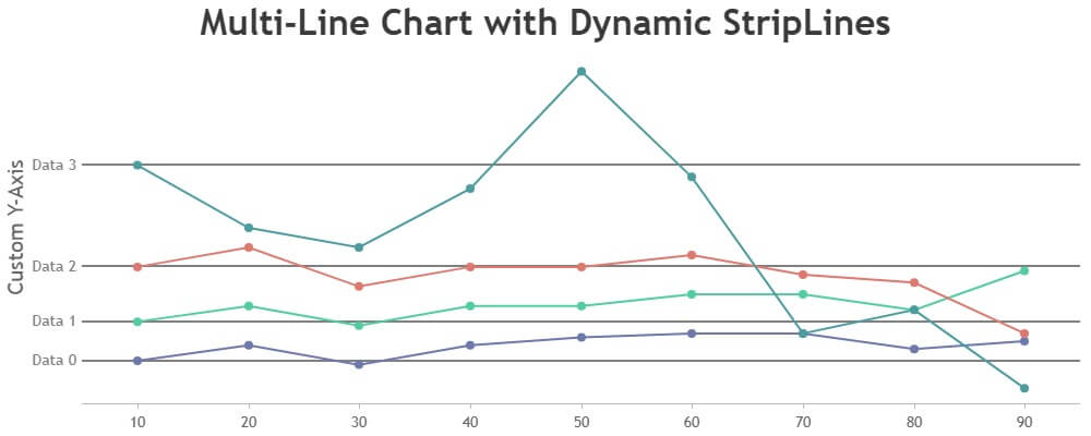
Say I have a multi line chart with multiple data points; can I show the label for the data, that particular data set belongs to?
       |                    _x_____x
       |                   /
       |          ______ /___x
data 3 |   x____x/     /       \___x
       |             /              \____x
       |           /
data 2 |   x____x/
       |
       |
       |
       |
       |
data 1 |   x____x
       |         \__________x
       |                     \_____x
       |_ _ _ _ _ _ _ _ _ _ _ _ _ _ _ _ _ _ _ _
           A.   B.   C.   D.   E.   F.
In the usual line chart, the values on the Y axis are based on where the chart sets the interval value. But can it be done so that it renders it where the first data point is shown on the cart?
Notice (in my crude drawing) the interval isn’t consistant and the labels (“data 1”, “data 2” etc) are next to the first entry in each data set.
Would something like this be possible?
Please and thank you.
-
This topic was modified 7 months ago by
 junker1224. Reason: styling
.