Home › Forums › Chart Support › Range area chart different lines color › Reply To: Range area chart different lines color
@mushu8,
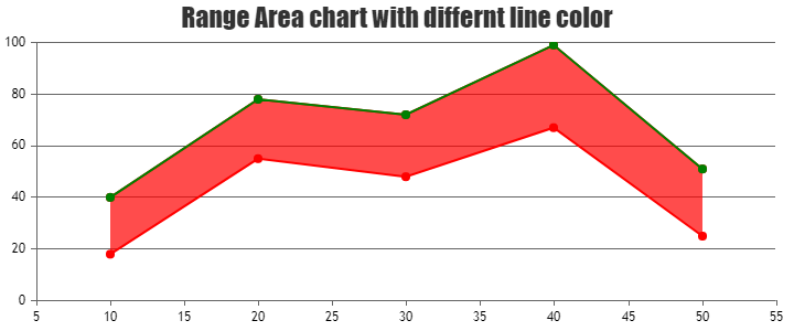
You can add one more dataseries with type set to ‘line‘ with the ‘y’ values same as one of the range values in range area chart.
Kindly look at this JSFiddle for the working example for the same.
__ Sachin Bisht Team CanvasJS